CloudMunch: Brand Extension

CloudMunch: Brand Extension

CloudMunch Marketing Website Header

Role
Visual Designer, Copywriter

Duration
8 Weeks, Completed in 2016

CloudMunch is an ambitious team working to tame the complex world of DevOps with a unifying platform for cloud-based app deployment, including plugins and pipeline templates.

Opportunity. With the popularity of the cloud came a chance to transform how IT teams and app developers worked to test, deploy and maintain apps across their networks. In 2015, cloud applications were gaining traction, and tools to improve their efficiencies would be part of pushing adoption of cloud technologies from a meager 8% of enterprises to 82%. CloudMunch had recently redesigned their logo, and needed help extending their brand identity and tone of voice across their product and website.

Approach. I worked in sprints alongside CloudMunch's Engineering team, and designed within the constraints of their existing graphic style. Because of the quick turnaround to announce their upcoming product release, I made minimal updates to the existing color palette, and improve their copywriting for a US audience.

Outcome. CloudMunch successfully launched their app, and were acquired by JFrog a few months later.

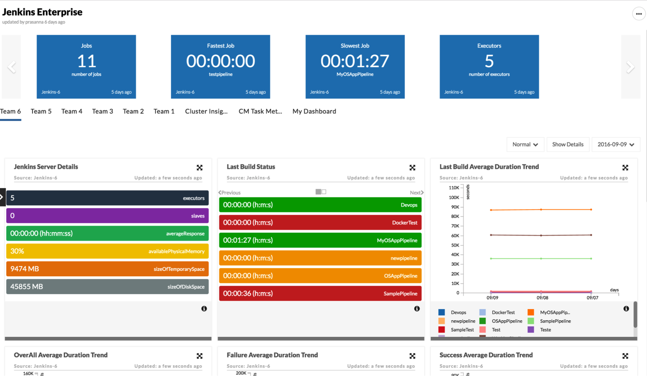
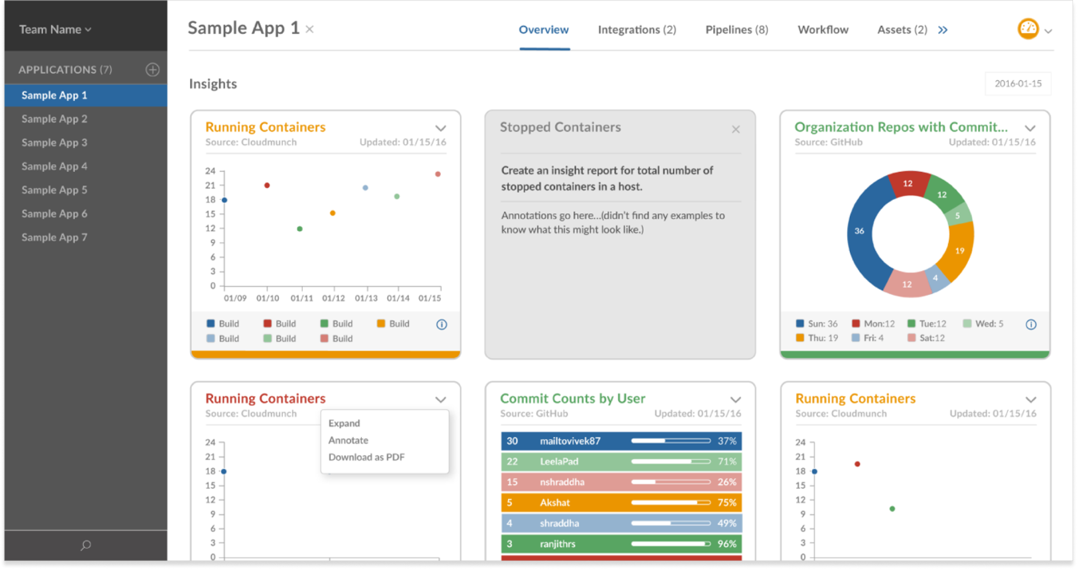
I expanded their brand across both their product design and their marketing website, and created custom branded illustrations and icons to match their desired cartoony style.

Cloudmunch Website Header
CloudMunch_DevOps_Platform_Portfolio_AppCentric@2x

CloudMunch provided their logo and two brand colors, and requested a “rippling wave” motif throughout their product. I fleshed out their style guide and created a cohesive look across their product, marketing website and presentations.

I designed a series of product icons to work as both a minimalist UI element as well as a high-fidelity marketing illustration for dramatic effect.

Cloudmunch_Product_Lineup
Cloudmunch Illustrations

I reimagined their infographics to explain the components of their three primary products and illustrate the structure of their app templates. These were used in various collateral, including their marketing website.

CloudMunch_Product_Diagram4 1
Cloudmunch_Diagram_Templates

CloudMunch: DevOps Platform

CloudMunch: DevOps Platform

CloudMunch_DevOps_Platform_Portfolio_AppCentric@2x

Role
UI Designer, Visual Designer

Duration
8 Weeks, Completed in 2016

CloudMunch is an ambitious team working to tame the complex world of DevOps with a unifying platform for cloud-based app deployment, including plugins and pipeline templates.

Opportunity. With the popularity of the cloud came a chance to transform how IT teams and app developers worked to test, deploy and maintain apps across their networks. In 2015, cloud applications were gaining traction, and tools to improve their efficiencies would be part of pushing adoption of cloud technologies from a meager 8% of enterprises to 82%. CloudMunch saw the opportunity to utilize quality user experience design as a differentiator to attract more of the 18 million software developers to their tools.

Approach. I worked in sprints alongside CloudMunch's Engineering team through multiple iterations of their web app.

Outcome. CloudMunch successfully launched their app, and were acquired by JFrog a few months later.

Their range of DevOps tools was presented in three distinct parts to emphasize their value in supporting continuous app delivery and monitoring: the Workspace, Dashboard and Hub.

CloudMunch_Web_Assets_Workspace_hiRes_Workspace

The Workspace featured app delivery pipelines with at-a-glance monitoring. Pipelines are a popular tool for testing app stability and performance before updating them across multiple environments. From the Workspace, users could walk through a step-by-step approach to build each new pipeline with robust functionality and less manual effort.

CloudMunch_May20_AppOnboarding_SelectProduct2
Cloudmunch App Setup2 2
CloudMunch_AppOnboarding_Mar2016_2_SelectTemplate 1
Cloudmunch App Setup2 3

The Dashboard provided flexible insights displayed as individual modules. This allowed users to customize their focus to highlight key stats for current projects, and download reports as needed.

Cloudmunch_Sprint2_Dashboard_Rough1_Modal_Dashboard_Tiles 1 Small

A lightbox effect allowed users to view stats close-up and in isolation. By improving the color scheme, contrast levels and spacing of elements, the graphs became more readable while conveying complex detail.

The Hub served as a growing library of templates, tools and plugins for developers to incorporate into their projects. I created a system of iconography and labels to represent the various types of resources to increase findability.

CloudMunch_Hub_Rough_Templates 1
CloudMunch_Hub_Plugins

Backup of Redox Podcast

The Redox Podcast

When Redox took to the airwaves to tackle the toughest questions in healthcare, we worked with them to expand their brand into audio experiences.

Redox Podcast Hero 3@2x

SERVICES
Design, Development, Music Selection

PROJECT TYPE
Logo Design, Website Design & Development, Web App Integration, Marketing Templates

Collaborating with Redox and their PR team, we coordinated the creation and launch of Redox's new podcast series about the challenges of modern healthcare. We crafted the podcast cover image, selected the intro music to use as sonic branding for each episode, created the graphics to promote the episodes on various platforms, designed the episode content structure for landing pages, designed and developed a new section of their marketing website for the podcast episodes and integrated it with the necessary third party tools to deliver the podcast across platforms and capture leads.

To support their in-house marketing team beyond the launch of the podcast, we built a system of templates for them to quickly and easily generate the graphics, landing pages and descriptions to promote each subsequent episode. Featuring high-profile guests like Jonathan Bush and Mint.com founder, Aaron Patzer, the newly branded podcast was an immediate success, attracting an initial audience of over 1,000 listeners and further establishing Redox as a thought leader in healthcare technology.

Redox Podcast Sound Waves
Redox Podcast Viewing Screen
Redox Podcast Feature Images
Redox Podcast Blog

Redox Podcast

Redox Podcast Hero 3@2x

Role
Creative Director, Visual Designer, Interaction Designer

Scope of Work
Logo Design, Website Design & Development, Web App Integration, Marketing Website Custom Post, Branded Asset Templates, Music Curation, Mini Design System

When Redox took to the airwaves to tackle tough questions in healthcare, I expanded their brand into audio experiences, with templates and integrations to streamline the broadcast.

Approach. In collaboration with Redox executives and their PR team, I oversaw the creation and launch of Redox's new podcast series about the challenges of modern healthcare, and technology's role in improving patient experiences.

Opportunity. Serving multiple roles, my work ranged from project management and creative direction, to creating both the workflow and assets needed to launch each new podcast episode. I brought in a full-stack engineer to integrate the podcast with various third party tools so it could be simultaneously broadcast across multiple platforms, and promoted easily from their marketing website.

Outcome. I built a mini Design System, including page templates, website components, and visual assets to allow their marketing team to generate the graphics, transcription highlights, landing pages and descriptions for each episode in minutes. Featuring high-profile guests like Jonathan Bush, and Mint.com founder, Aaron Patzer, the newly branded podcast was an immediate success, attracting an initial audience of over 1,000 listeners and further establishing Redox as a thought leader in healthcare technology.

Portfolio Redox Podcast Page Templates 1100
Portfolio Redox Podcast User Flows Episode Workflow

To reduce the workload and number of assets needed to publish each podcast episode, I created a series of assets and templates. This made it a light lift to both create and promote the podcast.

Redox Podcast Sound Waves
Redox Podcast Feature Images

I selected music to use as a branded intro for the podcast. The track needed to strike the right tone to match the seriousness of the subject matter with their optimistic outlook.

Redox Podcast Banner Template
Portfolio Redox Podcast User Flows User Subscribe

Ictero

Ictero Medical

An ambitious digital health company pioneered a non-invasive approach to gallbladder surgery and sought out a sleek identity system to attract attention from top surgeons.

SERVICES
Brand Strategy, Graphic Design, Copywriting, Website Design, Website Development

PROJECT TYPE
Visual Identity Design Refresh, Marketing Collateral, Website Design & Development

Ictero Medical developed a unique, non-invasive cryoablation solution to offer at-risk patients a better option for treating gallbladder disease. We worked with the founders to develop a clean, minimalist design to bring their product to life and position them as a high-end, high quality tool for surgeons.

With the icy mist from the cryoablation process as a primary brand differentiator, we developed their visual theme around frosty scenery. The logo itself is rendered in cool blue hues, and repurposes the "o" and relocated dot from the "i" to form a subtle "zero degrees" at the end of their name.

Ictero Business Card Gray Bkgrd@2x
Ictero Folder Mailer@2x
Ictero Tshirt Banner
Ictero Metal Stamp@2x

Junum

Junum

A determined, woman-led company sought to establish a strong brand with a mission to save lives and challenge misconceptions around the healing power of clinical nutrition.

SERVICES
Naming, Brand Strategy, Visual Identity Design, Graphic Design, Copywriting

PROJECT TYPE
Branding, Website Design, Website Development, Marketing Collateral

Selling to health systems is no easy feat. Advocating to change decades-old processes in a hospital setting is even tougher. But these women set out to do just that, backed by a compelling combination of evidenced-based medicine and firsthand health IT experience. We collaborated with the founder to perfect their message and create an upbeat brand to match the spirit of their mission.

Junum Website@2x
Before After
Junum Presentation

Orthodox Natural Fitness

Orthodox Natural Fitness

After building a successful local following, this group of fitness experts moved into a space eight times its original size and needed to rebrand to announce their updated mission.

SERVICES
Visual Identity Design

PROJECT TYPE
Rebranding

Orthodox Natural Fitness boasts a towering military-style obstacle course for intensive natural movement training, as well as yoga and martial arts classes. Partnering with the founders, we anchored their visual identity around the meaning of their new chosen name, Orthodox. In boxing, an orthodox set of principles is the foundation for success. The wings in the "O"-shaped logo conjure a sense of freedom and power through self-discipline and mental toughness, reflecting the core beliefs of their personalized training.

Orthodox Pin Patches
Orthodox TShirt
Orthodox Backpack2
Orthodox Salves

Resolution Health Collaborative

Resolution Health Collaborative

A popular Midwestern massage therapist expanded her practice into a wellness clinic, and rebranded with a dynamic design system to support their various service categories.

SERVICES
Brand Strategy, Design

PROJECT TYPE
Rebranding, Visual Identity Design, Marketing Collateral

Resolution Health Collaborative grew out of a solo practitioner's therapeutic massage business into a personalized wellness clinic and integrative fitness center. We collaborated with the founder to establish a look and feel that sets them apart from spa-like experiences by emphasizing their high-quality, high-impact therapeutic services.

Resolution Logo Process
Resolution Logo

For their logo, I generated concepts around safety, healing and nature. I noticed the way the veins of a leaf—which transport vital nutrients and remove waste for a plant—complemented the shape of a shield and mimicked the muscles of a person's back. Bringing together these components created a simple, memorable shape that expressed strength and elegance.

Resolution_Waterbottle
Resolution_Pin_Card
Resolution_Posters_2up
Resolution_Membership Card

As their list of service offerings grew, so did the need to bring awareness to their breadth of expertise without diluting their message. I created a series of patterns to differentiate each of the four service categories, highlighting their individual benefits. Displaying them together established the concept of an integrated, multi-pronged approach to promoting wellness.

Resolution Patterns
Resolution_Gift_Card

Roland Foods

Roland Foods

An 84-year-old food importing company rediscovers its original voice while changing with the times.

Roland Foods Hero

SERVICES
Brand Strategy, Identity Design Refresh, Responsive Website Design, Copywriting, Photography, Printed and Digital Marketing Campaigns

PROJECT TYPE
Brand Refresh, Brand Expansion, Website Design, Marketing Support

Roland Foods began with a powerful story of a man who fled Nazi Germany to America and built a company on a hunch about the desirability of dried French mushrooms. After years of dedication, good taste and natural relationship-building, the company grew from a husband-and-wife team sitting in a tiny New York office, to an internationally acclaimed standard in quality commercial ingredients.

Sifting through decades of photos, documents and label artwork, I discovered over 170 iterations of their company logo. Their most recent versions lacked the warmth and vigor that was so evident in their story and colorful illustrated packaging. We resurrected the label artwork and hand drew a new logo from scratch influenced by handwriting and typographic styles of the 1930s.

As a result of our work together, the founder's son shared his gratitude for seeing his parents' legacy honored through the visuals and content on the website. The CEO remarked that I had "helped move the brand forward 20 years," which helped Roland Foods reposition their company from mere importers to strategic partners in food service and product development.

They were now armed with a new identity to use on a variety of marketing collateral and product packaging. I oversaw the design and development of their custom responsive WordPress website, marketing email templates, promotional gift boxes, onboarding documents, presentation templates, and enviable company swag. For continuity after my portion of work was completed, I met with their in-house design team to introduce the brand guidelines and provide the assets to facilitate their continued work on the brand.

Roland Website Wide

To kick off the brand rollout, I printed branded t-shirts, mugs and tote bags for staff and top customers.

I helped to reposition their company from mere importers to strategic partners in food service and product development. Original vintage label artwork served as an endearing visual backdrop, bridging the old with the new, emphasizing dedication to their craft and their loyalty to vendors.

I collaborated with various department heads, from marketing to sales and operations, to develop brand consistency and breathe new life into customer onboarding documents, brand guidelines and marketing collateral.