Orthodox Natural Fitness
After building a successful local following, this group of fitness experts moved into a space eight times its original size and needed to rebrand to announce their updated mission.
SERVICES
Visual Identity Design
PROJECT TYPE
Rebranding
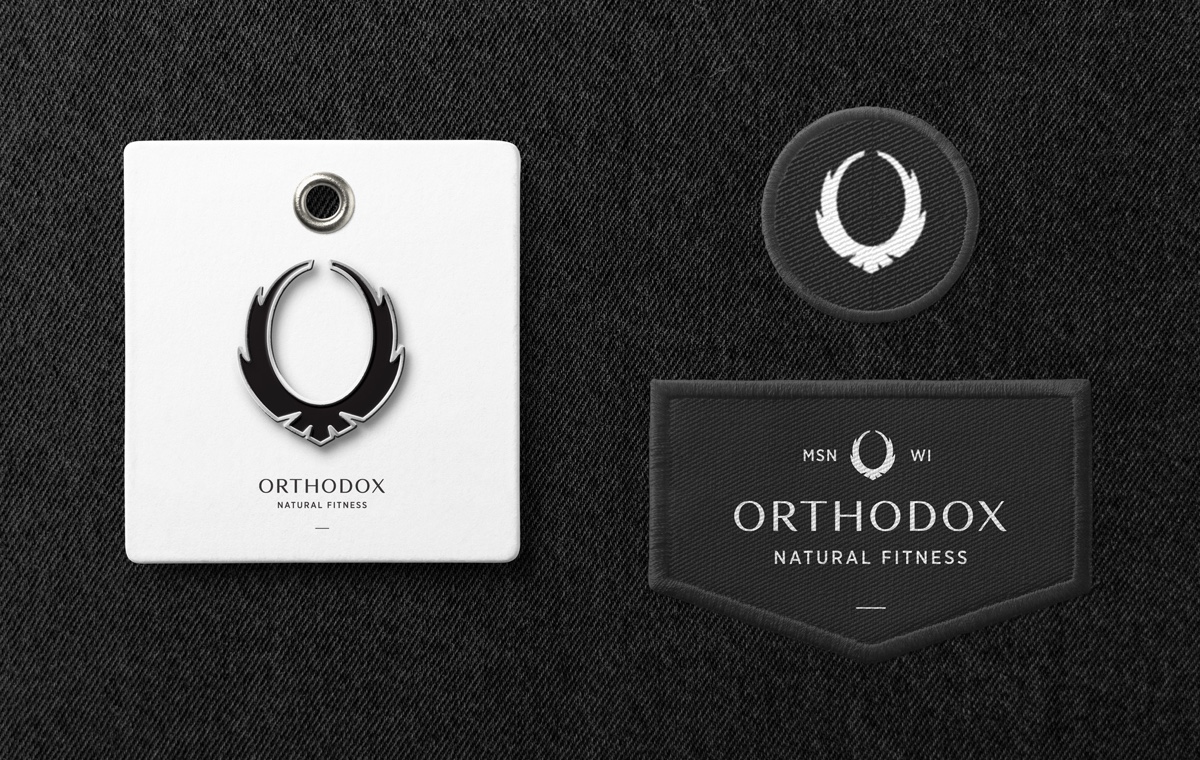
Orthodox Natural Fitness boasts a towering military-style obstacle course for intensive natural movement training, as well as yoga and martial arts classes. Partnering with the founders, we anchored their visual identity around the meaning of their new chosen name, Orthodox. In boxing, an orthodox set of principles is the foundation for success. The wings in the "O"-shaped logo conjure a sense of freedom and power through self-discipline and mental toughness, reflecting the core beliefs of their personalized training.


You must be logged in to post a comment.