Archives: Projects
Backup of Redox Podcast
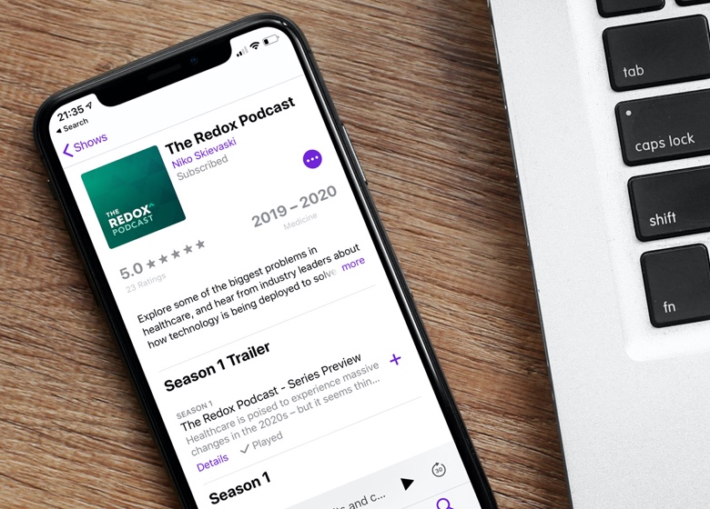
The Redox Podcast
When Redox took to the airwaves to tackle the toughest questions in healthcare, we worked with them to expand their brand into audio experiences.

SERVICES
Design, Development, Music Selection
PROJECT TYPE
Logo Design, Website Design & Development, Web App Integration, Marketing Templates
Collaborating with Redox and their PR team, we coordinated the creation and launch of Redox's new podcast series about the challenges of modern healthcare. We crafted the podcast cover image, selected the intro music to use as sonic branding for each episode, created the graphics to promote the episodes on various platforms, designed the episode content structure for landing pages, designed and developed a new section of their marketing website for the podcast episodes and integrated it with the necessary third party tools to deliver the podcast across platforms and capture leads.
To support their in-house marketing team beyond the launch of the podcast, we built a system of templates for them to quickly and easily generate the graphics, landing pages and descriptions to promote each subsequent episode. Featuring high-profile guests like Jonathan Bush and Mint.com founder, Aaron Patzer, the newly branded podcast was an immediate success, attracting an initial audience of over 1,000 listeners and further establishing Redox as a thought leader in healthcare technology.


Redox Podcast
The Redox Podcast
Role
Creative Director, Visual Designer, Interaction Designer
Scope of Work
Logo Design, Website Design & Development, Web App Integration, Marketing Website Custom Post, Branded Asset Templates, Music Curation, Mini Design System
When Redox took to the airwaves to tackle tough questions in healthcare, I expanded their brand into audio experiences, with templates and integrations to streamline the broadcast.
Approach. In collaboration with Redox executives and their PR team, I oversaw the creation and launch of Redox's new podcast series about the challenges of modern healthcare, and technology's role in improving patient experiences.
Opportunity. Serving multiple roles, my work ranged from project management and creative direction, to creating both the workflow and assets needed to launch each new podcast episode. I brought in a full-stack engineer to integrate the podcast with various third party tools so it could be simultaneously broadcast across multiple platforms, and promoted easily from their marketing website.
Outcome. I built a mini Design System, including page templates, website components, and visual assets to allow their marketing team to generate the graphics, transcription highlights, landing pages and descriptions for each episode in minutes. Featuring high-profile guests like Jonathan Bush, and Mint.com founder, Aaron Patzer, the newly branded podcast was an immediate success, attracting an initial audience of over 1,000 listeners and further establishing Redox as a thought leader in healthcare technology.


To reduce the workload and number of assets needed to publish each podcast episode, I created a series of assets and templates. This made it a light lift to both create and promote the podcast.
I selected music to use as a branded intro for the podcast. The track needed to strike the right tone to match the seriousness of the subject matter with their optimistic outlook.


User flow:
Subscribe via Redox Blog
User flow:
Discover and subscribe to podcast via LinkedIn


Eat Fresh Tech
Eat Fresh Tech: eCommerce Templates

Role
Product Design, Creative Direction, Visual Design, UX Design, Project Management
Duration
2 Months, Completed in 2018
Eat Fresh, a growing e-commerce platform for meal prep companies, needed a more efficient and attractive offering to keep costs down and drive customer acquisition. I created a full white label experience that Eat Fresh could use to quickly launch their customers' branded e-commerce storefronts.
Opportunity. In 2018, many meal prep companies were operating almost exclusively offline using small rented commercial kitchens, and partnering with local gyms and grocery stores to amplify their distribution. With modern life getting busier and busier, the $220 billion meal prep industry was predicted to see a steady increase at a compound annual growth rate (CAGR) of 4.3%. North America had been leading the way since 2015, specifically due to the advent of e-commerce platforms. Eat Fresh's founder saw the opportunity to improve people's health, and support many grassroots meal prep companies through their customizable e-commerce storefront. This would allow health-conscious chefs to focus on cooking rather than on complex website creation and maintenance.
Approach. I worked directly with the founder, who was also a software developer, to formulate a plan to scale his efforts. I brought in a front-end developer who was familiar with theming and e-commerce websites to help develop a scalable codebase from the design system I created. Together, we identified the functionality and individual components needed to build out branded websites and custom shopping cart experiences. This approach allowed Eat Fresh to keep costs and development time to a minimum without skimping on the design details that their chef customers demand.
Outcome. Eat Fresh has successfully scaled their business using the templated solution. It has allowed them to create branded websites and shopping experiences within a few hours, rather than weeks. They were last reported to process $5 million in orders annually.
Eat Fresh's clientele consisted mainly of busy chefs who had little interest or time for technology. Three goals remained top-of-mind for them—creating delicious, nutritious meals, building their brand, and being profitable. Each week required a lot of juggling: menu planning, sourcing and buying ingredients, distributing the menu, collecting orders, preparing the food, and finally, delivering meals.
Common User Flow & Pain Points

Gray = Chef's activities, Blue = Chef's customers' activities, Outlined areas = room for improvement
With their existing process, chefs and their customers communicated via multiple channels. This was extra work to maintain, and meant there was a lot of room for error and disorganization.
Improved User Flow with Eat Fresh

Purple areas represent points throughout the process where Eat Fresh could provide value to chefs and their customers.
By understanding where chefs lost most of their time, Eat Fresh could interject with technology to help gain it back. Improving the ordering experience would also have a direct impact on profitability. The primary goal was to make the experience as turn-key as possible for chefs, while upholding their brand image.


The templates for the e-commerce experience needed to take into account a wide variety of use cases to make it easy for Eat Fresh to provide fast turnaround times for chefs as they onboarded.
- Menu items with and without images
- Minimal or detailed meal descriptions
- Multiple meal customization options
- Fully-customizable meals
- Quantity of meals
- Varying prices for meals


Shopping Cart Templates
Depending on the complexity of their offerings, chefs could choose from different shopping cart layouts. Some businesses sold meal credits as part of ongoing meal memberships, some provided vouchers and discount codes, while others simply made individual meals available for purchase. I developed multiple flows, core templates and elements that could flex to emulate multiple brands. This strategy reduced the amount of customization required to onboard new Eat Fresh customers, which reduced implementation time and costs.

One-pager Checkout Flow
Multi-page Checkout Flow
Mobile Shopping Cart Experience


Website Template
In addition to the e-commerce platform, I also designed a templated solution so Eat Fresh could offer marketing websites that integrated with the Eat Fresh shopping cart. This packaged solution took yet another task off the busy chefs' plates.


Ictero
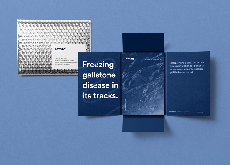
Ictero Medical
An ambitious digital health company pioneered a non-invasive approach to gallbladder surgery and sought out a sleek identity system to attract attention from top surgeons.
SERVICES
Brand Strategy, Graphic Design, Copywriting, Website Design, Website Development
PROJECT TYPE
Visual Identity Design Refresh, Marketing Collateral, Website Design & Development
Ictero Medical developed a unique, non-invasive cryoablation solution to offer at-risk patients a better option for treating gallbladder disease. We worked with the founders to develop a clean, minimalist design to bring their product to life and position them as a high-end, high quality tool for surgeons.
With the icy mist from the cryoablation process as a primary brand differentiator, we developed their visual theme around frosty scenery. The logo itself is rendered in cool blue hues, and repurposes the "o" and relocated dot from the "i" to form a subtle "zero degrees" at the end of their name.


More Projects


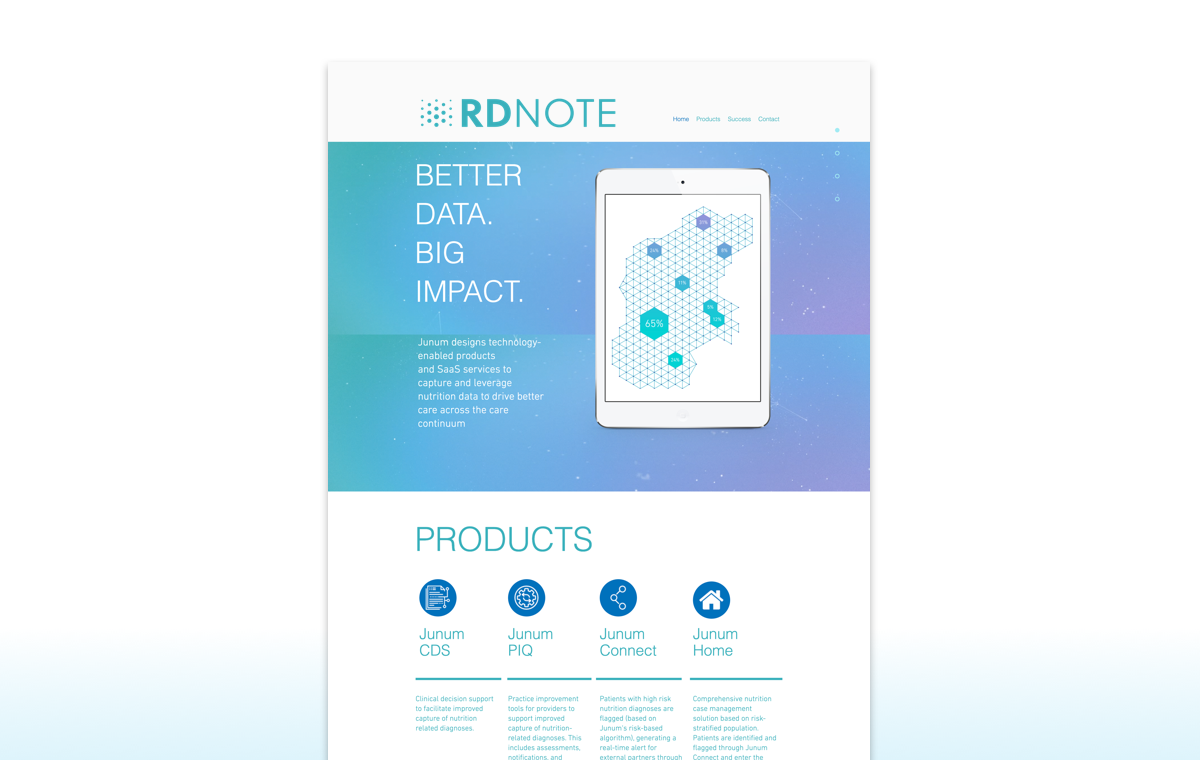
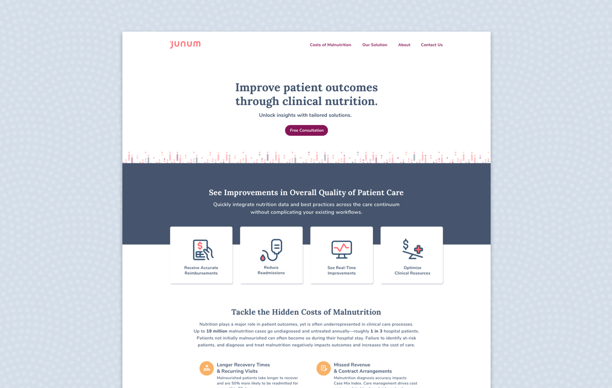
Junum
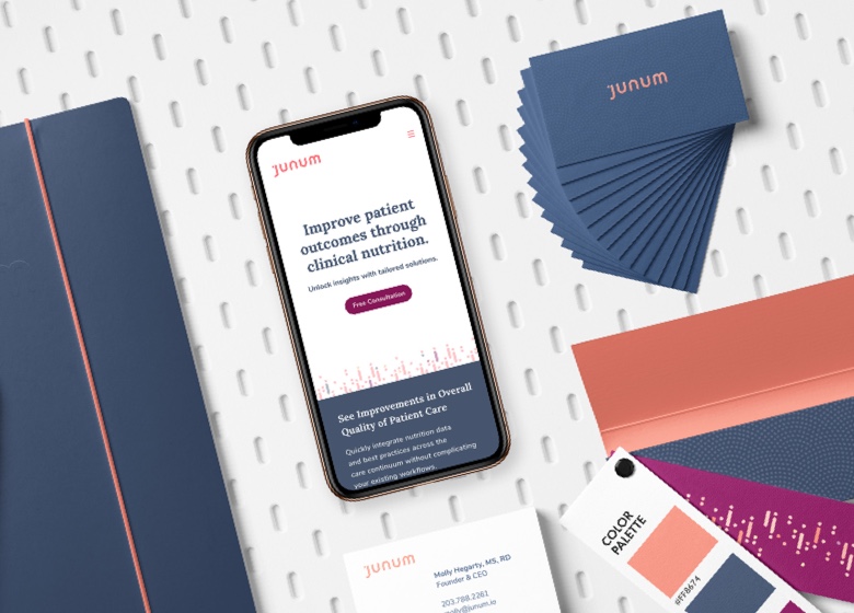
Junum
A determined, woman-led company sought to establish a strong brand with a mission to save lives and challenge misconceptions around the healing power of clinical nutrition.
SERVICES
Naming, Brand Strategy, Visual Identity Design, Graphic Design, Copywriting
PROJECT TYPE
Branding, Website Design, Website Development, Marketing Collateral
Selling to health systems is no easy feat. Advocating to change decades-old processes in a hospital setting is even tougher. But these women set out to do just that, backed by a compelling combination of evidenced-based medicine and firsthand health IT experience. We collaborated with the founder to perfect their message and create an upbeat brand to match the spirit of their mission.


More Projects
Orthodox Natural Fitness
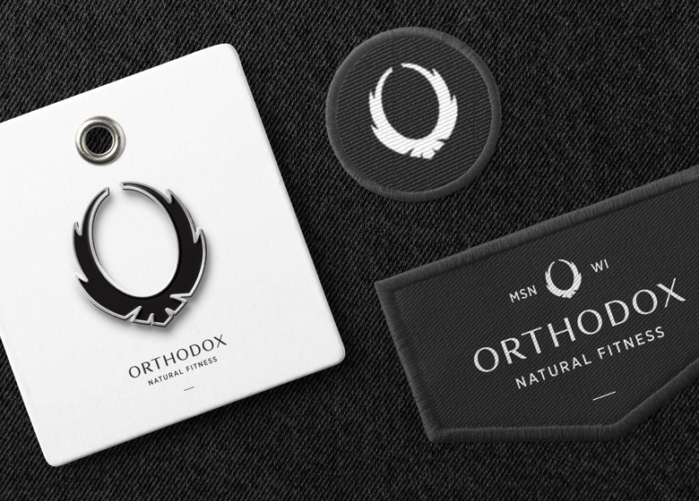
Orthodox Natural Fitness
After building a successful local following, this group of fitness experts moved into a space eight times its original size and needed to rebrand to announce their updated mission.
SERVICES
Visual Identity Design
PROJECT TYPE
Rebranding
Orthodox Natural Fitness boasts a towering military-style obstacle course for intensive natural movement training, as well as yoga and martial arts classes. Partnering with the founders, we anchored their visual identity around the meaning of their new chosen name, Orthodox. In boxing, an orthodox set of principles is the foundation for success. The wings in the "O"-shaped logo conjure a sense of freedom and power through self-discipline and mental toughness, reflecting the core beliefs of their personalized training.


More Projects
Resolution Health Collaborative
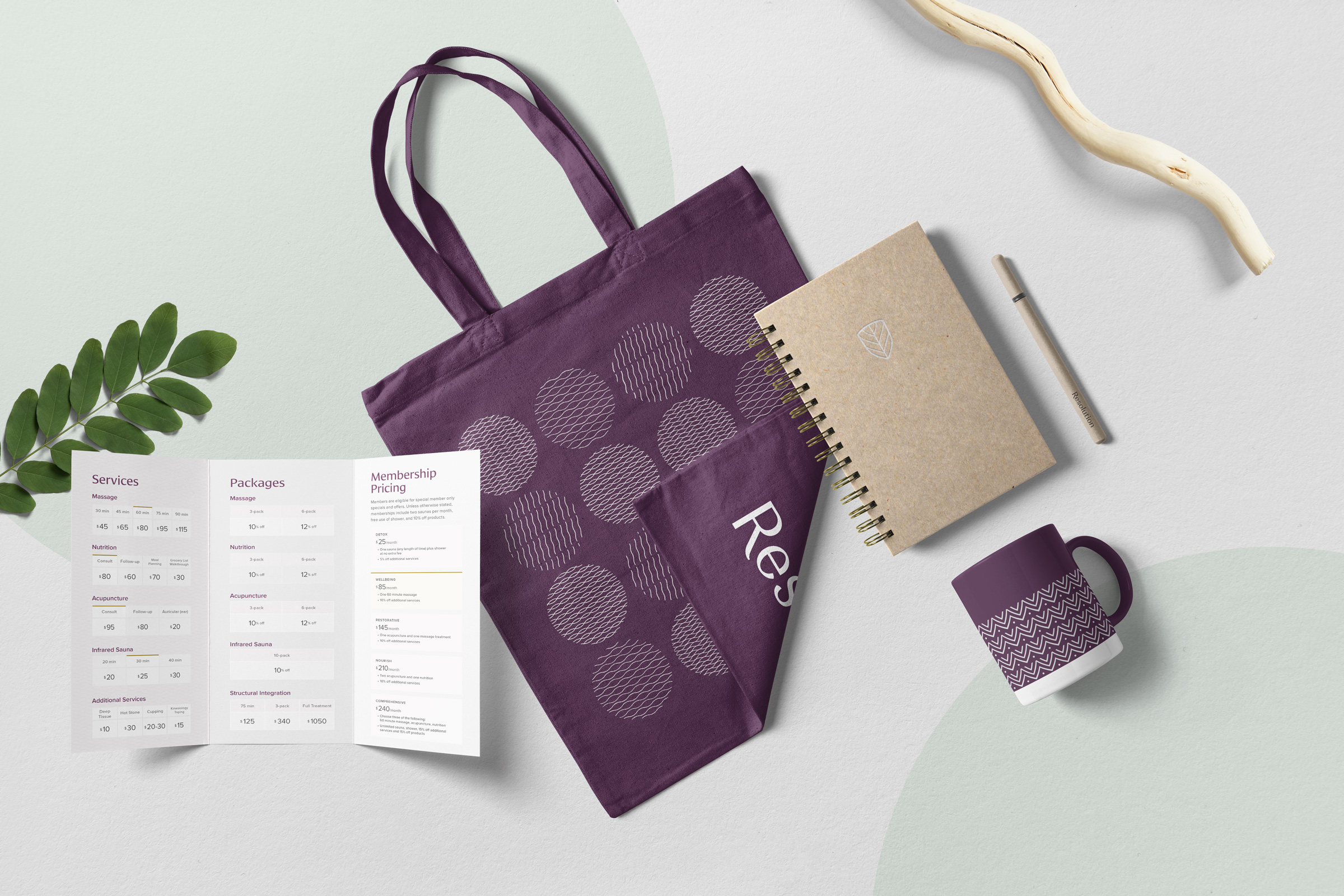
Resolution Health Collaborative
A popular Midwestern massage therapist expanded her practice into a wellness clinic, and rebranded with a dynamic design system to support their various service categories.
SERVICES
Brand Strategy, Design
PROJECT TYPE
Rebranding, Visual Identity Design, Marketing Collateral
Resolution Health Collaborative grew out of a solo practitioner's therapeutic massage business into a personalized wellness clinic and integrative fitness center. We collaborated with the founder to establish a look and feel that sets them apart from spa-like experiences by emphasizing their high-quality, high-impact therapeutic services.
For their logo, I generated concepts around safety, healing and nature. I noticed the way the veins of a leaf—which transport vital nutrients and remove waste for a plant—complemented the shape of a shield and mimicked the muscles of a person's back. Bringing together these components created a simple, memorable shape that expressed strength and elegance.


As their list of service offerings grew, so did the need to bring awareness to their breadth of expertise without diluting their message. I created a series of patterns to differentiate each of the four service categories, highlighting their individual benefits. Displaying them together established the concept of an integrated, multi-pronged approach to promoting wellness.


Roland Foods
Roland Foods
An 84-year-old food importing company rediscovers its original voice while changing with the times.

SERVICES
Brand Strategy, Identity Design Refresh, Responsive Website Design, Copywriting, Photography, Printed and Digital Marketing Campaigns
PROJECT TYPE
Brand Refresh, Brand Expansion, Website Design, Marketing Support
Roland Foods began with a powerful story of a man who fled Nazi Germany to America and built a company on a hunch about the desirability of dried French mushrooms. After years of dedication, good taste and natural relationship-building, the company grew from a husband-and-wife team sitting in a tiny New York office, to an internationally acclaimed standard in quality commercial ingredients.
Sifting through decades of photos, documents and label artwork, I discovered over 170 iterations of their company logo. Their most recent versions lacked the warmth and vigor that was so evident in their story and colorful illustrated packaging. We resurrected the label artwork and hand drew a new logo from scratch influenced by handwriting and typographic styles of the 1930s.
As a result of our work together, the founder's son shared his gratitude for seeing his parents' legacy honored through the visuals and content on the website. The CEO remarked that I had "helped move the brand forward 20 years," which helped Roland Foods reposition their company from mere importers to strategic partners in food service and product development.
They were now armed with a new identity to use on a variety of marketing collateral and product packaging. I oversaw the design and development of their custom responsive WordPress website, marketing email templates, promotional gift boxes, onboarding documents, presentation templates, and enviable company swag. For continuity after my portion of work was completed, I met with their in-house design team to introduce the brand guidelines and provide the assets to facilitate their continued work on the brand.

To kick off the brand rollout, I printed branded t-shirts, mugs and tote bags for staff and top customers.
I helped to reposition their company from mere importers to strategic partners in food service and product development. Original vintage label artwork served as an endearing visual backdrop, bridging the old with the new, emphasizing dedication to their craft and their loyalty to vendors.
I collaborated with various department heads, from marketing to sales and operations, to develop brand consistency and breathe new life into customer onboarding documents, brand guidelines and marketing collateral.
You must be logged in to post a comment.