Ten Forward Consulting

Ten Forward Consulting

Ten Forward Consulting writes scalable custom software for medium and large enterprises.

SERVICES
Brand Strategy, Identity Design Refresh, Responsive Website Design, Illustration

PROJECT TYPE
Brand Launch, Website Design

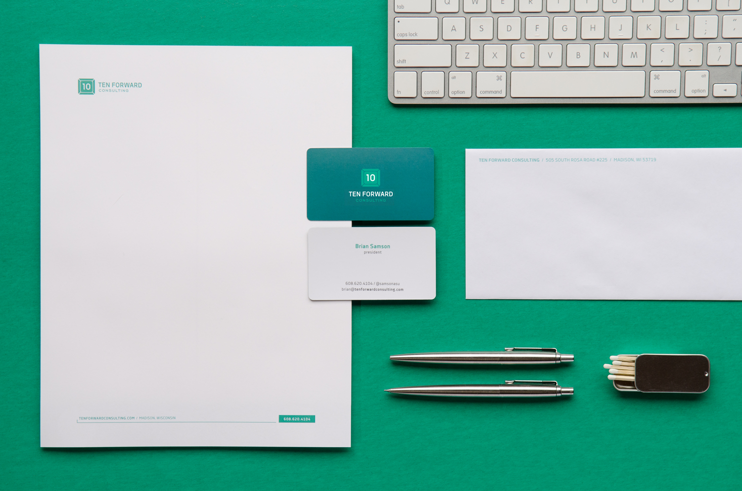
Ten Forward is named after the lounge on Star Trek’s USS Enterprise, where the crew would come for sage advice and a drink. The advice was always simple, deep and candid—a vibe that rings true for Ten Forward's personable demeanor and acumen. Approachability can be a rare asset in the world of tech, so we emphasized this with a simple, familiar keyboard key.

To further the message of clever simplicity, we combined the 1 and 0 onto one key instead of on two separate keys. This was our way of saying, "Ten Forward's developers are so fast, they’re able to do the work in half the time of other shops.” Or, “we're so easy to work with, all you need to do is ‘push the button.’”

Seven months after their brand launch, Ten Forward added two new employees and continues to wow their growing list of local and national clientele.

10FW Mug Pattern

Staying in line with the Star Trek theme, we created a teleportation animation effect on the portraits of their team members for their website's About page.

10FW Animated Pics Team
10FW Icons

We developed a series of geometric icons to represent each of their areas of expertise. These provided a way to differentiate their offerings and gave an intangible service physicality to feel more like a tangible product for sale.

CloudMunch Website

CloudMunch Website

CloudMunch is an ambitious team working to tame the complex world of DevOps with their unifying web app, integrations and template tools.

Cloudmunch Hero

SERVICES
UX Design, Website Design, Illustration

PROJECT TYPE
Brand Expansion, Website Design, Product Development

We worked with CloudMunch through multiple iterations of their marketing website and app. We created everything from their interface, to the individual product icons and their illustrated onboarding process and product diagrams.

CloudMunch Website Tour

We designed the website to be flexible so the layout could accommodate new products as they were developed. We created a series of icons for each product and illustrated how the products could be used together with other platforms and coding languages.

Cloudmunch Website Products

Cloudmunch Branded Spot Illustrations

Cloudmunch Product Launch

Cloudmunch Website Products Expansion

Cloudmunch Product Diagram

Visitors jump from the website directly into signing up for an account and starting their first project. The illustrated step-by-step instructions show users how to use the app as they progress through the account setup process.

CloudMunch Account Setup

CloudMunch App

See the work we did for the CloudMunch app interface.

CloudMunch App

CloudMunch App

An ambitious team developed a platform to tame the complex world of DevOps with their unifying web app, integrations and template tools.

Cloudmunch App Hero

SERVICES
UX Design, Illustration

PROJECT TYPE
Brand Expansion, Product Launch, Web Application

We worked with CloudMunch through multiple iterations of their marketing website and app platform. This included designing everything from their individual product icons to their multi-step onboarding process and illustrated product diagrams.

Because of the quick turnaround times for their product releases and their established image in the market, we didn't stray far from their original look and feel. We made gradual updates to their color palette, graphics and layouts, and consulted on their use of language and user experience to create a polished and simplified presentation for increased user adoption.

Within months of our work together, CloudMunch was able to be acquired by JFrog.

Cloudmunch Workspace

Cloudmunch Hub

Cloudmunch Dashboard

Cloudmunch Workspace Progress Tiles

Cloudmunch Templates

Cloudmunch UX Tiles

The CloudMunch application featured a Workspace, Integration Hub and Dashboard. We simplified their user interface and unified their color palette to create a clean, uncluttered work environment for developers.

Cloudmunch Dashboard

Cloudmunch Dashboard Modal

We illustrated custom icons to depict each of their products and distinct sections within their application.

Cloudmunch Product Buttons

Cloudmunch App Menu Icons

Cloudmunch Product Icons 1

CloudMunch_Hub_Icons

In addition to redesigning their user interface, we helped them streamline user onboarding.

CloudMunch Account Setup

We illustrated clear step-by-step visuals to help new users get started with their first project.

Cloudmunch App Setup

CloudMunch Website

See the work we did for the CloudMunch marketing website.

Quietyme

Quietyme

Quietyme developed technology to resolve noise complaints before they even happen. Over the course of their rapid business development, we supported Quietyme's growth with copywriting, design and illustrations to position their brand as a real contender in three verticals.

SERVICES
Branding & Identity Design, Responsive Website Design, Collateral, Illustration

PROJECT TYPE
Brand Launch, Collateral Design, Website Design

Through two accelerators, and thanks to their dedicated founding team, Quietyme grew into a respected brand as the guardians of peace and quiet. We supported them from their very early stages while they were still distilling their ideas and designing their prototypes. Over the course of a few years, we supported the launch of their products in the healthcare, hospitality and property management verticals. Their "Internet of Things" includes a configurable web app, base station and sensors.

The concept of quiet and the glowing sensor lights became the focus of their visual identity. We set aside large areas of white space in their layouts to provide a calm space in contrast with the colorful gradients that mimic the glowing sensor lights. The friendly fonts and color combinations create an approachable image for this high-tech shushing system that helps organizations provide more peaceful environments and gain favor in their industries.

Quietyme Logo
Quietyme_Logo_Explanation

The logomark is the letter “Q” shaped by four walls of a room. Its shape is also similar to a chat icon to highlight the communicative nature of the device to building managers.

Quietyme Hardware

We drew their base station and sensors as realistic vector illustrations so they could be scaled to any size and be placed on any colored background throughout their collateral with total flexibility.

Quietyme Diagram

Each room is outfitted with a noise-detecting sensor that warns occupants when they get too loud. Breaches are reported in real-time to management to prevent complaints.

Quietyme icons
Quietyme Case Study Diagram_web_white
Quietyme_Team_2015_155_John1

"Few designers understand and support business the way Kari does. We trust her with our most important projects, from our logo design to our investor pitch decks, and we lean on her professional guidance for our brand. She created materials that impress all of our clients, even the ones that currently work with the GE's and Samsungs of the world."

John Bialk, Founder & CEO
Quietyme Presentation
Quietyme Website Verticals Desktop
Quietyme_Poster_01_Rectangle
Quietyme Brochures
Quietyme_Team_2015_155_John1

"We’ve seen the wisdom in working with someone who understands branding and startups from the beginning. Kari makes it easy to work quickly and effectively. She is our go-to person in many matters not even directly related to design. She has never let us down."

John Bialk, Founder & CEO

Redox

Redox

This rapidly growing health data integration company is on a mission to improve healthcare experiences by powering a lean, developer-friendly platform.

Redox Hero@2x

SERVICES
Brand Strategy, Visual Identity Design, Website Design, Website Development, Product Design, Product Development, Print Design, Marketing Collateral, Advertisement Design, Illustration

PROJECT TYPE
Branding, Marketing, Website Design & Development, Product Design & Development

When Redox first approached us to refine their visual identity, their team was only five strong. We supported their growth by operating as an extension of their team, providing strategic creative services ranging from illustration to product development. By year five, their total funding grew to $60 million and their staff count increased to 172 people.

Redox Bus Cards 2019@2x
Redox Hoodie
Redox_LED_Sign_Mockup@2x
Redox TShirts 2019@2x
Redox Presentation@2x
Redox Lg Whitepaper Covers Copy@2x
Redox Whitepaper Bare Necessities@2x
Redox Bare Necessities Promo@2x

We amplified their desire for clean, minimalist design with bold patterns, friendly fonts and a dynamic color palette to express their upbeat culture and driven attitude.

Redox Podcast Sound Waves

The Redox Podcast Launch

See the work we did for the Redox Podcast launch, including music selection, templated graphics and landing pages.

Seattle In Progress Web App

Seattle In Progress

Seattle in Progress tracks construction projects throughout Seattle from application to completion, giving local residents and businesses a way to stay informed at each step of the process, right from their phones.

Seattle In Progress Web App

SERVICES
Visual Identity Refresh, UX Design

PROJECT TYPE
Brand Expansion, Online Ads, Responsive Web App, White Label App Extension

Seattle is currently one of the most rapidly growing cities in America. Construction projects have become a normal part of everyday conversation, and with that, the desire to know what's being built downtown, down the street, or even right next door. Beyond providing information to satisfy curiosities, Seattle in Progress can also notify users of new projects, giving naysayers the chance to appeal for changes to construction plans that might create unfair or unappealing living situations.

We worked with them to revamp their marketing website, improve the user experience design for the responsive web app, and extend it as a white label solution for businesses. They were able to double their business as a result.

SiP Ads

SiP Construction Abstract 2b Light

SiP Construction Abstract Light

SiP Revised Menus

By making the web app responsive, users can view details about construction projects as they encounter them throughout Seattle.

SiP Mobile View

We helped Seattle in Progress develop a white-label version of their app to generate a new revenue stream.

SiP White Label Map View

SiP White Label 3-up

Mobile Doorman Web App

Mobile Doorman App Hero

Role
UX Design, Design

Scope of Work
Responsive Web App for Desktop, White Label iOS and iPadOS app, Onboarding collateral for each brand

Mobile Doorman is a white-label app for high-end residential property managers and residents to communicate and develop a sense of community.

Duration. 5 months of iterative work, designed in 2014

Opportunity. 2014 saw a tremendous increase in urban development. 7,000 condos and 31,000 multi-family properties, and 1,400 student properties became a primary target for improving the environment for managed buildings. Mobile Doorman served as a conduit between corporate, building staff and residents. Their goal was to increase resident and staff satisfaction, improve retention rates, and decrease operational costs.

Approach. I worked with them from square one, starting with their brand strategy and visual identity, and carrying it through to their marketing collateral and app. I collaborated directly with the founder, CTO, and their engineering team.

Outcome. Over the course of 2014, Mobile Doorman built momentum as their products were adopted in more than twenty high-end residential buildings across the United States. They continued to grow and were featured in leading real estate tech news sources, attracting top talent and an impressive national portfolio of clients. In 2021, Mobile Doorman was acquired by Zego.

MD Dashboard Invoices

I designed a simple interface for the property managers to oversee operations from a single online dashboard. From maintenance requests to financials and direct messages from tenants, managers were finally given the power of organization without being tethered to a single workstation.

MD Web App Menu
MD Web App Dashboard Details
MD Dashboard Invoices Wide cropped
MD iPad Doorman

Doormen required a separate app, which was designed specifically for use on a tablet. The doorman app gave staff the ability to assist tenants with services such as package deliveries and guest check-ins with greater speed and accuracy. Because it was tied to the same database, information was synced with the manager's web portal. This made for a more organized staff, easier record-keeping and a better overall tenant experience.

MD iPhone Residents

The resident's app was designed for use on their mobile devices—the same devices that captured their attention for hours of their day, everyday. Each building received their own branded app with access to amenities and information that kept them connected with the management team and in sync with their building community.

MD iPhone Residents Flow
MD iPhone White Label Package

I worked with Mobile Doorman's engineers to establish a streamlined user flow. Work included wireframing, UX copywriting, icon creation and a strategy to provide a themed UI for a white label experience.

MD iPhone White Label Web App
MD iPhone White Label

The white label experience included the design for each of the three applications—management, on-site staff and residents—as well as a marketing package to help each building promote the app to their tenants.

Mobile Doorman Branding

Mobile Doorman Branding

Mobile Doorman is a white-label app for high-end residential property managers and residents.

Mobile Doorman Hero

SERVICES
Brand Strategy, Identity Design Refresh, Responsive Website Design, Copywriting, Printed and Digital Marketing Campaigns

PROJECT TYPE
Brand Refresh, Brand Expansion, Website Design, Marketing Support

Mobile Doorman was a brand new company. We worked with them from square one, starting with their brand strategy and visual identity, and carrying it through to their marketing collateral and app.

Our work included copywriting and design services for all of their marketing materials and digital products, including their marketing website, web app and iOS and Android app.

Over the course of 2014, Mobile Doorman built momentum as their products were adopted in over twenty high-end residential buildings across the United States. Years later, they continue to grow and be featured in leading real estate tech news sources, attracting top talent and an impressive national portfolio of clients.

MobileDoorman_Logo_RevolvingDoor_flat_sm_bkgrd

MobileDoorman_BusCards_Letterhead_Portfolio

Mobile Doorman Website Home

MD Ads

Mobile Doorman Website Home Pitch

MD Pitch Deck2

Mobile Doorman App

See the work we did for the Mobile Doorman app.