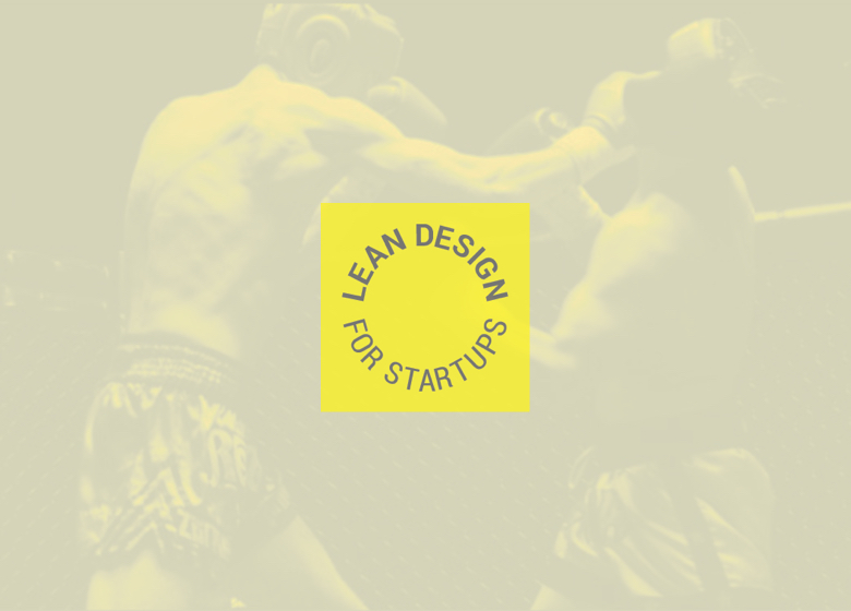
Lean Design for Startups
A startup for startups, Lean Design teaches entrepreneurs the importance of clarifying their message from day one and using their limited resources to their full potential.

SERVICES
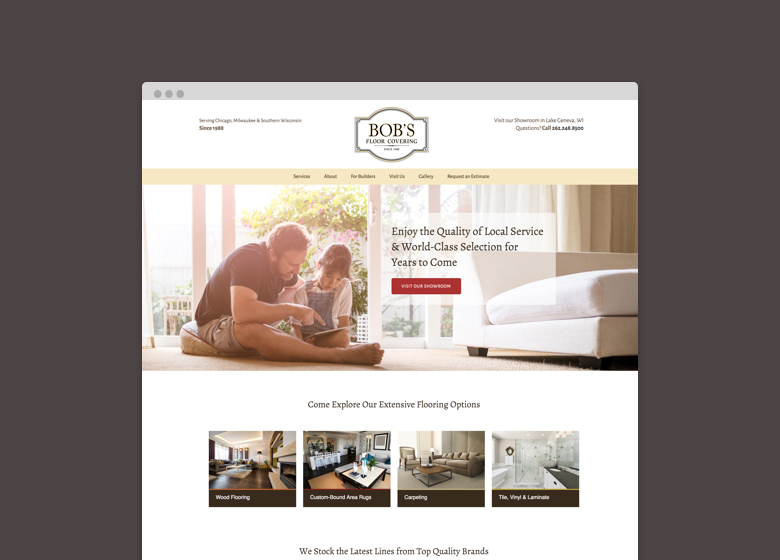
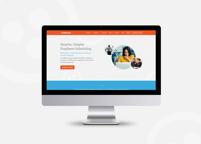
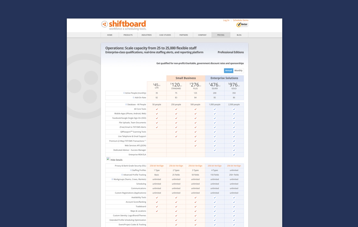
Product Validation, Branding, Identity, Website Design, Copywriting, Printed and Digital Marketing Collateral
PROJECT TYPE
Branding, Visual Identity Design, Website Design, Marketing Collateral, Educational Course Design
Lean Design for Startups is one of our Founder's favorite pet projects. After helping dozens of startups launch and iterate on their products, Kari saw how a lack of understanding about the creative process was costing entrepreneurs precious time and unnecessary heartache.
Kari developed the Lean Design™ brand and wrote, designed and organized the educational content from scratch. She is continually developing new materials to help entrepreneurs design their businesses and products to fit their lifestyle, personality and talents.
This growing collection of educational content is both an exercise in "eating your own dog food" as well as a service to ambitious tech-savvy entrepreneurs. Boiling down over a decade of branding and design expertise into bite-size exercises for the design-challenged has been an incredible experience that has strengthened Kari's love for the design process and its ability to serve people in practical and often life-changing ways.


You must be logged in to post a comment.