Redox Web App UX & UI Enhancements
Objective. Align UI with brand identity, improve onboarding UX
Background. Redox is a healthcare interoperability platform aimed at simplifying the healthcare journey for patients, payors and providers. As they were preparing to transition their app to React, they wanted to take the opportunity to address some minimal UX/UI improvements and reflect more of their visual identity in the product.
Duration. 6 weeks
Approach. In addition to simple UI enhancements, Redox presented several small UX challenges to tackle as part of a short series of sprints. I worked with their UI engineers to flesh out a simple style guide to get them started in a good direction. I provided redlines, style guides and video walkthroughs to introduce new features and redesigns.
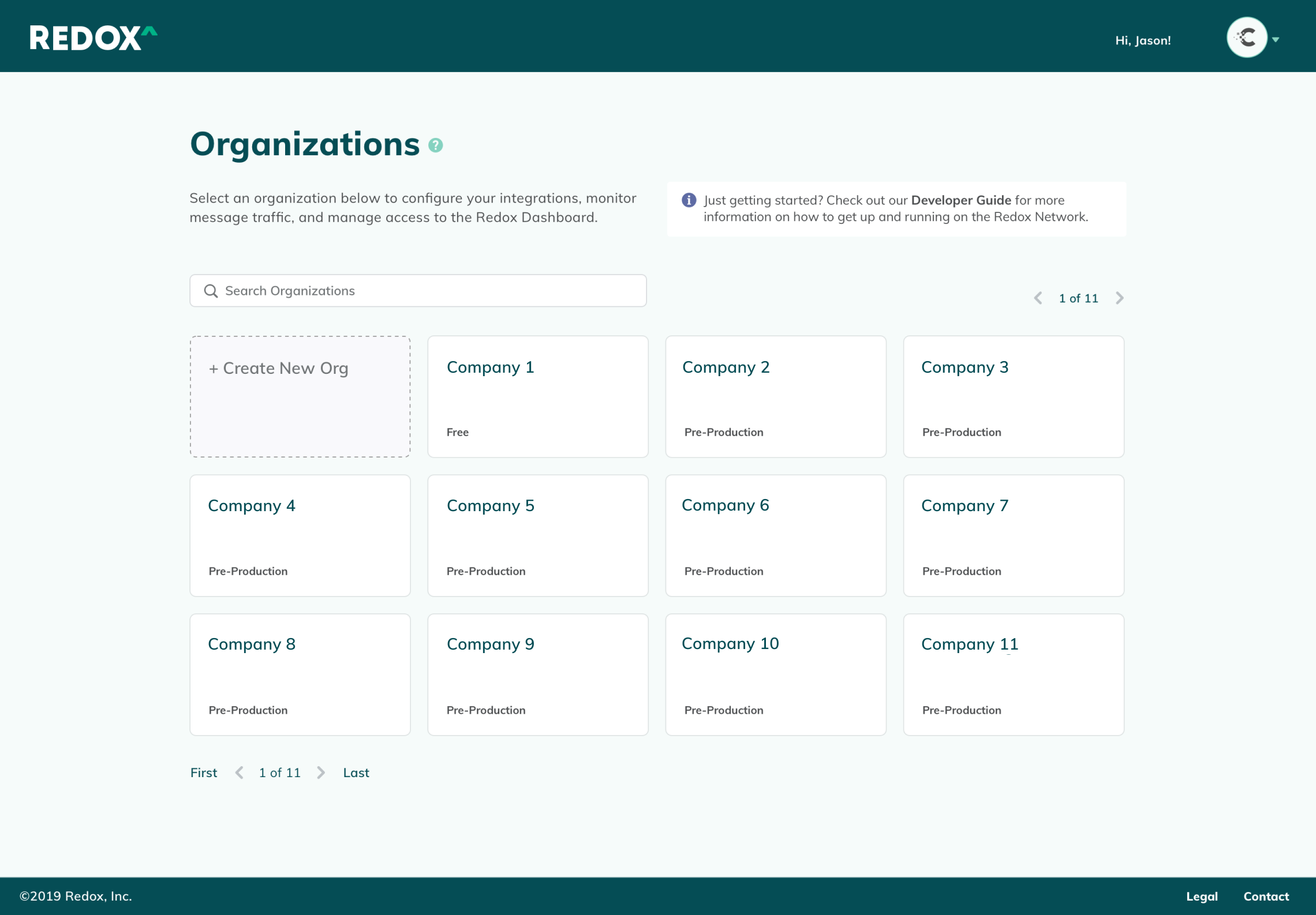
I worked with the UI engineers to identify a React-based UI kit to minimize the work required to flesh out their app. I reviewed their existing UX/UI patterns, and modified components from the UI kit to carry their branding throughout the product.


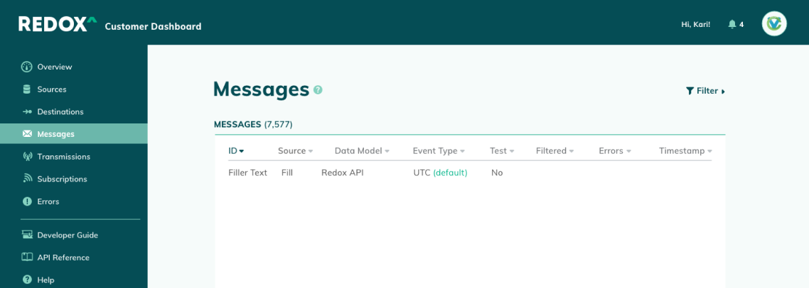
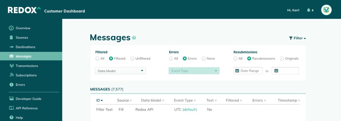
Since the sidebar is an omnipresent element, it needed to serve as an anchor for the rest of the page—an element that is intuitively organized and easy to reference at a glance. I updated the font weights, padding, and color assignments, and swapped in icons from the new UI kit. These simple updates made for a fairly extreme makeover to the interface, and saved precious vertical space.
To guide the user throughout the product, I added descriptions, tooltips and contextual documentation links for each product section.
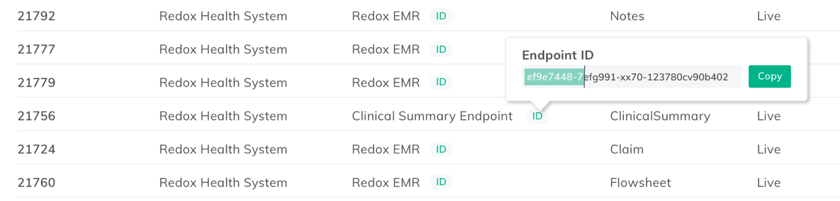
Simple improvements, like enabling one-click copying of Endpoint IDs, and space-saving accordion-style filters made for a more delightful user experience.

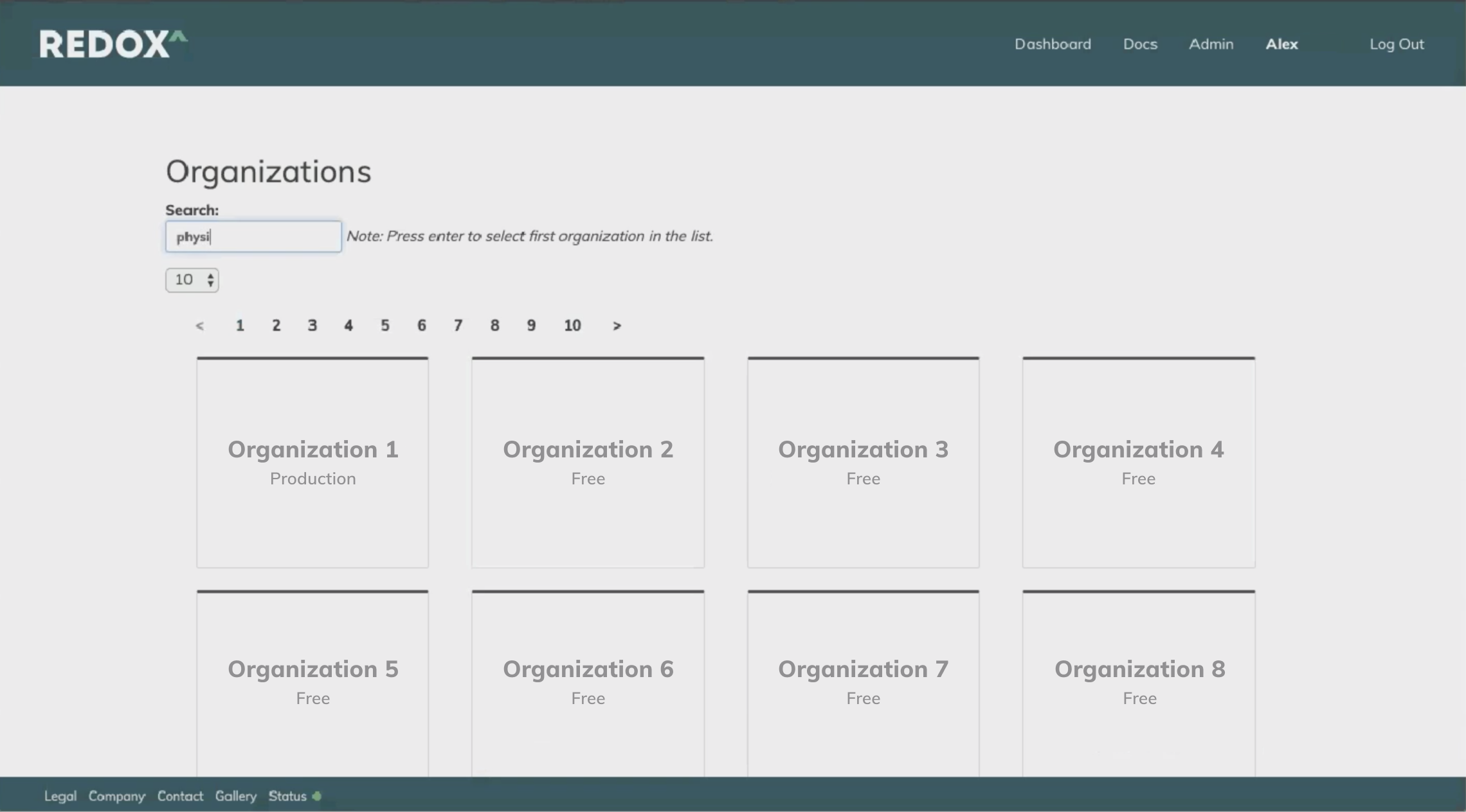
Previously, the “Getting Started” checklist was easy to miss, as half of it appeared below the fold. It also included extraneous steps beyond what was actually needed to up the product, which cluttered the interface, and made it likely to be overlooked by users. Additionally, the list was pervasive even after steps were completed. It became a clunky interruption to daily work unless the user had hunted down the “off” switch in their settings menu.
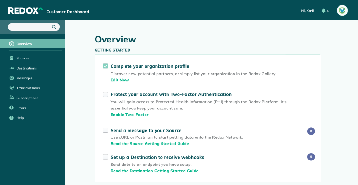
I removed unnecessary items from the checklist, and positioned it at the very top of the Overview page. When users completed all the steps, the checklist would automatically disappear from the Overview page.

As a future iteration, I suggested integrating with Salesforce's Content Management System to pull in relevant guides and collateral based on customer data.


You must be logged in to post a comment.