Shiftboard

Shiftboard

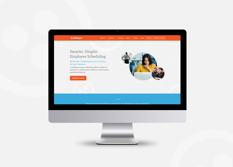
As a rapidly growing cloud-based workforce management software and employee scheduling solution, Shiftboard needed a facelift for their website and presentations.

SERVICES
Website Design, Graphic Design

PROJECT TYPE
Visual Identity Refresh, Website Design, Collateral Design

Shiftboard serves a wide range of industries throughout the United States and United Kingdom. They sought to refine their image to stand out from their more established competitors. Time was of the essence, so we made simple tweaks to their visual identity and completely revamped their website, making it more responsive, functional and attractive to prospects. We worked with their in-house marketing team to maintain their SEO and clarify content.

To flesh out their image, we extended their identity to include photo treatments, a bold color palette, custom icons, page layouts and type treatments for their responsive website and PowerPoint presentation templates.

Shiftboard_Logo_Original_Revised

Not wanting to noticeably transform their image, which was growing in recognition, we made minor alterations to their logo's letter spacing to improve its readability and polish, and toned down their very orange primary color to a more palatable reddish orange.

Shiftboard Color Palette Orig
Shiftboard Color Palette Revised

We tweaked their primary brand colors and expanded their palette to provide more range and establish a modern image.

Before After

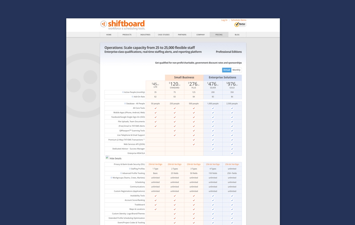
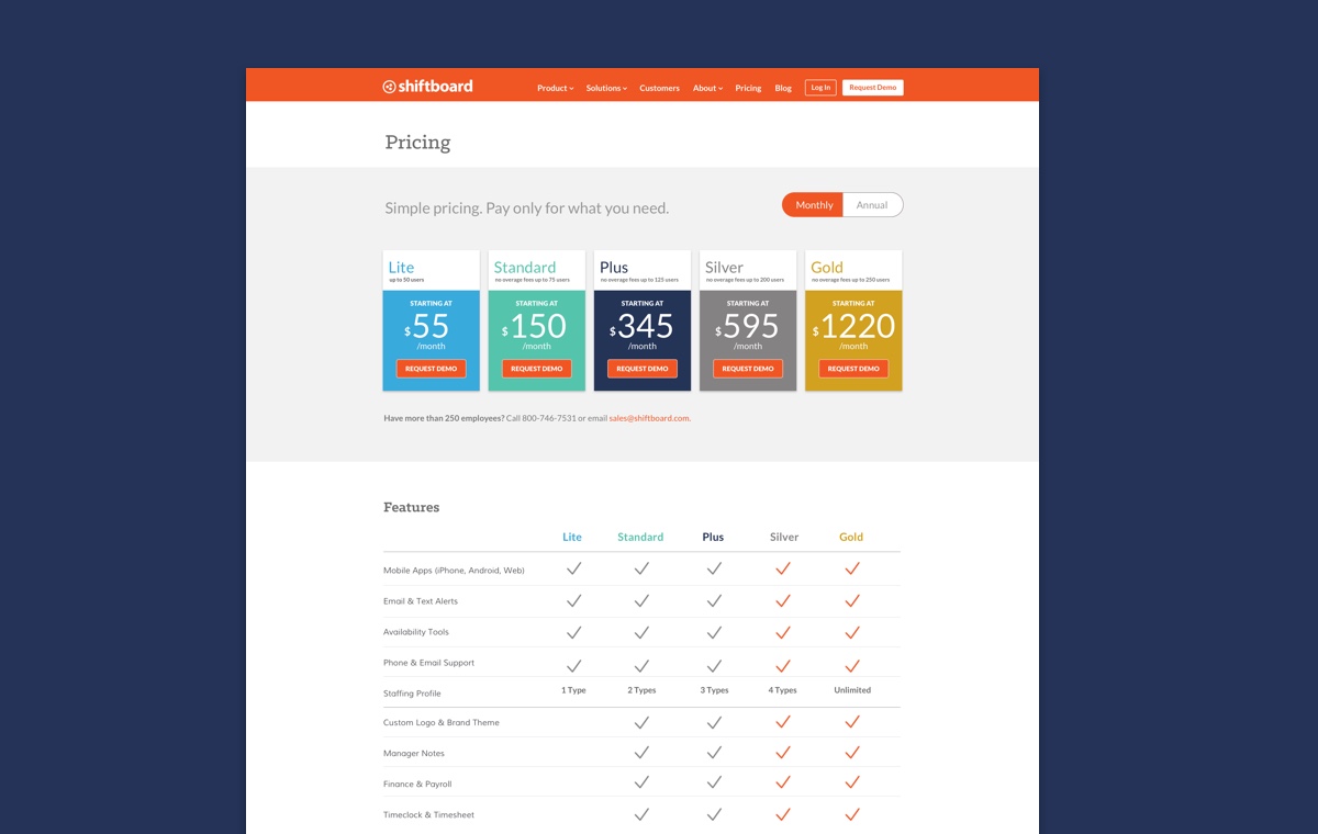
We simplified their pricing tables to showcase options more clearly, and developed toggle functionality to view monthly and annual pricing.

Before After

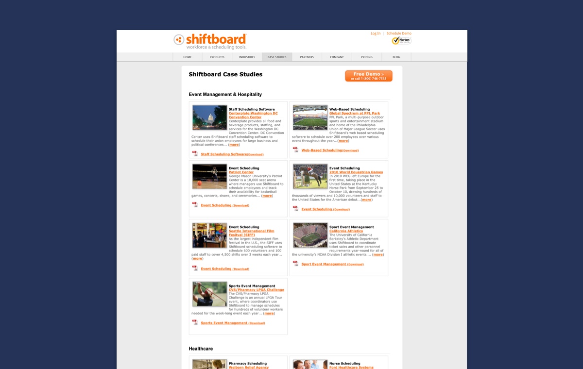
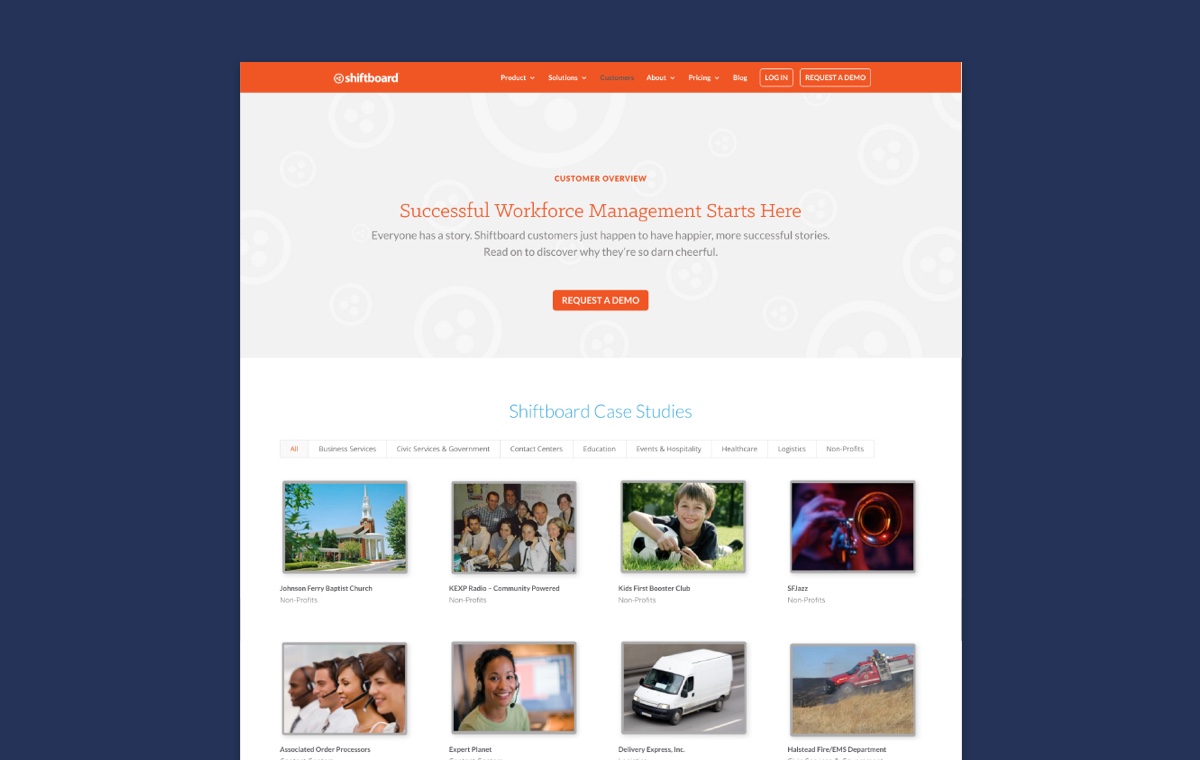
We developed functionality to make their vast number of case studies filterable by industry.

Digital Alchemy

Digital Alchemy

Digital Alchemy Hero

Role
Lead Product Designer

Scope of Work
User Research, iOS App Design, Prototyping, UX Design, UI Design, Visual Design, Interaction Design

Digital Alchemy uses the power of mobile technology to connect house hunters and homeowners with financial professionals. Polish the UX/UI for bank loan iOS app

Opportunity. Digital Alchemy is a white label financial product for real estate brokers and agents. It non-intrusively guides home owners and house hunters through each stage of the home financing process with in-depth information uncommonly found in tools for mass markets.

Approach. We worked with Digital Alchemy to create a sleek visual identity, with matching collateral and a white label app customized for each financial institution.

Outcome. The mark, formed by two sets of rising bars, create an "A" for Alchemy. Given the name, gold was an obvious choice for their primary brand color; it's contrasted nicely with a stately navy blue to give the brand a confident, professional foundation.

Digital Alchemy Logotype
Digital Alchemy Logomark White
DigitalAlchemy Pitch Deck
Digital Alchemy Signage
Digital Alchemy Website App Duo
DigitalAlchemy One Sheet White

Little Green Light

Little Green Light

A cloud-based donor management platform provides nonprofits with simple, approachable tech tools to maximize fundraising efforts.

LGL Hero

SERVICES
Brand Strategy, Visual Identity Design Refresh, Website Design, Copywriting, Design, Illustration

PROJECT TYPE
Brand Refresh, Brand Expansion, Website Design, Marketing Collateral

After ten years in business, Little Green Light had gained outstanding recognition in the nonprofit world. To accelerate signups, they decided it was time to enlist outside help to express their fun personality and consolidate their message.

Working in-depth with the executive team, we pulled together their values and individual personalities into a simple, potent identity. We paid special attention to the user experience on their website to guide visitors through the product features and benefits, and removing obstacles to encourage user sign-ups.

We expanded their new identity across a variety of marketing collateral, including a custom responsive WordPress website, complete with humorous illustrations and eye-catching animations, as well as digital and printed collateral, including trade show exhibits, one sheets and online ads.

LGL Web Pages

LGL Migrate Data

LGL Logo wMark Lg

LGL Screen Illustrations

LGL Badges & Icons

LGL One Sheet

LGL Banner_Booth

Seattle in Progress Website

Seattle in Progress Website

Seattle in Progress tracks construction projects throughout Seattle, giving local residents and businesses a way to stay informed at each step of the process right from their phones.

SiP Website Hero

SERVICES
Visual Identity Design Refresh, Responsive Website Design

PROJECT TYPE
Brand Expansion, Website Design

Seattle is one of the most rapidly growing cities in America. Construction projects have become a normal part of everyday conversation, and with that, the desire to know what's being built downtown, down the street, or even right next door. Beyond providing information to satisfy curiosities, Seattle in Progress can also notify users of new projects, giving naysayers the chance to appeal for changes to construction plans that might create unfair or unappealing living situations.

We worked with them to revamp their marketing website, improve the user experience design for the responsive web app, and extend it as a white label solution for businesses. They were able to double their business as a result.

Seattle in Progress App

See the work we did for the Seattle in Progress app interface.

Ten Forward Consulting

Ten Forward Consulting

Ten Forward Consulting writes scalable custom software for medium and large enterprises.

SERVICES
Brand Strategy, Identity Design Refresh, Responsive Website Design, Illustration

PROJECT TYPE
Brand Launch, Website Design

Ten Forward is named after the lounge on Star Trek’s USS Enterprise, where the crew would come for sage advice and a drink. The advice was always simple, deep and candid—a vibe that rings true for Ten Forward's personable demeanor and acumen. Approachability can be a rare asset in the world of tech, so we emphasized this with a simple, familiar keyboard key.

To further the message of clever simplicity, we combined the 1 and 0 onto one key instead of on two separate keys. This was our way of saying, "Ten Forward's developers are so fast, they’re able to do the work in half the time of other shops.” Or, “we're so easy to work with, all you need to do is ‘push the button.’”

Seven months after their brand launch, Ten Forward added two new employees and continues to wow their growing list of local and national clientele.

10FW Mug Pattern

Staying in line with the Star Trek theme, we created a teleportation animation effect on the portraits of their team members for their website's About page.

10FW Animated Pics Team
10FW Icons

We developed a series of geometric icons to represent each of their areas of expertise. These provided a way to differentiate their offerings and gave an intangible service physicality to feel more like a tangible product for sale.

CloudMunch Website

CloudMunch Website

CloudMunch is an ambitious team working to tame the complex world of DevOps with their unifying web app, integrations and template tools.

Cloudmunch Hero

SERVICES
UX Design, Website Design, Illustration

PROJECT TYPE
Brand Expansion, Website Design, Product Development

We worked with CloudMunch through multiple iterations of their marketing website and app. We created everything from their interface, to the individual product icons and their illustrated onboarding process and product diagrams.

CloudMunch Website Tour

We designed the website to be flexible so the layout could accommodate new products as they were developed. We created a series of icons for each product and illustrated how the products could be used together with other platforms and coding languages.

Cloudmunch Website Products

Cloudmunch Branded Spot Illustrations

Cloudmunch Product Launch

Cloudmunch Website Products Expansion

Cloudmunch Product Diagram

Visitors jump from the website directly into signing up for an account and starting their first project. The illustrated step-by-step instructions show users how to use the app as they progress through the account setup process.

CloudMunch Account Setup

CloudMunch App

See the work we did for the CloudMunch app interface.

Quietyme

Quietyme

Quietyme developed technology to resolve noise complaints before they even happen. Over the course of their rapid business development, we supported Quietyme's growth with copywriting, design and illustrations to position their brand as a real contender in three verticals.

SERVICES
Branding & Identity Design, Responsive Website Design, Collateral, Illustration

PROJECT TYPE
Brand Launch, Collateral Design, Website Design

Through two accelerators, and thanks to their dedicated founding team, Quietyme grew into a respected brand as the guardians of peace and quiet. We supported them from their very early stages while they were still distilling their ideas and designing their prototypes. Over the course of a few years, we supported the launch of their products in the healthcare, hospitality and property management verticals. Their "Internet of Things" includes a configurable web app, base station and sensors.

The concept of quiet and the glowing sensor lights became the focus of their visual identity. We set aside large areas of white space in their layouts to provide a calm space in contrast with the colorful gradients that mimic the glowing sensor lights. The friendly fonts and color combinations create an approachable image for this high-tech shushing system that helps organizations provide more peaceful environments and gain favor in their industries.

Quietyme Logo
Quietyme_Logo_Explanation

The logomark is the letter “Q” shaped by four walls of a room. Its shape is also similar to a chat icon to highlight the communicative nature of the device to building managers.

Quietyme Hardware

We drew their base station and sensors as realistic vector illustrations so they could be scaled to any size and be placed on any colored background throughout their collateral with total flexibility.

Quietyme Diagram

Each room is outfitted with a noise-detecting sensor that warns occupants when they get too loud. Breaches are reported in real-time to management to prevent complaints.

Quietyme icons
Quietyme Case Study Diagram_web_white
Quietyme_Team_2015_155_John1

"Few designers understand and support business the way Kari does. We trust her with our most important projects, from our logo design to our investor pitch decks, and we lean on her professional guidance for our brand. She created materials that impress all of our clients, even the ones that currently work with the GE's and Samsungs of the world."

John Bialk, Founder & CEO
Quietyme Presentation
Quietyme Website Verticals Desktop
Quietyme_Poster_01_Rectangle
Quietyme Brochures
Quietyme_Team_2015_155_John1

"We’ve seen the wisdom in working with someone who understands branding and startups from the beginning. Kari makes it easy to work quickly and effectively. She is our go-to person in many matters not even directly related to design. She has never let us down."

John Bialk, Founder & CEO