Project Type: Product Design
Redox: Web App
Redox: Healthcare Interoperability Platform

Role
Lead Product Designer
Duration
6 Weeks, Completed in 2020
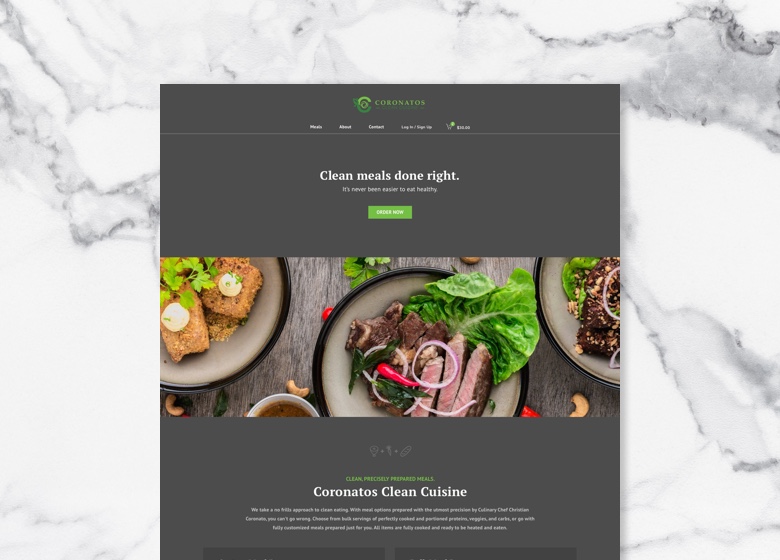
Redox is a healthcare interoperability platform aimed at simplifying the healthcare journey for patients, payors and providers. As they were preparing to transition their app to React, they wanted to take the opportunity to address some minimal UX/UI improvements and reflect more of their visual identity in the product.
Opportunity. Like many companies at the time, Redox was making the shift to React and wanted to make some simple updates to their UI and UX in the process. Based on feedback from Customer Success, the onboarding tasks and dashboard were in particular need of a revamp to provide context and generate enthusiasm at the outset for the app developers who used their product. Copywriting and minimal UI updates needed to be kept to a minimum so Redox's engineers could focus on the more critical tasks for the transition.
Approach. I worked with their UI engineers to flesh out a simple style guide to get them started in a good direction. I provided redlines, style guides and video walkthroughs to introduce new features and redesigns. Since we had received feedback that users often conflated terms like "Source" and "Destination" when configuring their tenant, I added simple tooltips and copywriting updates to guide users through the process.
Outcome. Unfortunately, layoffs affecting 25% of the company occurred before the project was implemented.
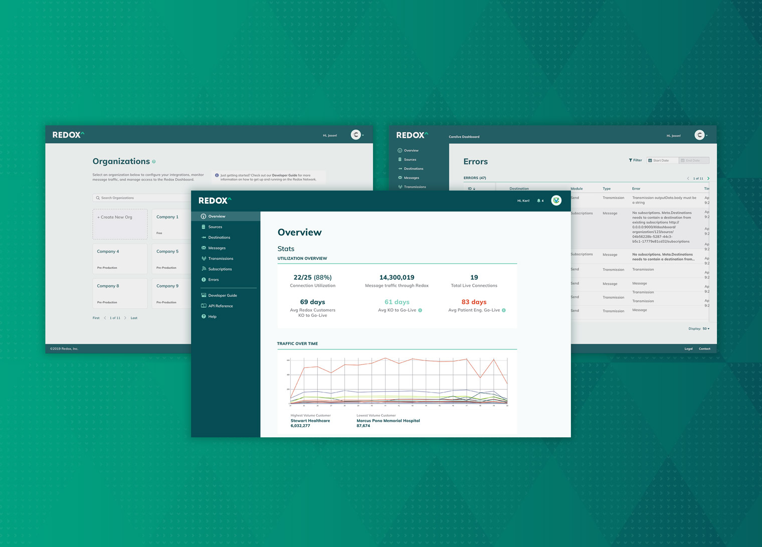
I worked with the UI engineers to identify a React-based UI kit to minimize the work required to flesh out their app. I reviewed their existing UX/UI patterns, and modified components from the UI kit to carry their branding throughout the product.


Consolidated Navigation

Since the sidebar is an omnipresent element, it needed to serve as an anchor for the rest of the page—an element that is intuitively organized and easy to reference at a glance. I updated the font weights, padding, and color assignments, and swapped in icons from the new UI kit. These simple updates made for a fairly extreme makeover to the interface, and saved precious vertical space.
To guide the user throughout the product, I added descriptions, tooltips and contextual documentation links for each product section.
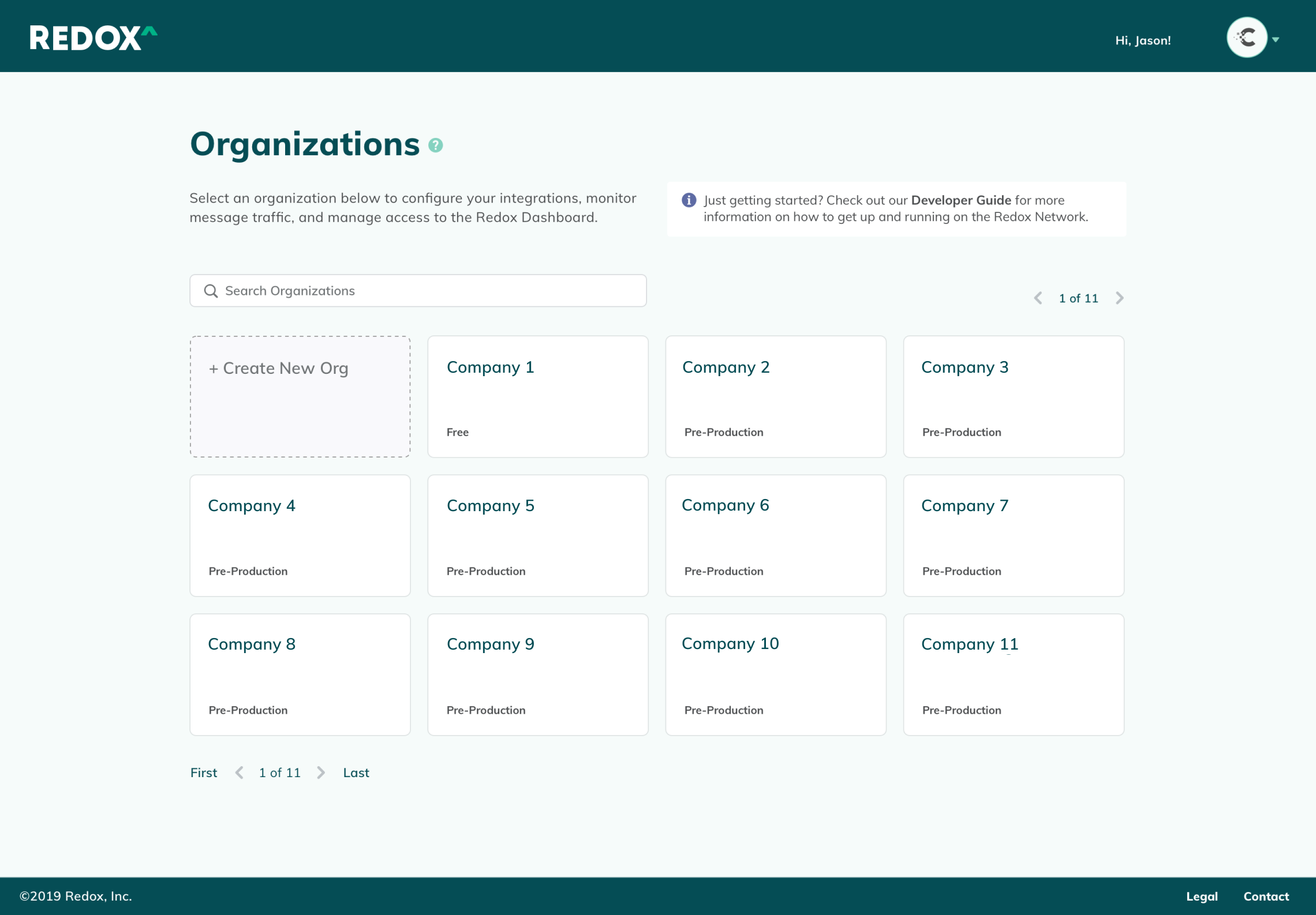
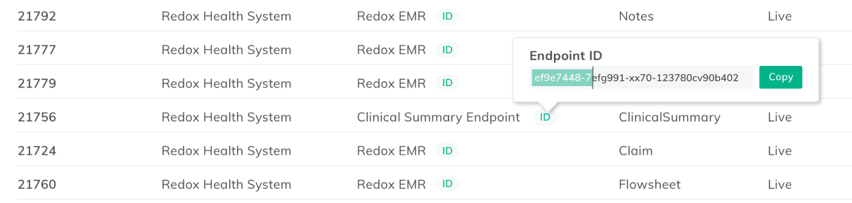
Simple improvements, like enabling one-click copying of Endpoint IDs, and space-saving accordion-style filters created a more seamless user experience.
Onboarding Improvements
I narrowed the focus of the onboarding experience to the bare essentials, and linked pertinent documentation for easy reference.

Previously, the “Getting Started” checklist was easy to miss, as half of it appeared below the fold. It also included extraneous steps beyond what was actually needed to up the product, which cluttered the interface, and made it likely to be overlooked by users. Additionally, the list was pervasive even after steps were completed. It became a clunky interruption to daily work unless the user had hunted down the “off” switch in their settings menu.
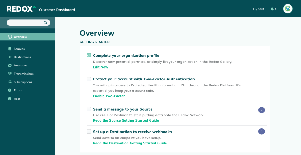
I removed unnecessary items from the checklist, and positioned it at the very top of the Overview page. When users completed all the steps, the checklist would automatically disappear from the Overview page.

As a future iteration, I suggested integrating with Salesforce's Content Management System to pull in relevant guides and collateral based on customer data.
Dashboard Improvements
The Redox Network drew power from the "strength in numbers" maxim. The more healthcare providers that joined their network, the easier it became for health tech companies and app developers to connect to these institutions. More institutions meant more patients being offered options to enhance their personal healthcare experience with technology—Redox's ultimate mission. These numbers highlighted the Redox Network's collective progress, and encouraged their community of users to keep building.


Digital Alchemy: iOS App
Digital Alchemy: Bank Loan iOS App

Role
Lead Product Designer
Scope of Work
User Research, iOS App Design, Prototyping, UX Design, UI Design, Visual Design, Interaction Design
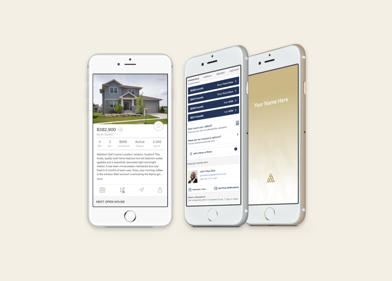
Digital Alchemy uses the power of mobile technology to connect house hunters and homeowners with trusted financial professionals. This white label bank iOS app allows users to discover new real estate opportunities, then guides them through comparison shopping for mortgage rates and applying for a loan.
Duration. 9 months, completed in 2017
Opportunity. Digital Alchemy is a white label financial product for real estate brokers and agents. It non-intrusively guides home owners and house hunters through each stage of the home financing process with in-depth information uncommonly found in tools for mass markets. For house hunters, this means less time spent hunting down agents' and loan officers' contact information or sifting through emails. For agents and loan officers, the app provides a direct connection to clients, while guiding them through a simplified experience, reducing repeated questions and back-and-forth communication.
Approach. I worked directly with the executive team. They requested targeted support to validate their product offering for three audience segments, explore UX and UI design enhancements to their existing app, and create a system of matching collateral and branded app themes customized for each financial institution. In addition to conducting user research, I proposed a plan to improve the app's readability and establish the interactive experience of launching the white label app for different brands. I also provided prototypes to present to prospects to help close deals.
Outcome. Digital Alchemy was able to launch their app with multiple financial institutions. They sold their company and suite of products three years later.
User Research

Surveys
I emailed a 9-question survey to a group of pre-screened participants, all of whom owned an iPhone and had experience with real estate apps. This included current renters, current and former home owners, and those who had invested in multiple properties. The surveys revealed differences in how they approached the home-buying process, and their comfort level for using an app to communicate with agents and loan officers.
User Interviews & Usability Testing
To learn whether the existing screens and flows were providing adequate information, I conducted in-person and virtual usability tests using a prototype of the current app design. The feedback drew attention to readability issues, and highlighted the information different personas tended to prioritize first when searching for properties.
As always, speaking with participants directly provided a wealth of information about how they preferred to use technology in their property search and engagement with real estate and financial professionals. For example, investors who were more familiar with the real estate process strongly preferred viewing additional fine-grained financial details, and therefore preferred accessing this app from a larger screen.

Before. Landing page and property details page
Customer Journey: Finding a Desirable Property
A house hunter's journey to find a property is long and meandering. This meant that the app needed to be flexible enough to account for the number of times a user may need to research properties before they were ready to put in an offer, or, in many cases, another offer.

Assessing Property Financials
Keeping an eye on interest rates is top-of-mind for house-hunters. I explored a few design concepts that would allow users to cycle through saved mortgage rates without having to navigate through the app to get to them.

Dynamic sliders. Users could explore financing options based on their desired downpayment.

Cash-to-close. Cash to close is a complex set of calculations, so scrolling is required to see it all (hover to scroll).

Saved for comparison. Weighing the pros and cons of each loan was made easier by consolidating saved estimates in one place.
Discovering Mortgage Options
Keeping an eye on interest rates is top-of-mind for house-hunters. I explored a few design concepts that would allow users to cycle through saved mortgage rates without having to navigate through the app to get to them.

Saved mortgages. The ability to save mortgage rates made it easier to shop, compare and revisit options.

Expanding tab bar. A long-press would animate to display mortgage details, and allow the user to cycle through a few saved mortgages.

Stock-ticker style mortgages. This treatment allowed users to glance at interest rates as they scrolled across the screen. They could drag to view previous and next rates.
Messaging
Discussion threads support conversations with verified loan officers assigned via the app, as well as personal contacts, such as a spouse who may need to co-sign documents. Images, property links and documents are consolidated from messages in a separate area for easy reference.

New Message. Contact names would populate as users typed.

Message inbox. Arranged with most recent messages on top.

Contacts. Loan officers' images were automatically imported, and were used to help build trust.

Contact search. Dynamic search made it faster to find contacts by typing the first letter or two.

Shared—Empty State. Until property links or documents are shared, this is displayed.

Shared Content. Both property links and documents could be communicated in-app, cutting down on cluttered email inboxes.

Message archives. Discussions can get long, so the app archives them by month. Tapping on the count unfurls them for viewing.

Unarchived messages. After a session, the messages archive again to keep threads tidy. (hover to scroll)

Built-in organization. Important content is consolidated in one place keeps all parties organized throughout the process.

Save time uploading. Rather than using a scanner, users could take pictures from their phone and upload important documents to keep things moving.

Automatically locked content. As an extra security precaution, sensitive documents could be set to expire after a number of days.
Mortgage Application
The app drastically reduced the burden of finding properties, gathering and comparing mortgage estimates, and hunting down loan officers' contact information. Once a house-hunter found their ideal property, the app made it convenient to connect them with a loan officer directly to begin their mortgage application.
Convenient in-app messaging. Rather than having to hunt for a loan officer, users could simply click a button to be connected with one in-app.


Recent Threads. If a discussion had previously been initiated, the thread would conveniently appear above the message box so users didn't accidentally contact multiple loan officers.
Loan Application Status. Once an application is submitted, house-hunters can see the status as it moves throughout the lengthy approval process.


A face to go with a name. The loan officer's portrait appears next to the status bar to reassure the user they're in good hands.

Confirmation. Once the loan is approved, a confirmation message is displayed, and the loan application process is marked complete.
Eat Fresh Tech
Eat Fresh Tech: eCommerce Templates

Role
Product Design, Creative Direction, Visual Design, UX Design, Project Management
Duration
2 Months, Completed in 2018
Eat Fresh, a growing e-commerce platform for meal prep companies, needed a more efficient and attractive offering to keep costs down and drive customer acquisition. I created a full white label experience that Eat Fresh could use to quickly launch their customers' branded e-commerce storefronts.
Opportunity. In 2018, many meal prep companies were operating almost exclusively offline using small rented commercial kitchens, and partnering with local gyms and grocery stores to amplify their distribution. With modern life getting busier and busier, the $220 billion meal prep industry was predicted to see a steady increase at a compound annual growth rate (CAGR) of 4.3%. North America had been leading the way since 2015, specifically due to the advent of e-commerce platforms. Eat Fresh's founder saw the opportunity to improve people's health, and support many grassroots meal prep companies through their customizable e-commerce storefront. This would allow health-conscious chefs to focus on cooking rather than on complex website creation and maintenance.
Approach. I worked directly with the founder, who was also a software developer, to formulate a plan to scale his efforts. I brought in a front-end developer who was familiar with theming and e-commerce websites to help develop a scalable codebase from the design system I created. Together, we identified the functionality and individual components needed to build out branded websites and custom shopping cart experiences. This approach allowed Eat Fresh to keep costs and development time to a minimum without skimping on the design details that their chef customers demand.
Outcome. Eat Fresh has successfully scaled their business using the templated solution. It has allowed them to create branded websites and shopping experiences within a few hours, rather than weeks. They were last reported to process $5 million in orders annually.
Eat Fresh's clientele consisted mainly of busy chefs who had little interest or time for technology. Three goals remained top-of-mind for them—creating delicious, nutritious meals, building their brand, and being profitable. Each week required a lot of juggling: menu planning, sourcing and buying ingredients, distributing the menu, collecting orders, preparing the food, and finally, delivering meals.
Common User Flow & Pain Points

Gray = Chef's activities, Blue = Chef's customers' activities, Outlined areas = room for improvement
With their existing process, chefs and their customers communicated via multiple channels. This was extra work to maintain, and meant there was a lot of room for error and disorganization.
Improved User Flow with Eat Fresh

Purple areas represent points throughout the process where Eat Fresh could provide value to chefs and their customers.
By understanding where chefs lost most of their time, Eat Fresh could interject with technology to help gain it back. Improving the ordering experience would also have a direct impact on profitability. The primary goal was to make the experience as turn-key as possible for chefs, while upholding their brand image.


The templates for the e-commerce experience needed to take into account a wide variety of use cases to make it easy for Eat Fresh to provide fast turnaround times for chefs as they onboarded.
- Menu items with and without images
- Minimal or detailed meal descriptions
- Multiple meal customization options
- Fully-customizable meals
- Quantity of meals
- Varying prices for meals


Shopping Cart Templates
Depending on the complexity of their offerings, chefs could choose from different shopping cart layouts. Some businesses sold meal credits as part of ongoing meal memberships, some provided vouchers and discount codes, while others simply made individual meals available for purchase. I developed multiple flows, core templates and elements that could flex to emulate multiple brands. This strategy reduced the amount of customization required to onboard new Eat Fresh customers, which reduced implementation time and costs.

One-pager Checkout Flow
Multi-page Checkout Flow
Mobile Shopping Cart Experience


Website Template
In addition to the e-commerce platform, I also designed a templated solution so Eat Fresh could offer marketing websites that integrated with the Eat Fresh shopping cart. This packaged solution took yet another task off the busy chefs' plates.


Chalkdoc: Web App
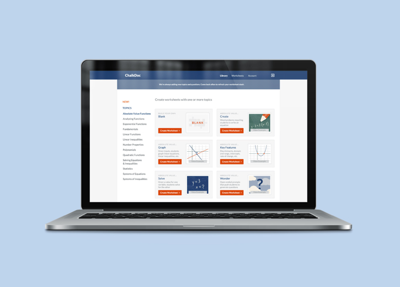
ChalkDoc

Role
Lead Product Designer
Scope of Work
User Research, Launch MVP, Visual Identity, Marketing Website, Web App, Illustration
ChalkDoc was created by a teacher who was disenchanted by the canned lesson-planning tools on the market. He decided to build tools that both students and teachers can enjoy.
Duration: 8 weeks, Completed in 2015
Opportunity: ChalkDoc's founder wanted to create a completely customizable lesson-planning app to accommodate teachers' tiny budgets and limited time. The tool features simple, streamlined functionality and access to relevant and entertaining questions to engage students' hearts and minds. While other apps generate non-editable worksheets, ChalkDoc gives teachers control over the specific kinds of problems they know their students need to work on most.
Approach: My work with ChalkDoc started with brand and product positioning through market research and user surveys. I connected the founder with an engineering team, and developed a simple visual identity as a foundation for a consistent look and feel to extend across their responsive marketing website, worksheets and web app as they experimented and scaled its functionality. I provided illustrated assets, a mini design system for the web app, high-fidelity wireframes, and templates for the downloadable worksheets.
Outcome: Using the provided assets and foundational user flows, the ChalkDoc team was able to scale the product across multiple iterations without requiring additional design work. The software continues to provide value for thousands of users many years later.
User Flow: Creating a Worksheet

Create Worksheet Flow - Iteration 1
Since the final output was intended to be a printable worksheet, the interface was designed to provide a preview of the worksheet as the user added their desired content. The worksheet title, page numbers, and a space for students to write their name and date, were auto-generated to keep things organized.
1. Create New Worksheet

2. Add New Section

3. Configure Section - Advanced Options

4. Worksheet Preview (hover to scroll)

Create Worksheet Flow - Iteration 2
After reviewing and testing different options, the engineers suggested some simplifications to reduce the lift. Displaying "pages" in the preview proved to be more complex than it was worth due to the varying lengths of questions that filled an unpredictable amount of the page. Additionally, rather than printing directly from the app, teachers were offered the option to "download" the worksheet and the answer key separately, and share the worksheet via email.

While keeping it simple was the number one priority in their early days, I made sure to bring out the approachable charm of the brand through custom illustrations and playful copywriting.

I built a marketing website for the founder to edit as needed, establishing a simple design system, and providing a series of illustrated assets to flesh out the look for the website and within the app itself.


The Final Product
After conceiving of the initial flows, and handing off the wireframes and mini design system, the founder and engineers continued to evolve the platform over time to include an increasingly complex library of swappable equations.
You must be logged in to post a comment.