Seattle in Progress: Web App
Role
Lead Product Designer
Scope of Work
Mini Design System, Prototyping, UX Design, UI Design, Visual Design
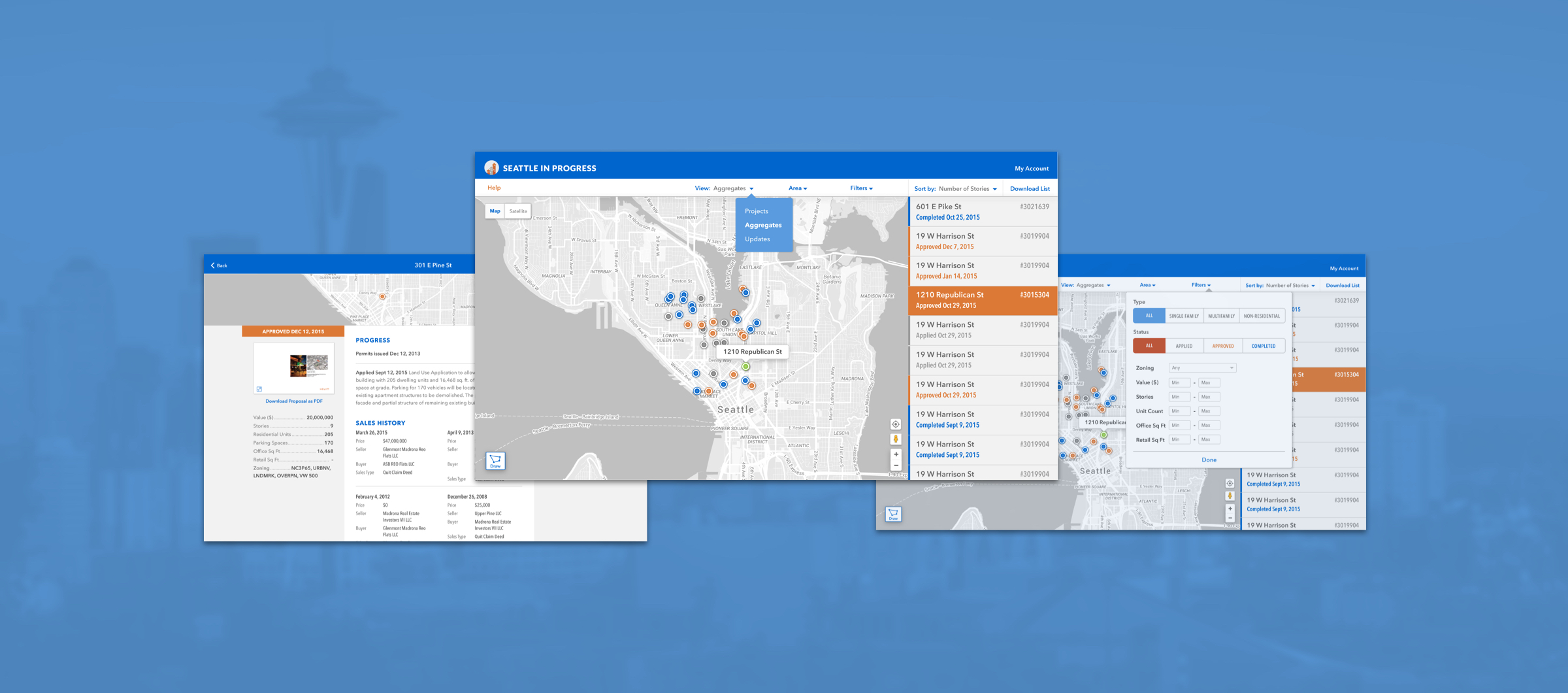
Seattle in Progress set out to give residents greater visibility into the development of their city by providing easy access to upcoming construction and land development plans.
Duration. 3 months, Completed in 2015
Opportunity. Seattle in Progress tracks construction projects throughout Seattle from application to completion, giving local residents and businesses a way to stay informed at each step of the process, right from their phones. The founder approached me to improve the UX and UI in preparation for creating a white label offering as well as a paid subscription.
Approach. I worked with the founder/developer directly to refine their style guide and make simple design updates that could be executed with little effort in CSS and HTML. The need to differentiate this product was unusually high since a look-alike app had recently launched. With this in mind, I looked for ways to solidify the Seattle in Progress identity and position the product as a more enjoyable, robust interface. As companies showed interest in the white label option, I provided branded mockups and collateral to pitch the idea.
Outcome. The founder ultimately decided not to implement the new app design, as he transitioned his focus to other projects. The free app continues to provide value to users many years later.
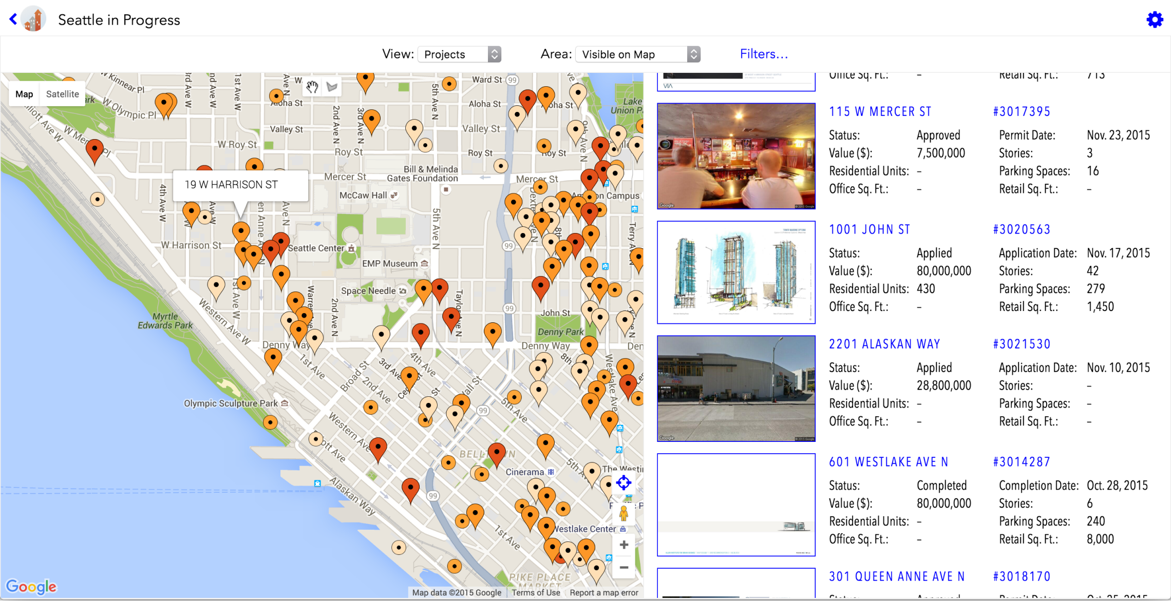
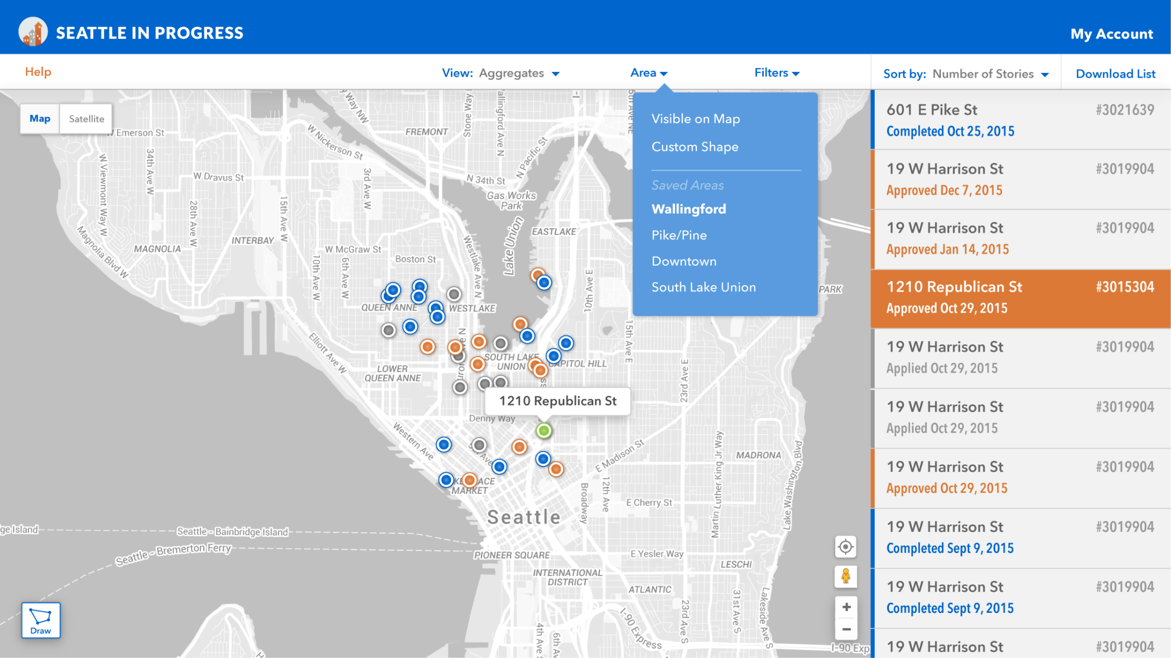
The need to differentiate this product was unusually high due to the fact that another organization had copied it almost down to the pixel. Rather than seeking legal retribution, the founder took the opportunity to level up his app and amplify its value with a superior UX and UI. With this in mind, I emphasized the Seattle in Progress brand throughout the UI, and used minimalist UI elements and bold color blocking to polish the look.
Before. Primary Navigation Bar

After. Primary Navigation Bar

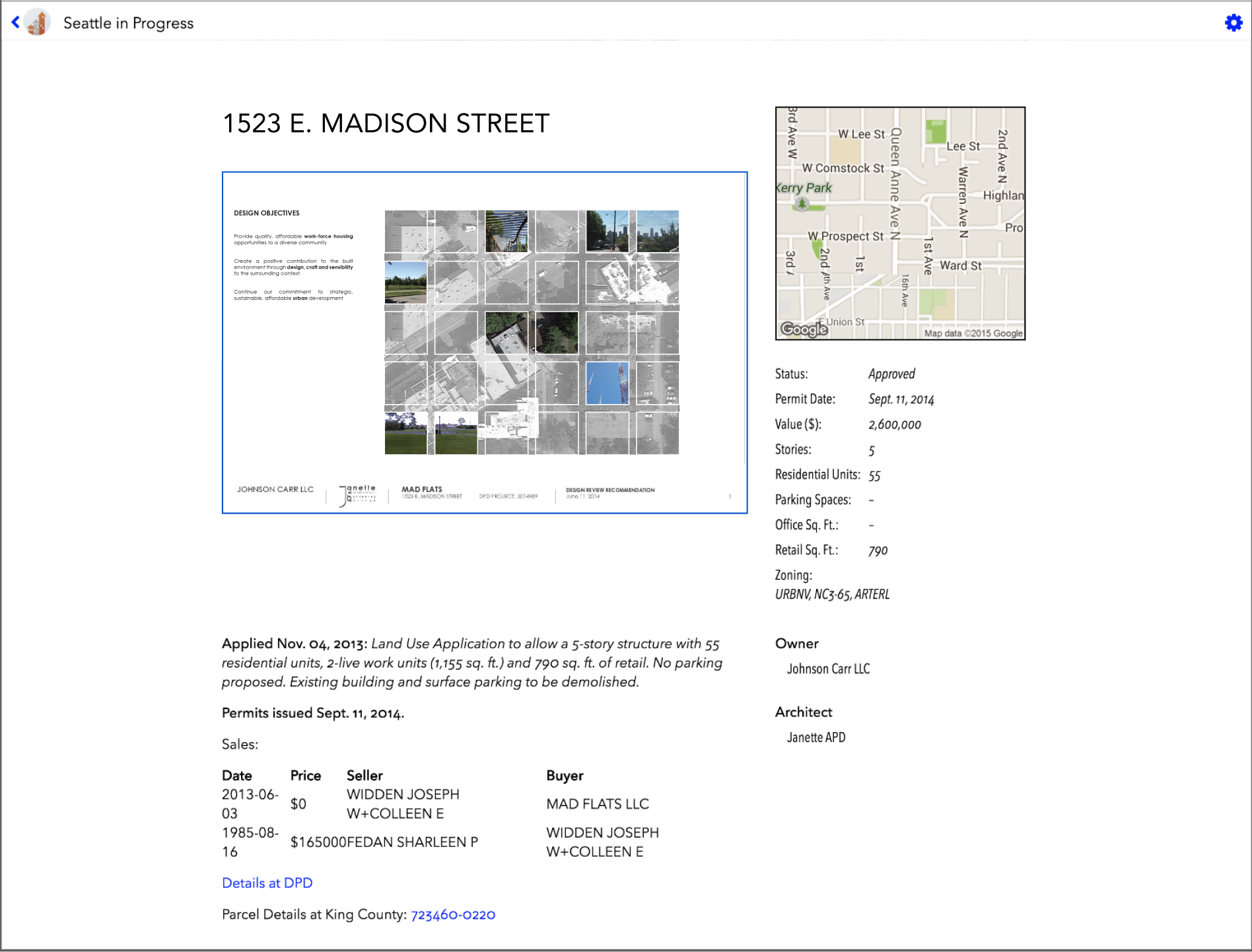
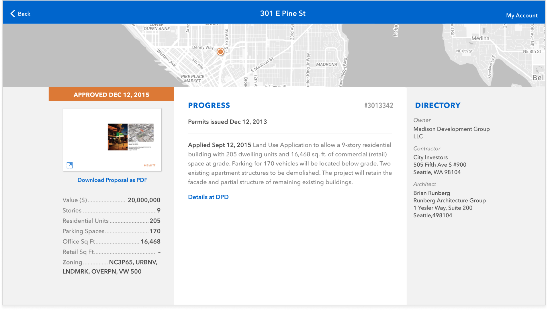
The scope of the project was limited to improving how existing elements displayed on screen. Redefining the page hierarchy, element positioning, typography, colors and spacing modernized the look and feel instantly, and made it easier to find tools throughout the interface.
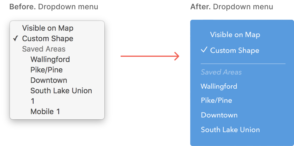
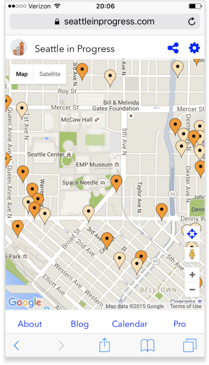
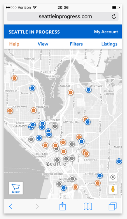
As the map and listings were the primary focus of the app, I paid close attention to reducing visual clutter and removing unnecessary elements to create a clean working space for users. This involved swapping default map location beacons for smaller jewel-like nodes, simplifying the map colors to a monochromatic palette, and repositioning tools.
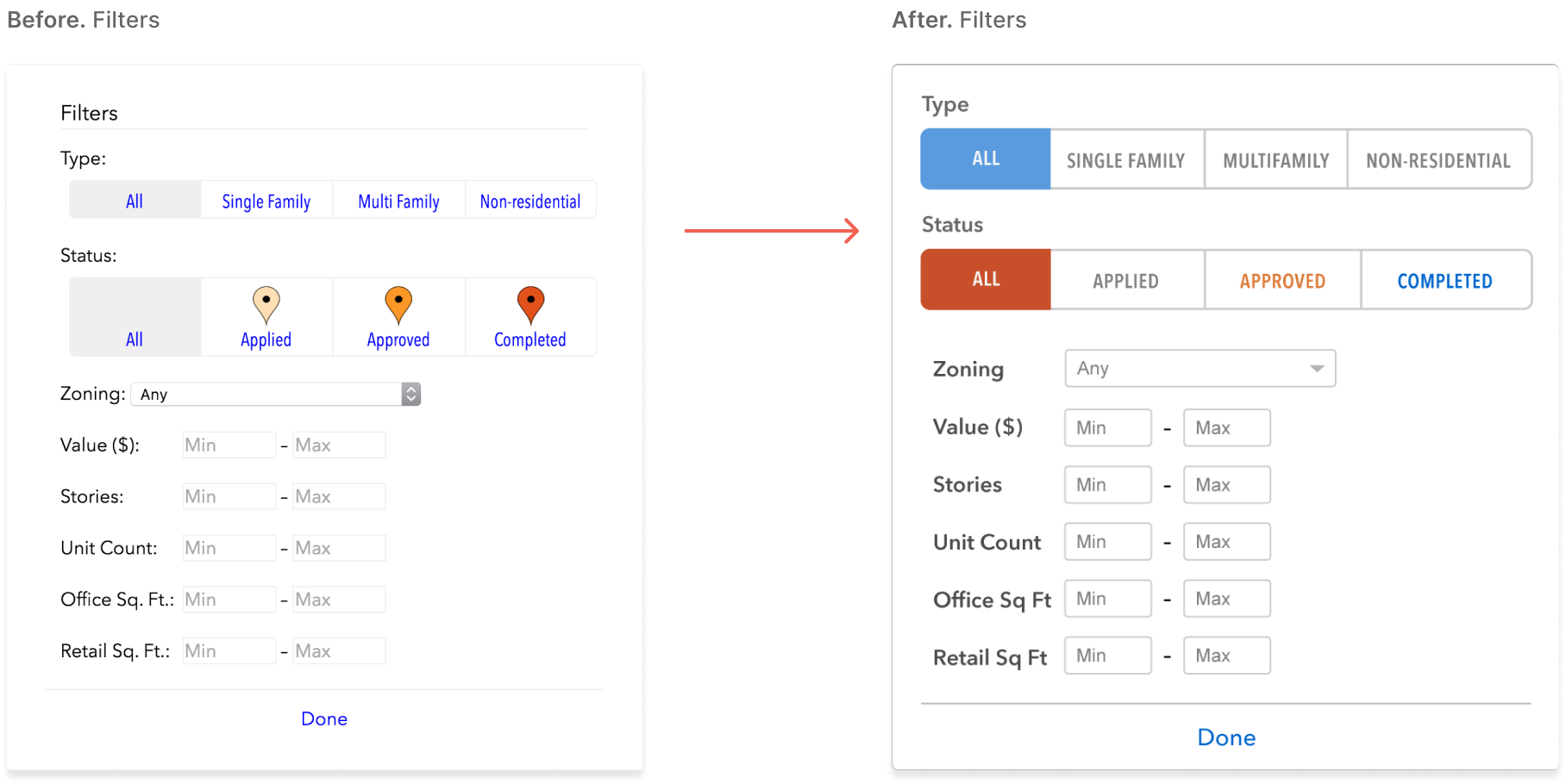
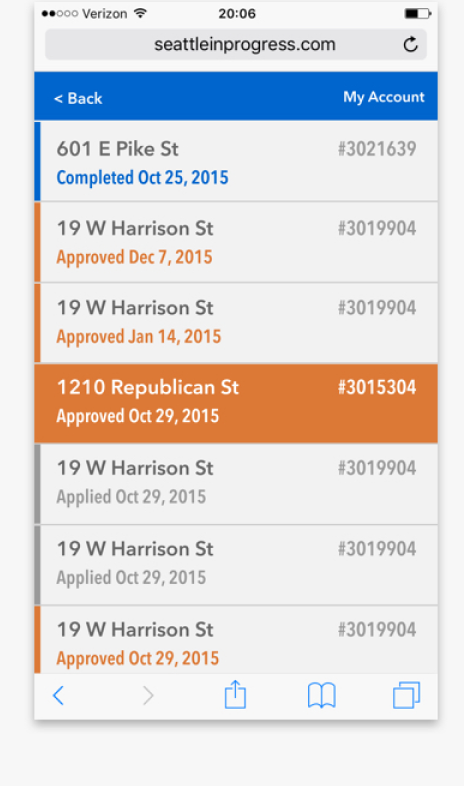
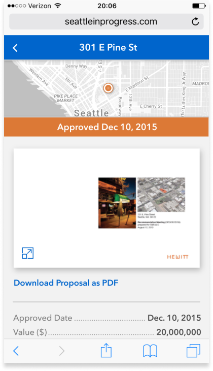
The responsive web app was ideal for users looking to explore details about construction projects as they encountered them throughout Seattle. The modular design and bold colors translated well across both desktops and mobile devices.
Before. Mobile view
After. Mobile view
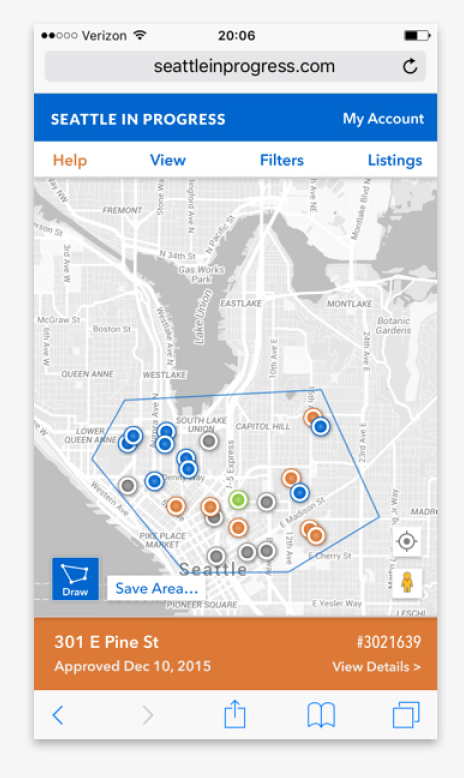
After. Mobile experience
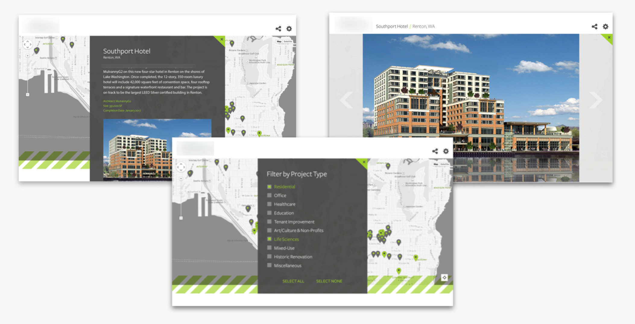
In parallel with updating their new app, I helped Seattle in Progress develop a white-label version of the app to generate a new revenue stream.
You must be logged in to post a comment.