Redox: Healthcare Interoperability Platform
Role
Lead Product Designer
Duration
6 Weeks, Completed in 2020
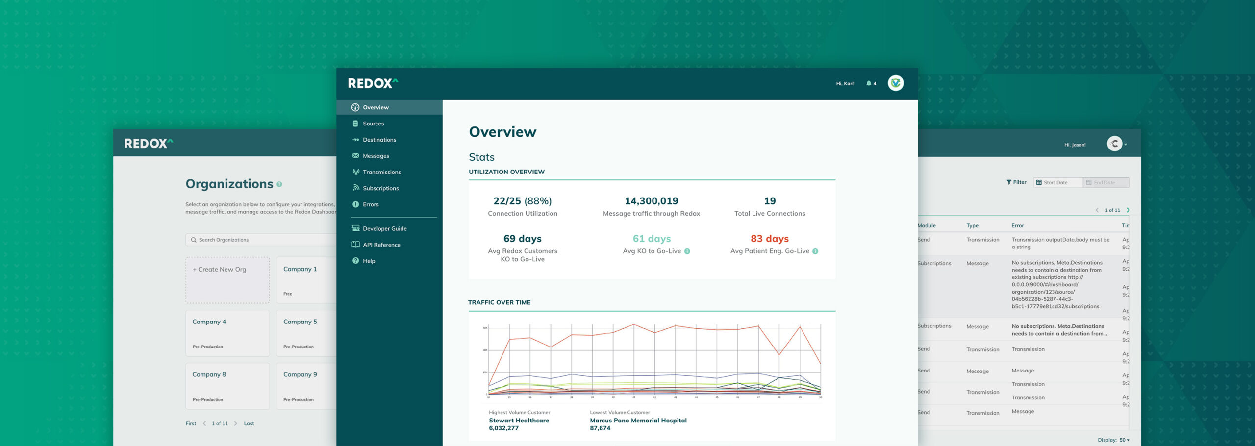
Redox is a healthcare interoperability platform aimed at simplifying the healthcare journey for patients, payors and providers. As they were preparing to transition their app to React, they wanted to take the opportunity to address some minimal UX/UI improvements and reflect more of their visual identity in the product.
Opportunity. Like many companies at the time, Redox was making the shift to React and wanted to make some simple updates to their UI and UX in the process. Based on feedback from Customer Success, the onboarding tasks and dashboard were in particular need of a revamp to provide context and generate enthusiasm at the outset for the app developers who used their product. Copywriting and minimal UI updates needed to be kept to a minimum so Redox's engineers could focus on the more critical tasks for the transition.
Approach. I worked with their UI engineers to flesh out a simple style guide to get them started in a good direction. I provided redlines, style guides and video walkthroughs to introduce new features and redesigns. Since we had received feedback that users often conflated terms like "Source" and "Destination" when configuring their tenant, I added simple tooltips and copywriting updates to guide users through the process.
Outcome. Unfortunately, layoffs affecting 25% of the company occurred before the project was implemented.
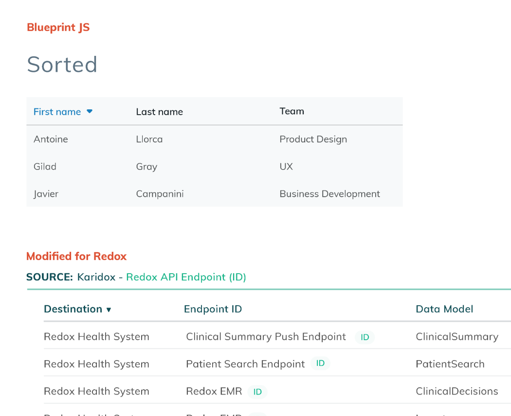
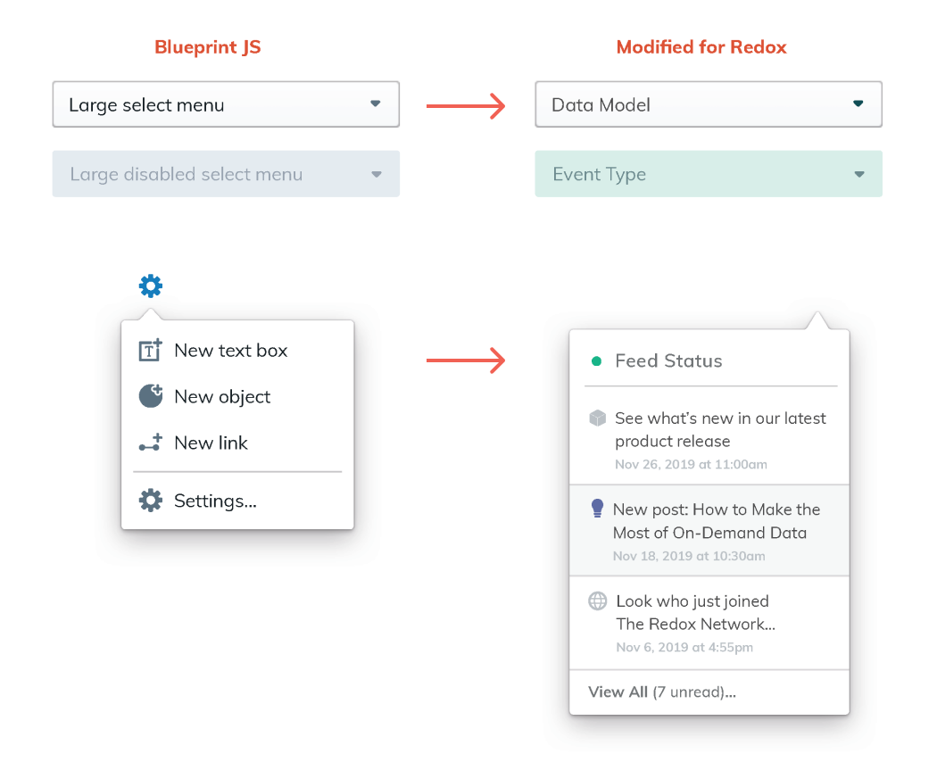
I worked with the UI engineers to identify a React-based UI kit to minimize the work required to flesh out their app. I reviewed their existing UX/UI patterns, and modified components from the UI kit to carry their branding throughout the product.
Consolidated Navigation
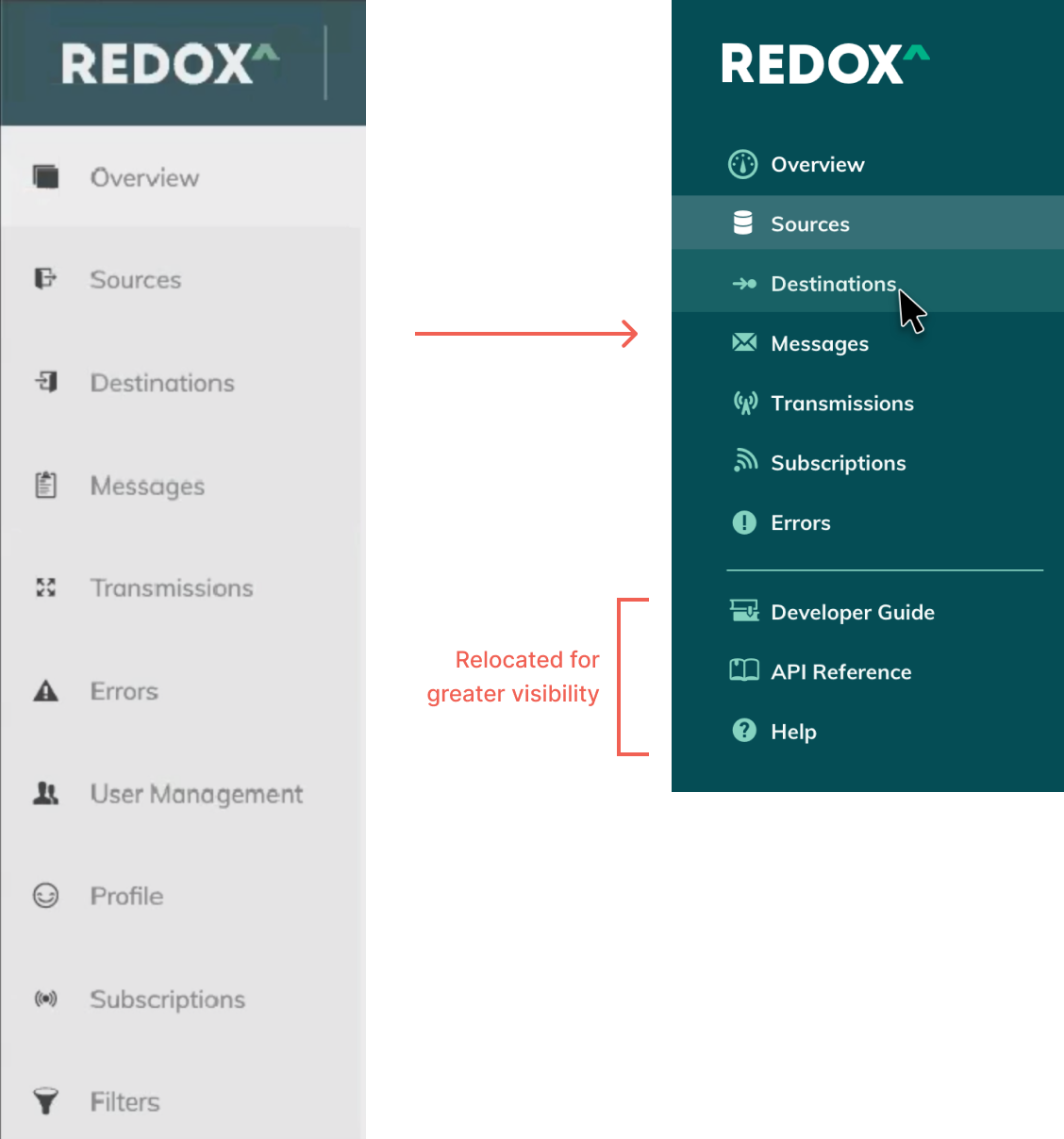
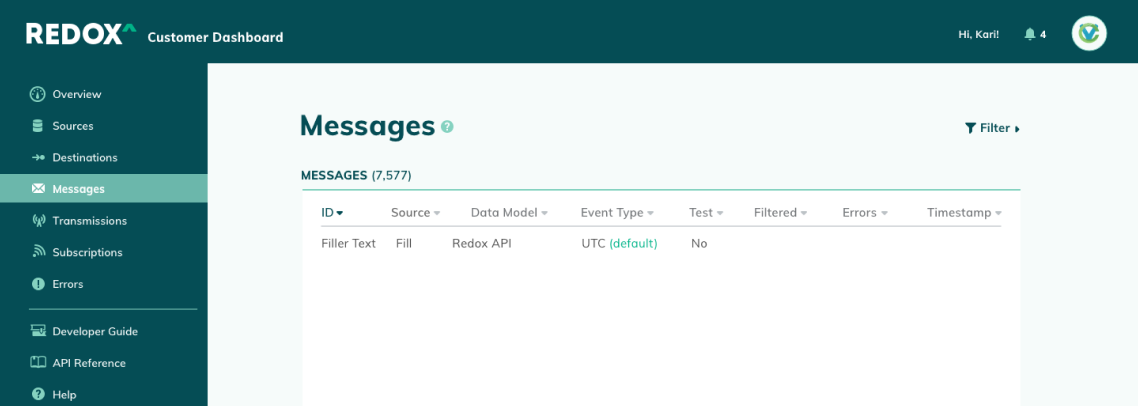
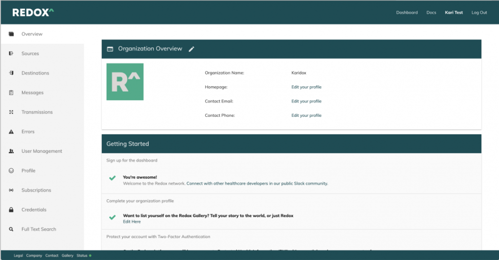
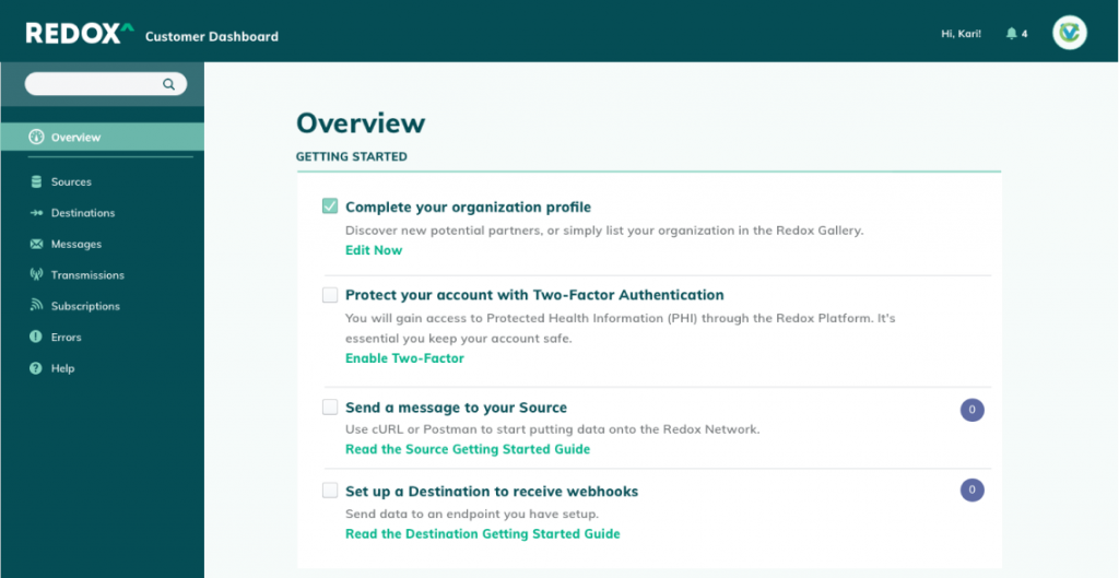
Since the sidebar is an omnipresent element, it needed to serve as an anchor for the rest of the page—an element that is intuitively organized and easy to reference at a glance. I updated the font weights, padding, and color assignments, and swapped in icons from the new UI kit. These simple updates made for a fairly extreme makeover to the interface, and saved precious vertical space.
To guide the user throughout the product, I added descriptions, tooltips and contextual documentation links for each product section.
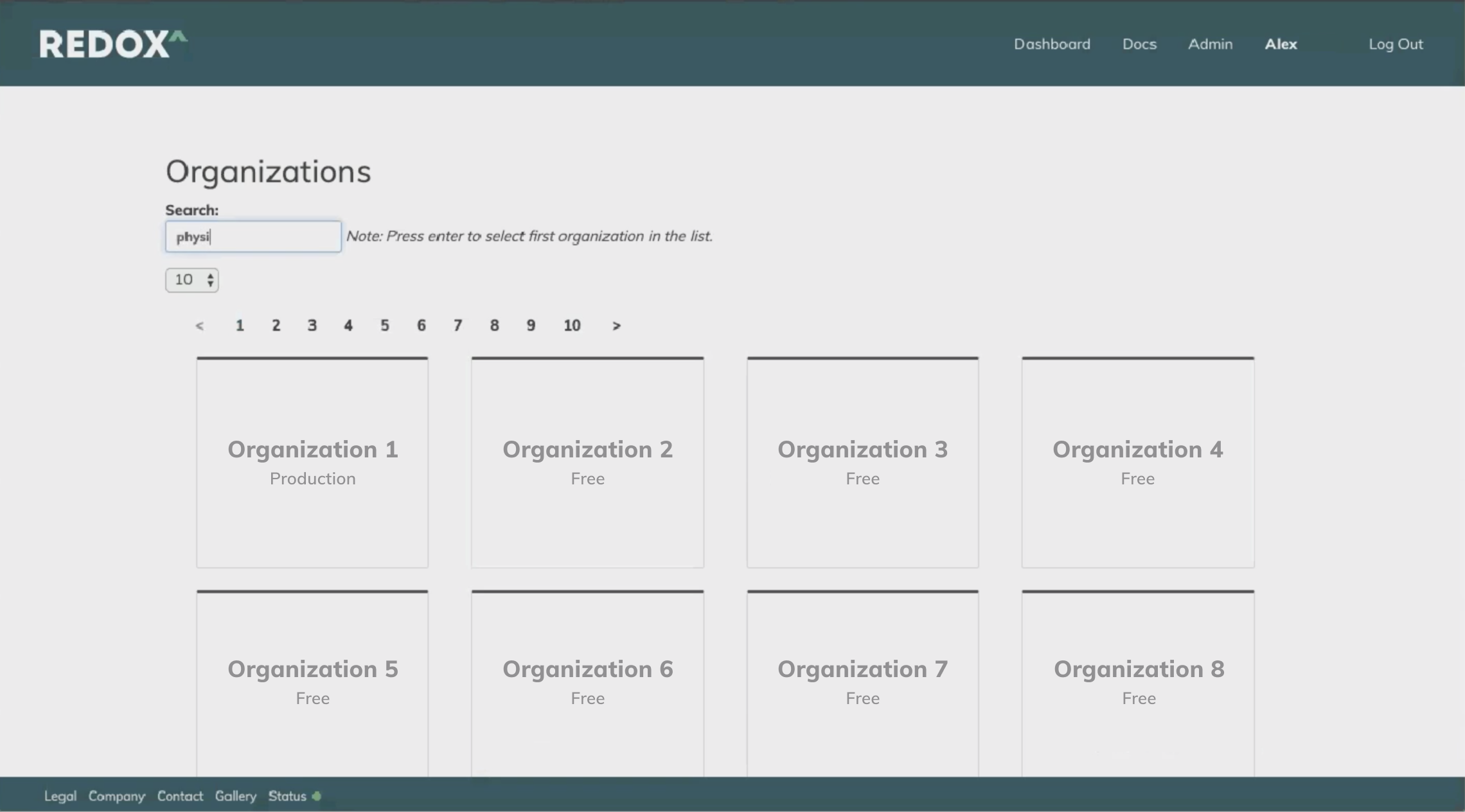
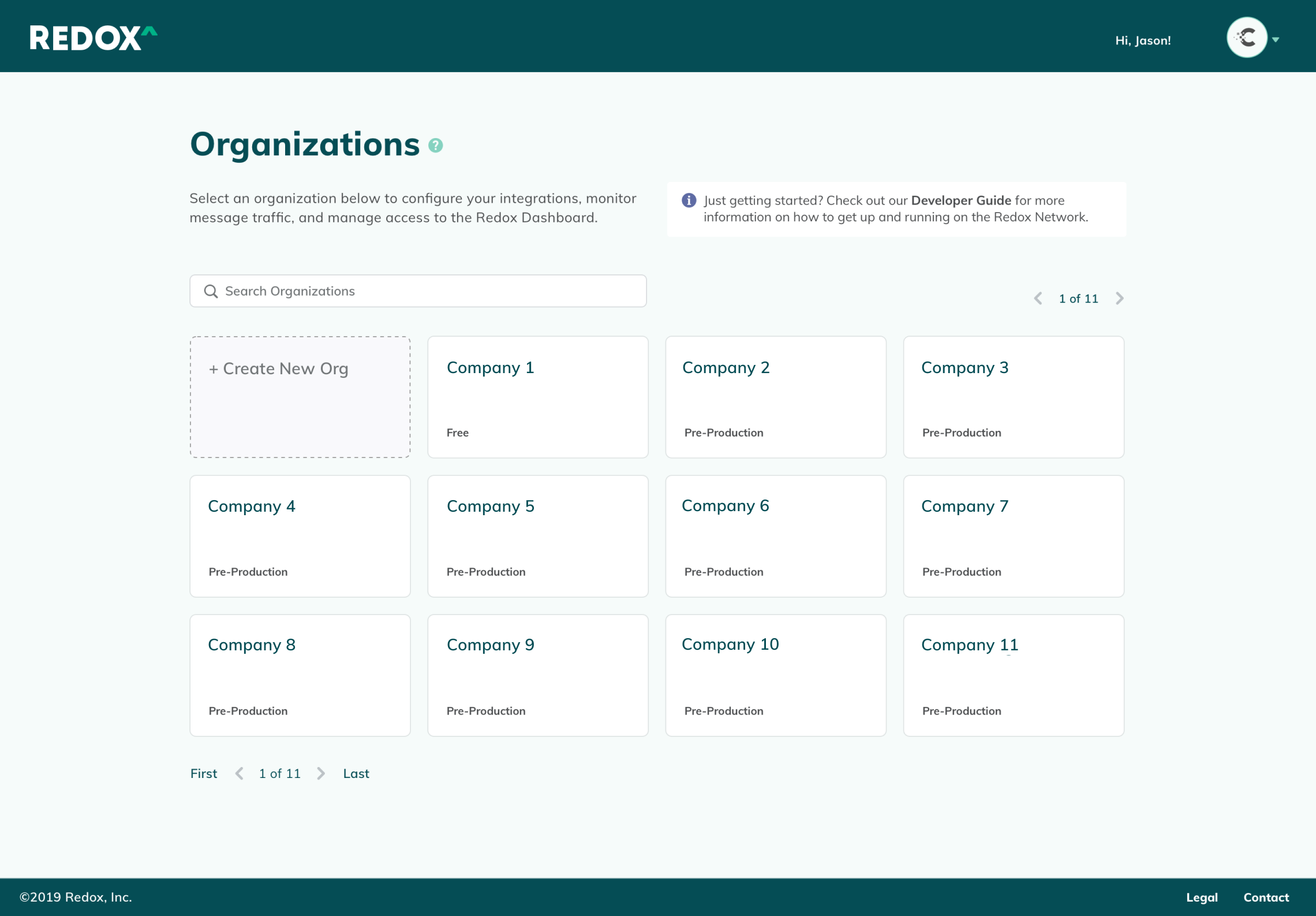
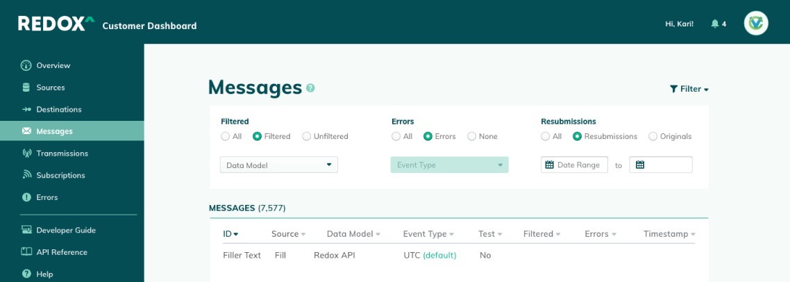
Simple improvements, like enabling one-click copying of Endpoint IDs, and space-saving accordion-style filters created a more seamless user experience.


Onboarding Improvements
I narrowed the focus of the onboarding experience to the bare essentials, and linked pertinent documentation for easy reference.
Previously, the “Getting Started” checklist was easy to miss, as half of it appeared below the fold. It also included extraneous steps beyond what was actually needed to up the product, which cluttered the interface, and made it likely to be overlooked by users. Additionally, the list was pervasive even after steps were completed. It became a clunky interruption to daily work unless the user had hunted down the “off” switch in their settings menu.
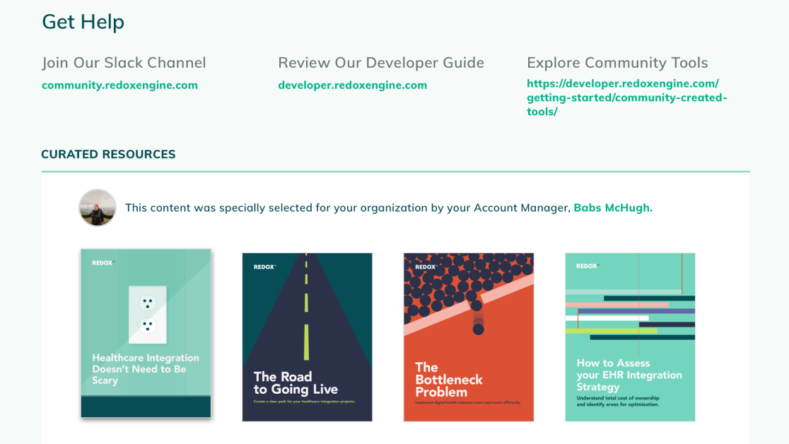
As a future iteration, I suggested integrating with Salesforce's Content Management System to pull in relevant guides and collateral based on customer data.
Dashboard Improvements
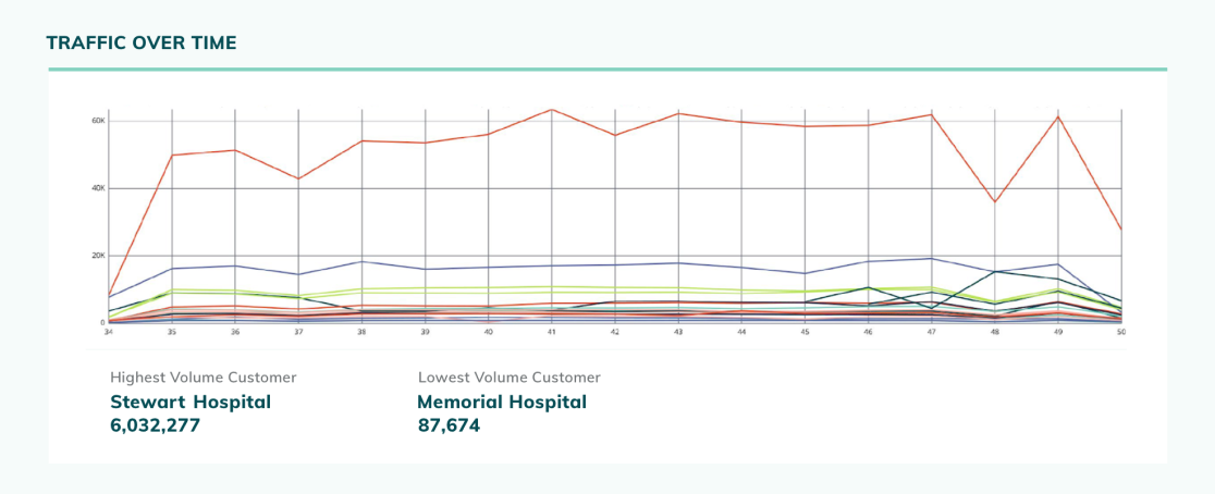
The Redox Network drew power from the "strength in numbers" maxim. The more healthcare providers that joined their network, the easier it became for health tech companies and app developers to connect to these institutions. More institutions meant more patients being offered options to enhance their personal healthcare experience with technology—Redox's ultimate mission. These numbers highlighted the Redox Network's collective progress, and encouraged their community of users to keep building.

You must be logged in to post a comment.