CloudMunch: Brand Extension

Role
Visual Designer, Copywriter
Duration
8 Weeks, Completed in 2016
CloudMunch is an ambitious team working to tame the complex world of DevOps with a unifying platform for cloud-based app deployment, including plugins and pipeline templates.
Opportunity. With the popularity of the cloud came a chance to transform how IT teams and app developers worked to test, deploy and maintain apps across their networks. In 2015, cloud applications were gaining traction, and tools to improve their efficiencies would be part of pushing adoption of cloud technologies from a meager 8% of enterprises to 82%. CloudMunch had recently redesigned their logo, and needed help extending their brand identity and tone of voice across their product and website.
Approach. I worked in sprints alongside CloudMunch's Engineering team, and designed within the constraints of their existing graphic style. Because of the quick turnaround to announce their upcoming product release, I made minimal updates to the existing color palette, and improve their copywriting for a US audience.
Outcome. CloudMunch successfully launched their app, and were acquired by JFrog a few months later.
I expanded their brand across both their product design and their marketing website, and created custom branded illustrations and icons to match their desired cartoony style.


CloudMunch provided their logo and two brand colors, and requested a “rippling wave” motif throughout their product. I fleshed out their style guide and created a cohesive look across their product, marketing website and presentations.
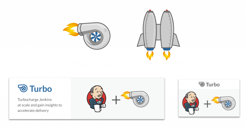
I designed a series of product icons to work as both a minimalist UI element as well as a high-fidelity marketing illustration for dramatic effect.

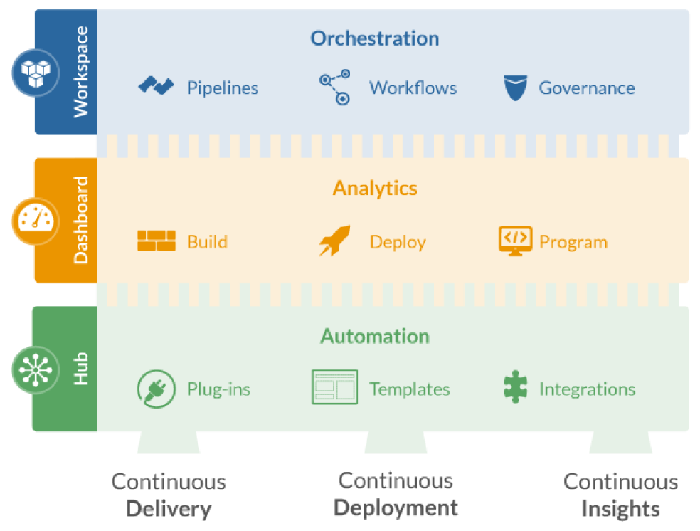
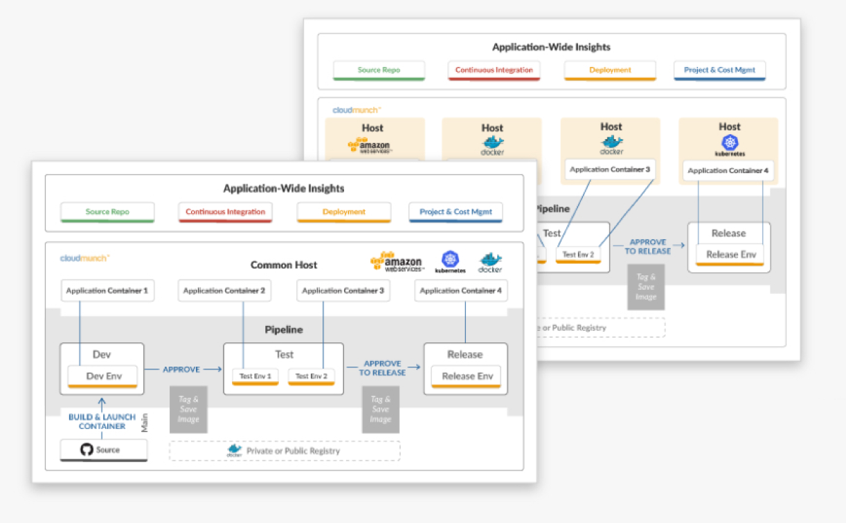
I reimagined their infographics to explain the components of their three primary products and illustrate the structure of their app templates. These were used in various collateral, including their marketing website.
You must be logged in to post a comment.