Nonprofit Donor Management Web App
Objective. Establish new global styling and roll out iteratively
Background. Little Green Light, a donor management platform for nonprofits, was nearing their tenth business anniversary. They were ready to transition to Vue and refresh their product UI for a leaner, more modern interface. To avoid spending energy maintaining two code databases simultaneously while developing the new version of the app, I worked with their team of developers to deliver iterative updates.
Duration. 5 weeks, Completed in 2018
Approach. Little Green Light provided an inventory of their existing pages and components. I audited existing layouts, navigation structure, theming, and reviewed their list of prioritized areas for UX improvements. I then selected a UI library compatible with Vue to shave additional design and development time.
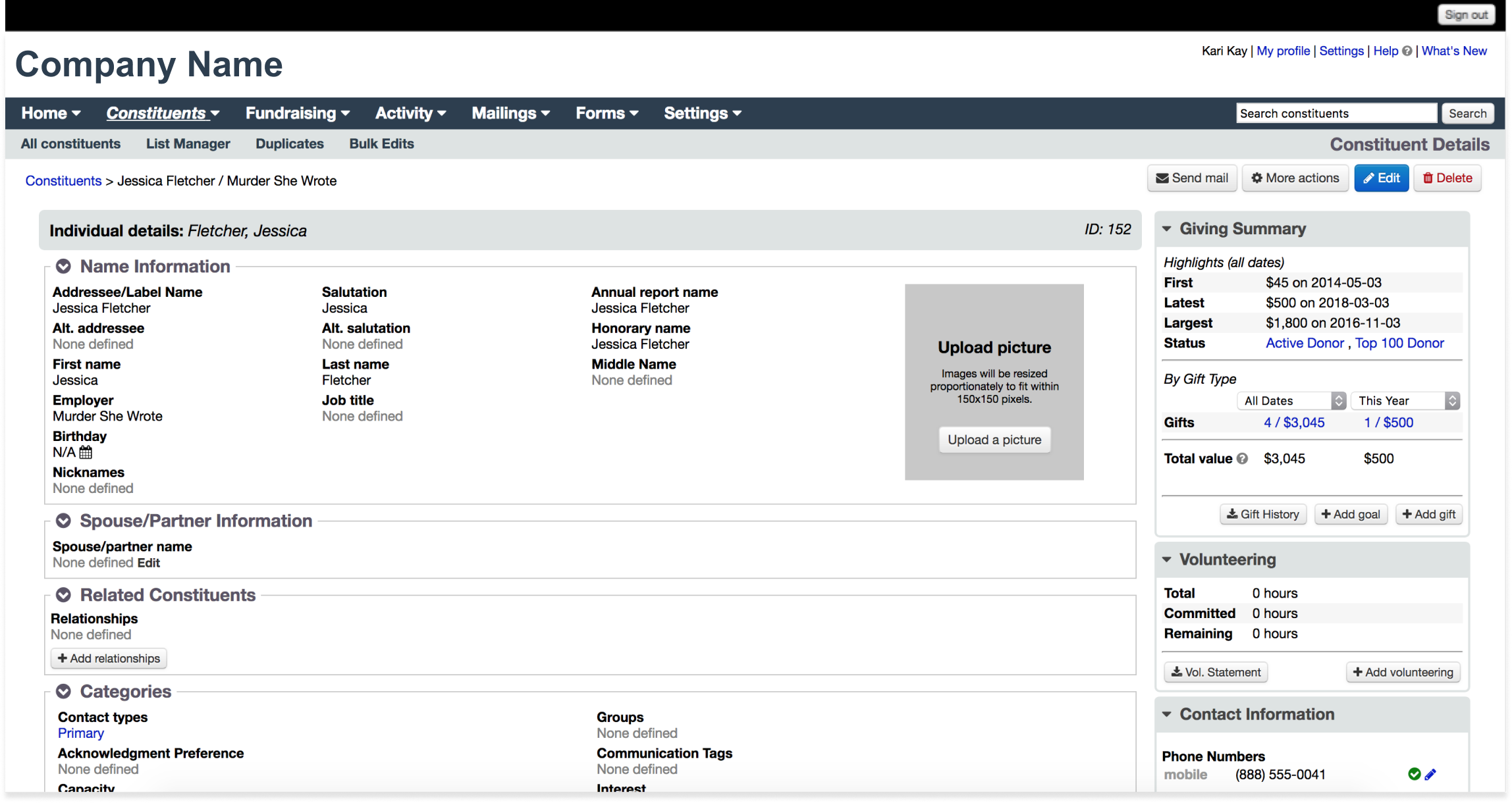
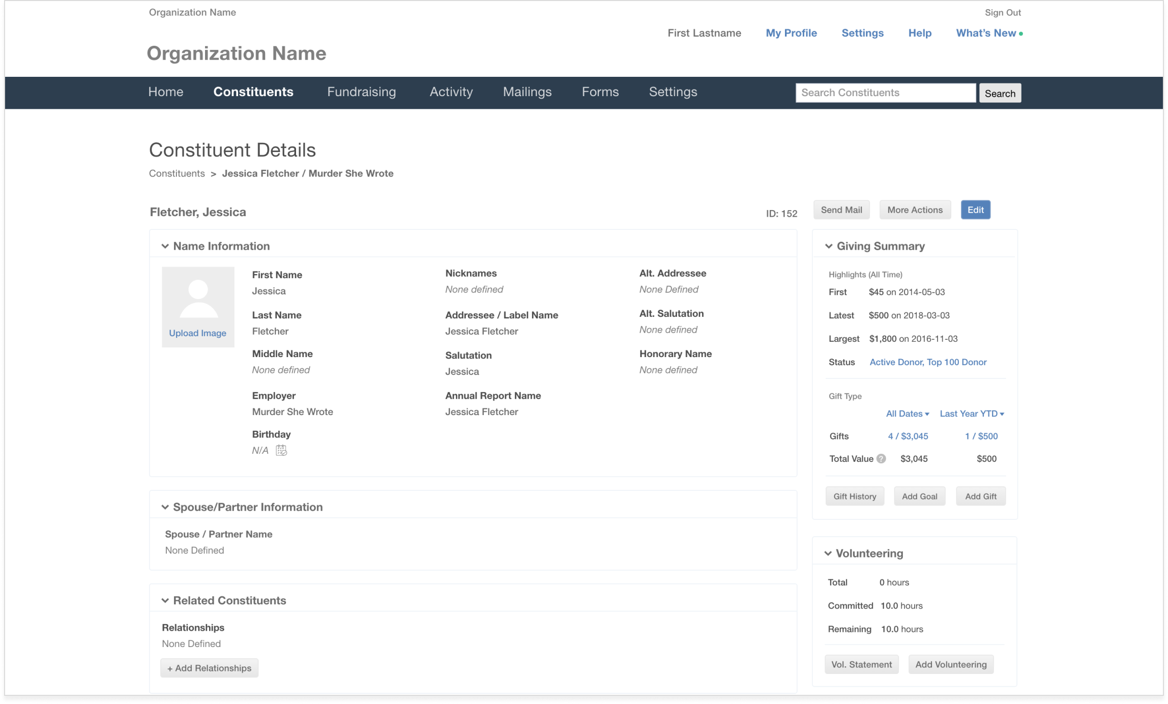
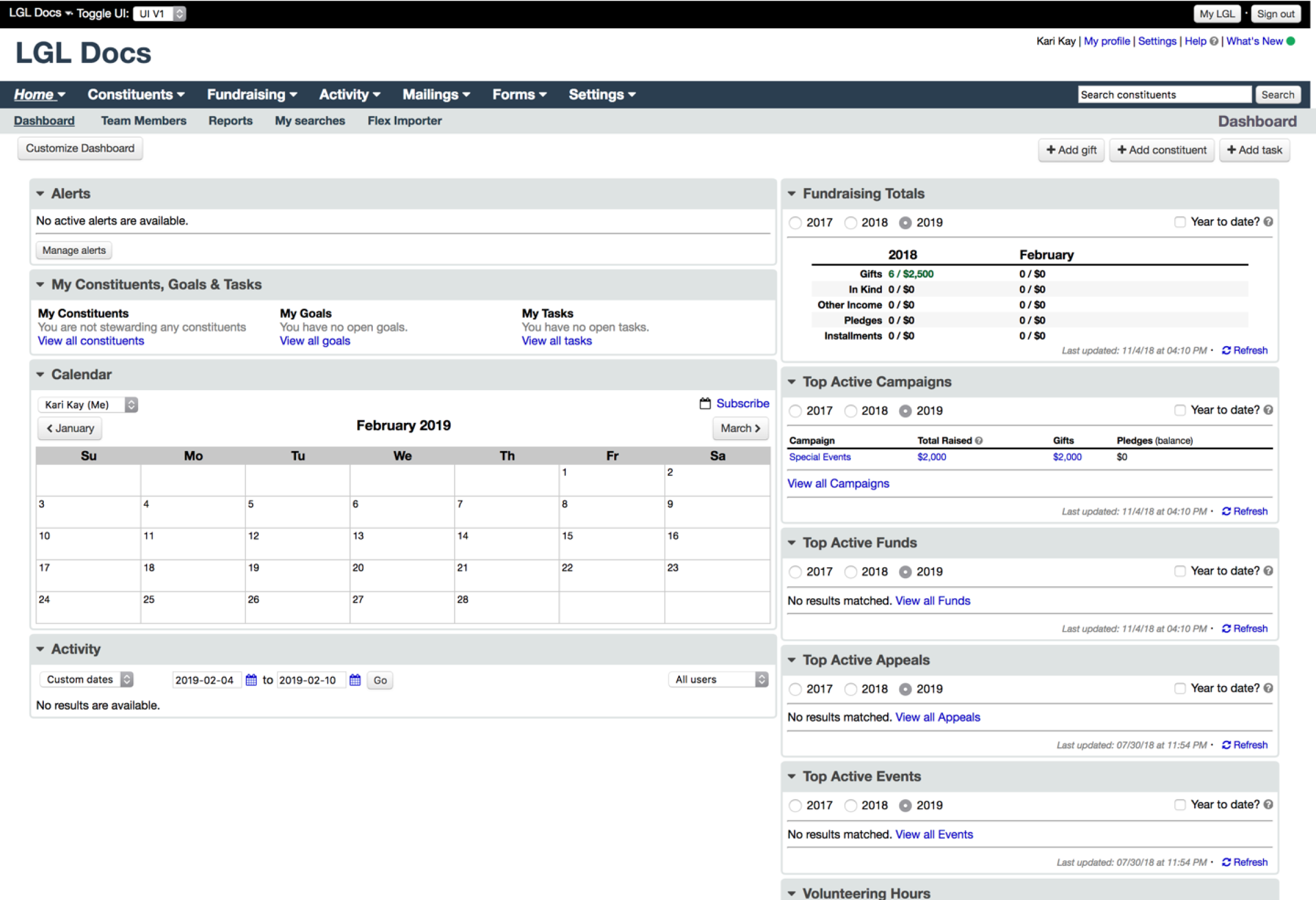
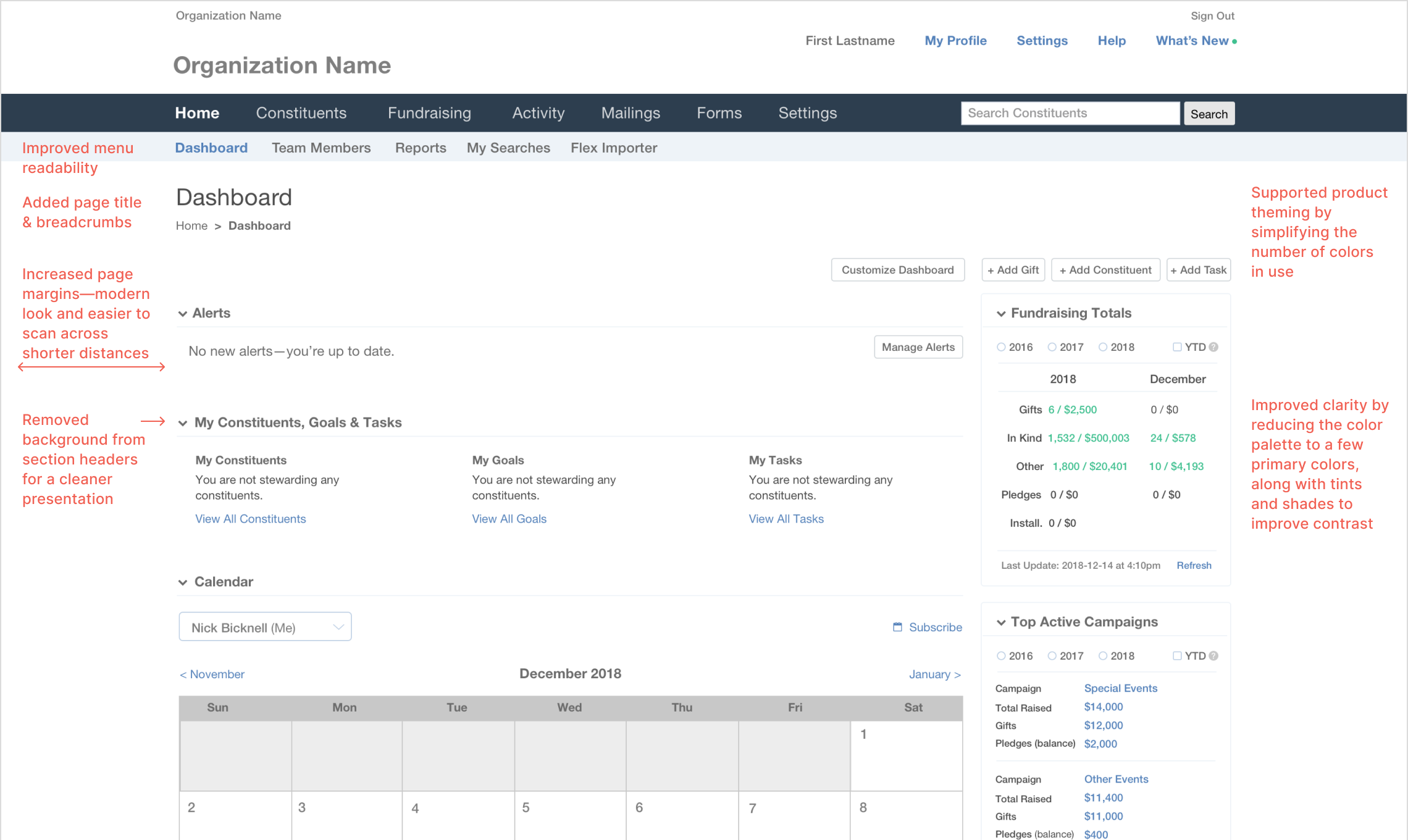
I started by auditing their existing layouts and design patterns, looking for opportunities to declutter and reduce clicks.

Little Green Light provided a list of components in use, highlighting some issues to resolve.

I discovered additional opportunities to clarify functionality and create more defined hierarchy using simple text updates to statuses and labels
Despite the temptation to make more drastic recommendations to evolve the UI, the scope of work was limited to the most surface-level CSS and HTML updates. This left little room to reduce the density of content on the pages, which proved to be the most challenging design issue to solve. Instead, I focused on improving visual proportions and introducing more hiearchy to guide the eye throughout the page.
Component Improvements
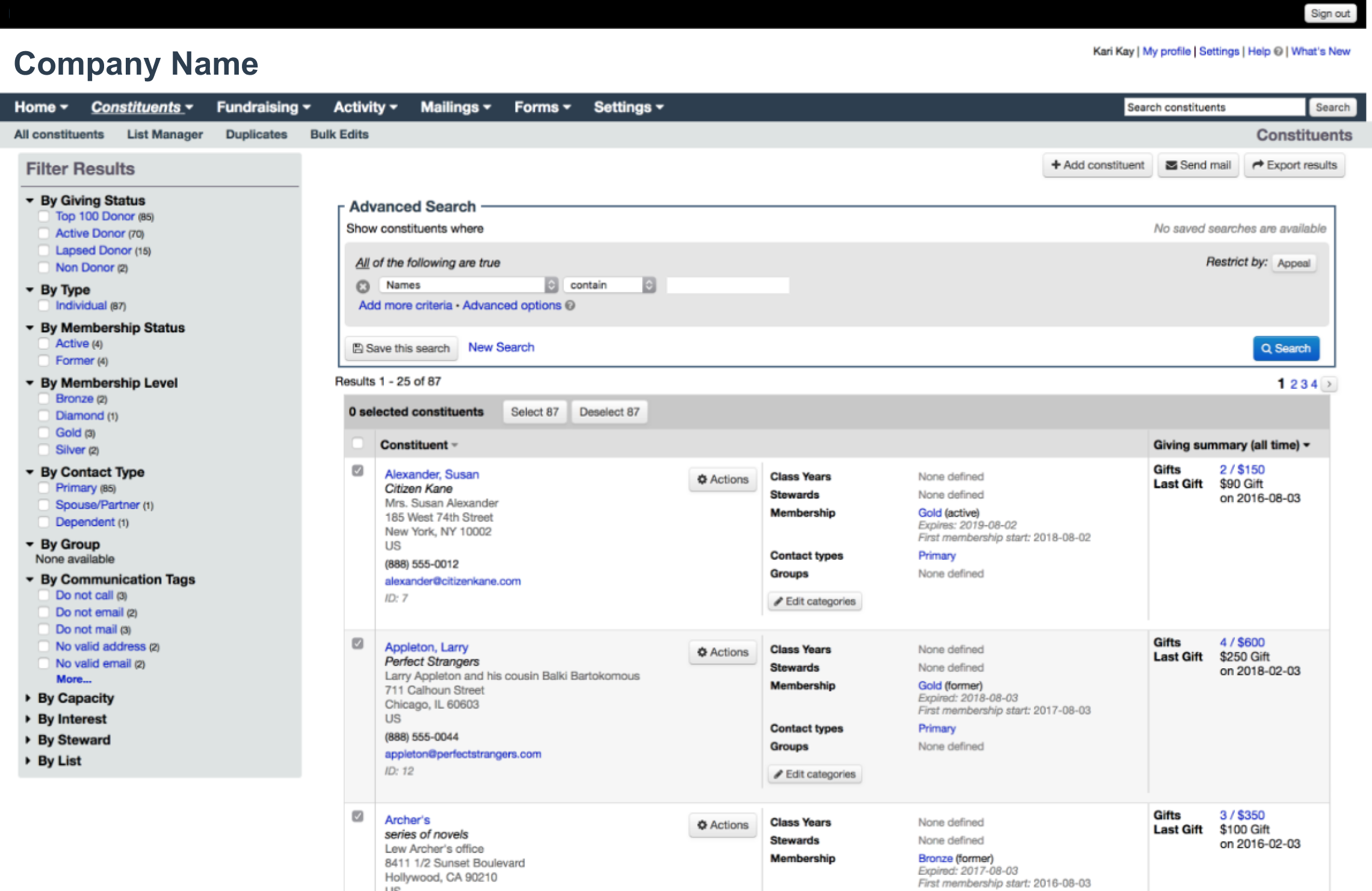
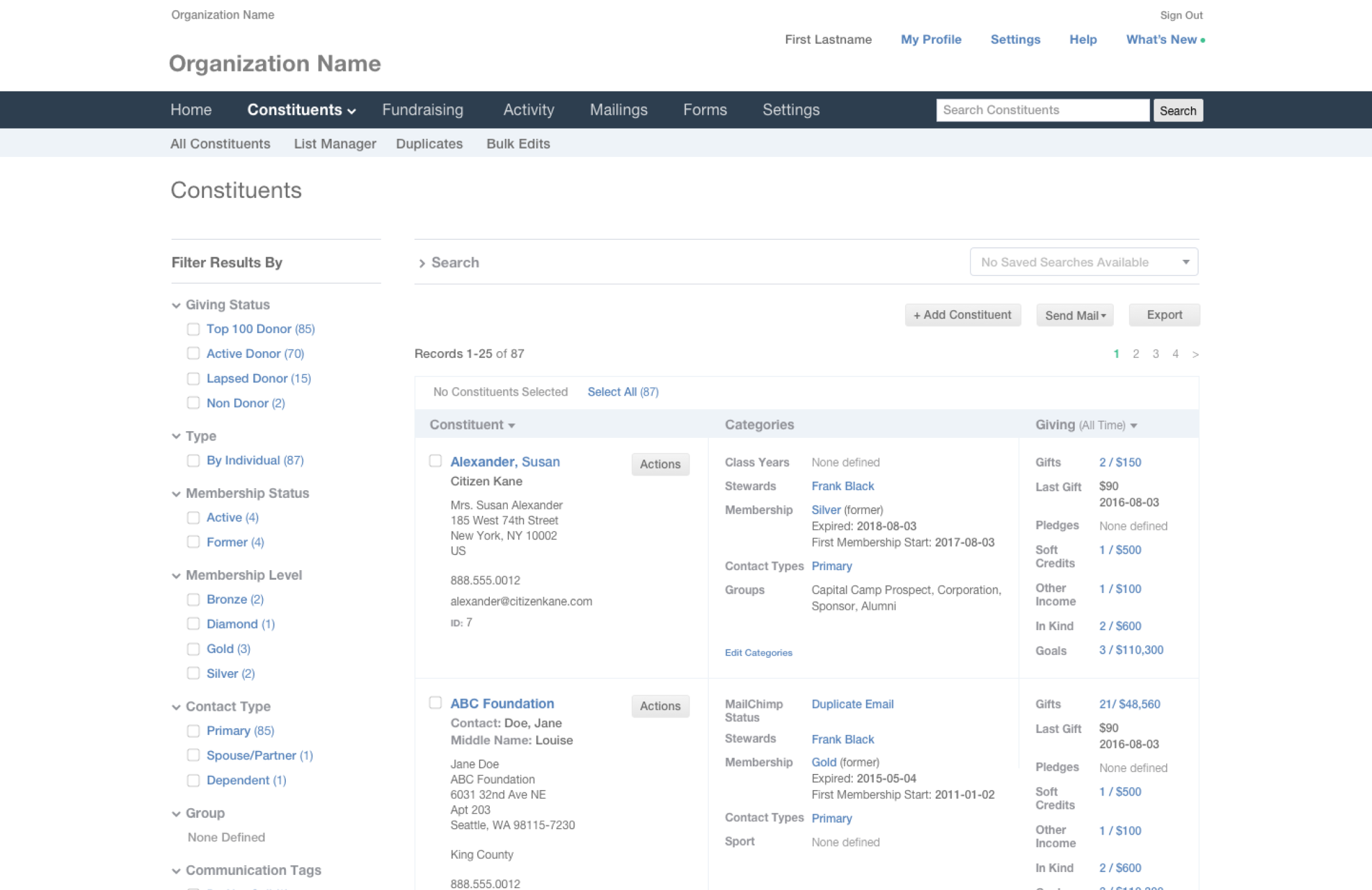
Before. Sorted lists were difficult to scan quickly, were clunky to work with due to the tight spacing between elements, and looked dated

After. Sorted lists were simplified by removing unnecessary repeated elements, increasing spacing between lines and reducing the weight of fonts and carets

Before. Sidebar panels remained open most of the time, and were styled slightly differently throughout the interface, adding to the visual clutter

After. By removing unnecessary UI elements, and aligning elements differently, the multitude of sidebar panels began to look more neat and orderly

Before. The Advanced Search function supported numerous nested fields. While it was robust, it was not readily intuitive, and users couldn’t enjoy its full functionality.

Before. Sidebar panels remained open most of the time, and were styled slightly differently throughout the interface, adding to the visual clutter


You must be logged in to post a comment.