Device Fleet Management
Objective. Scale the interface to support Enterprise-sized fleets
Background. Enterprise fleets consist of hundreds of thousands of distributed mobile devices. The rigid layout of the existing UI interfered with a user’s ability to quickly find, diagnose and address individual device-level issues without losing its context within the fleet. To continue meeting the needs of global corporations and evolve the product, Esper’s console needed more fluid navigation to provide greater visibility into the fleet and to streamline maintenance processes.
Timeline. 2 months user research & ideation, 3 months implementation
Approach. I determined that the primary obstacle to improving the usability and extensibility of the product was the rigid backend architecture for nesting devices. I conducted user research around group management and worked with a PM to address the underlying architecture and introduced new views to promote visibility and reduce the number of clicks to access information. To test the new design concept, I created customized prototypes for key customers to explore.
The existing layout separated nested devices and groups in a way that disconnected the visual hierarchy and obscured the relationship. In addition to creating organizational challenges, this also obstructed critical device management tools, and limited visibility to as few as 3 devices at a time. This resulted in a constant need to scroll and click on pagination.
Before. Devices & Groups: Grid View
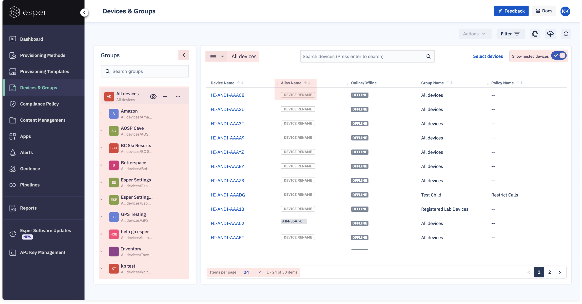
Multiple “sort” icons in the table, along with other scattered UI elements, made the interface visually busy and unintuitive.
Even though devices were nested inside groups, they felt disconnected because they were visually separated
Only 11 devices visible at a time until users scrolled and navigated between pages
Device details and actions were only visible if the user knew to scroll horizontally within the table.
The device actions that were surfaced weren’t high priority, forcing the user to navigate to each individual device page to access useful actions.
Scroll bar only appears if user is already scrolling horizontally within the table
Before. Devices & Groups: Grid View
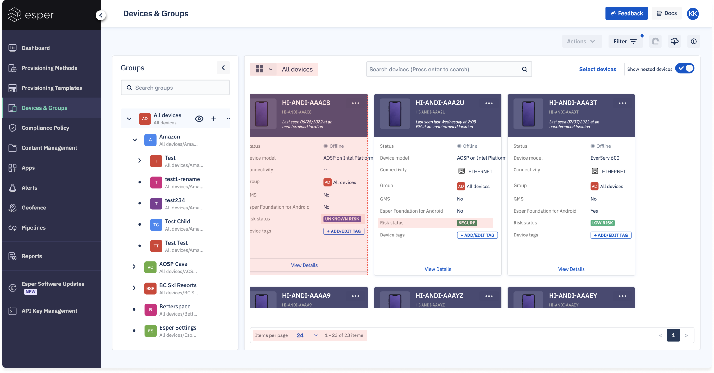
Only 3 devices visible at a time, additional devices only visible upon scrolling and navigating between pages
All details were not necessarily helpful to the user. Security levels, for example, were arbitrary and not customizable.

The backend architecture forced all devices and groups to be nested under one supergroup called “All Devices.” By removing this supergroup, nested groups could gain autonomy, and begin supporting additional functionality.
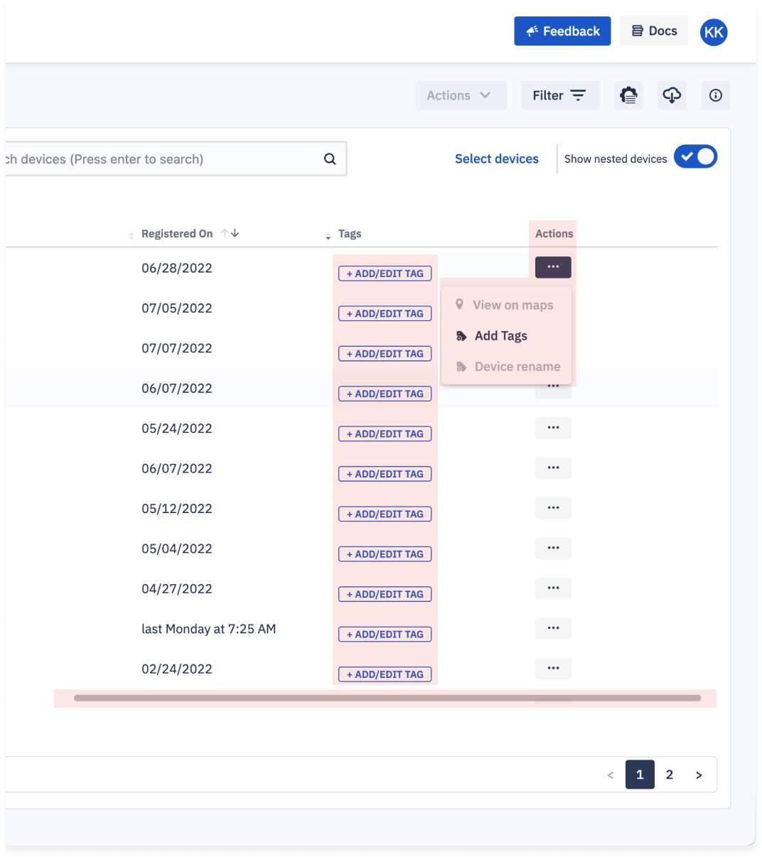
Applying actions to devices in bulk was a three-step process that wasn’t readily visible. The actions surfaced were also limited to a select few that didn’t align with the most common use cases, such as factory resetting a device.

Two separate search bars existed due to restrictions around API calls for devices vs. groups.

Users visited device details pages in order to troubleshoot functionality issues. The existing content and layout did not lend itself well to skimming or diagnosing common causes of issues, resulting in a longer resolution response time.
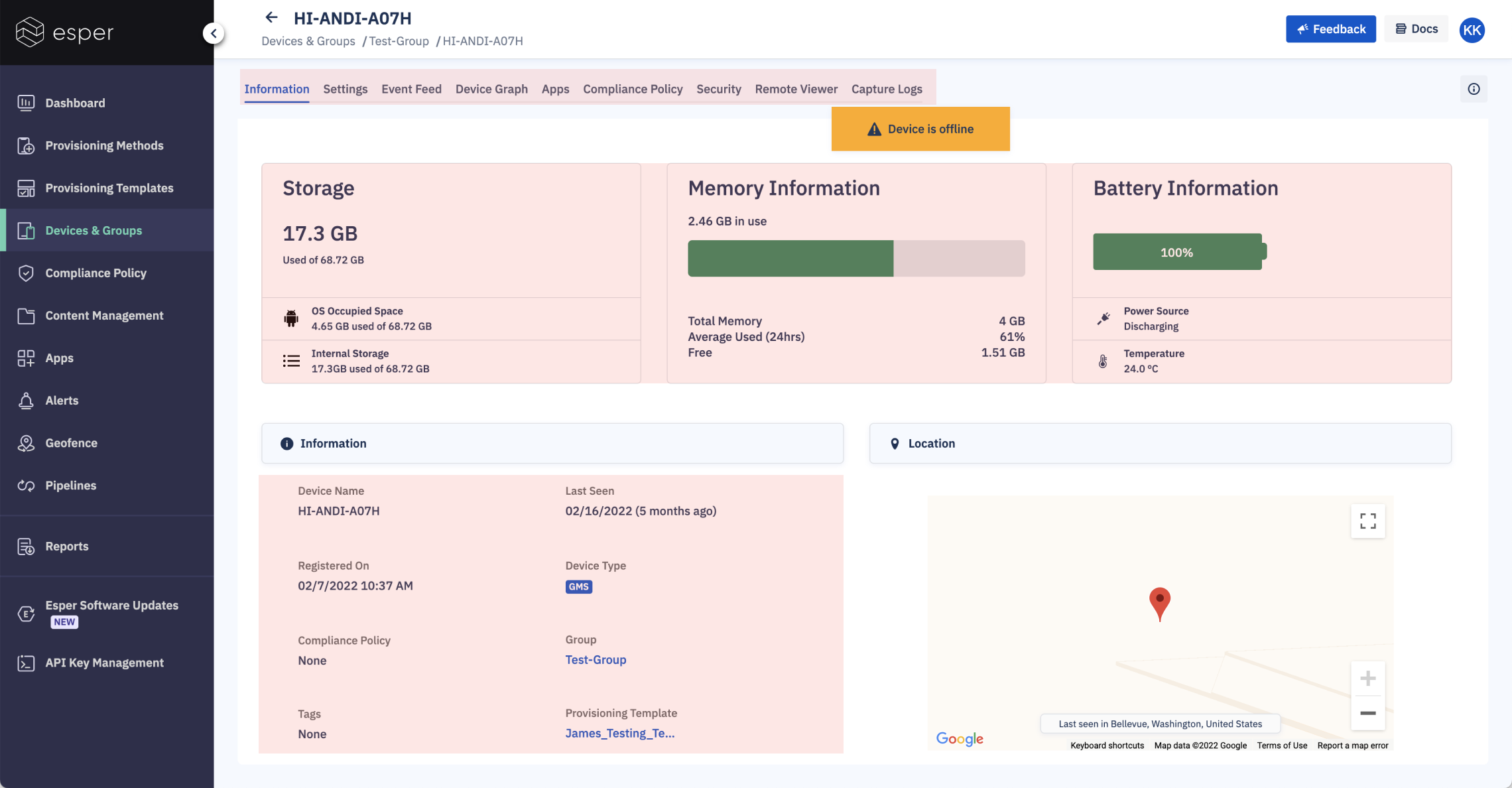
Core diagnostic details and functionality were spread out amongst many tabs
While this overview of device health was helpful, it ate up valuable space
Significant device characteristics for diagnosing issues weren’t visible above the fold
Solutions >
You must be logged in to post a comment.