DevOps Platform Interface
Objective. Simplify key functions and revamp UI
Background. In addition to updating their UX to improve key functionality, CloudMunch wanted to take the opportunity improve the readability of their telemetry, and incorporate their new brand into the product.
Duration. 3 months, Completed in 2016
Approach. I worked in Sprints alongside CloudMunch's Engineering team through multiple iterations of their web app.
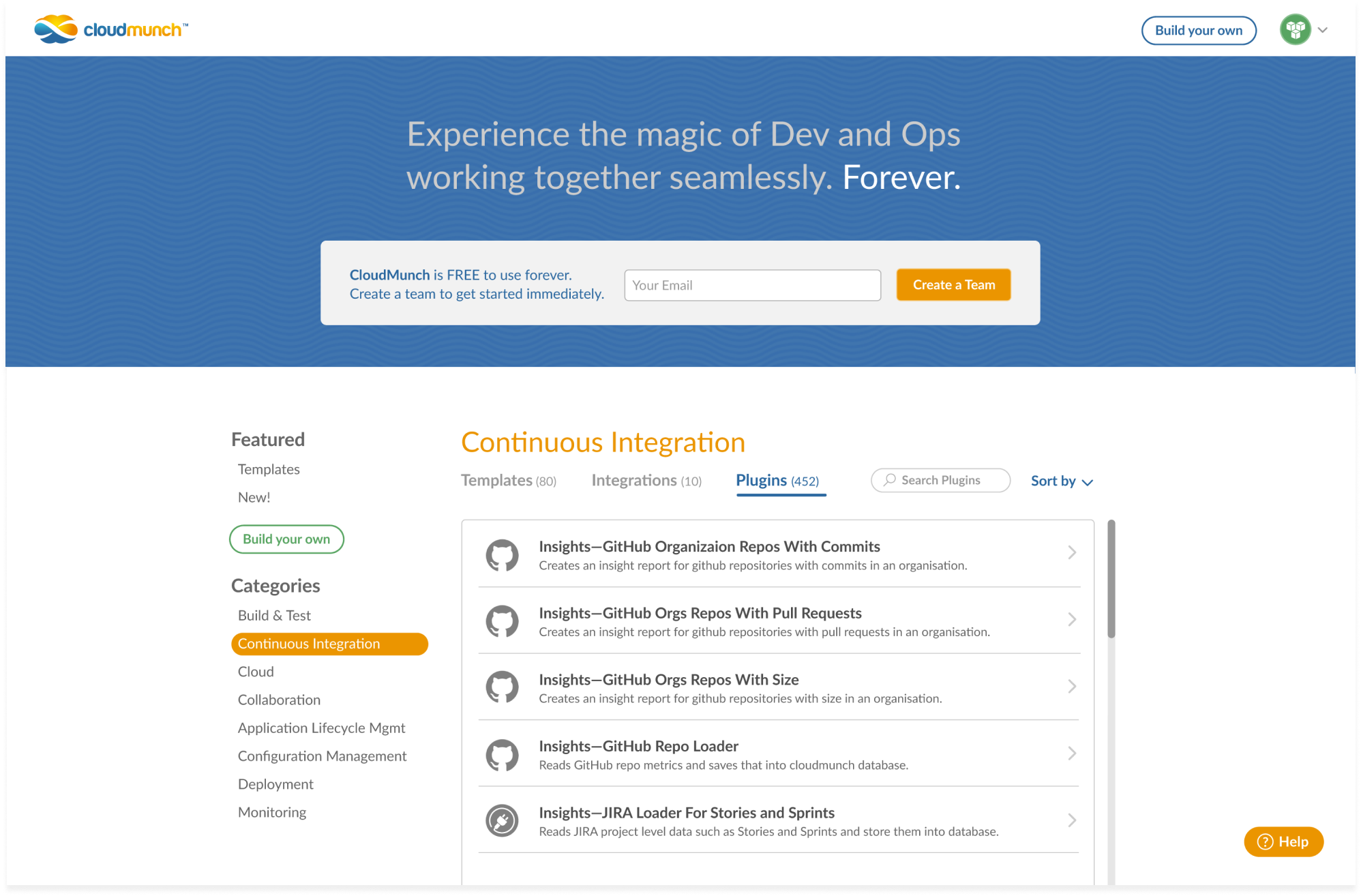
Their range of DevOps tools was presented in three distinct parts to emphasize their value in supporting continuous app delivery and monitoring: the Workspace, Dashboard and Hub.
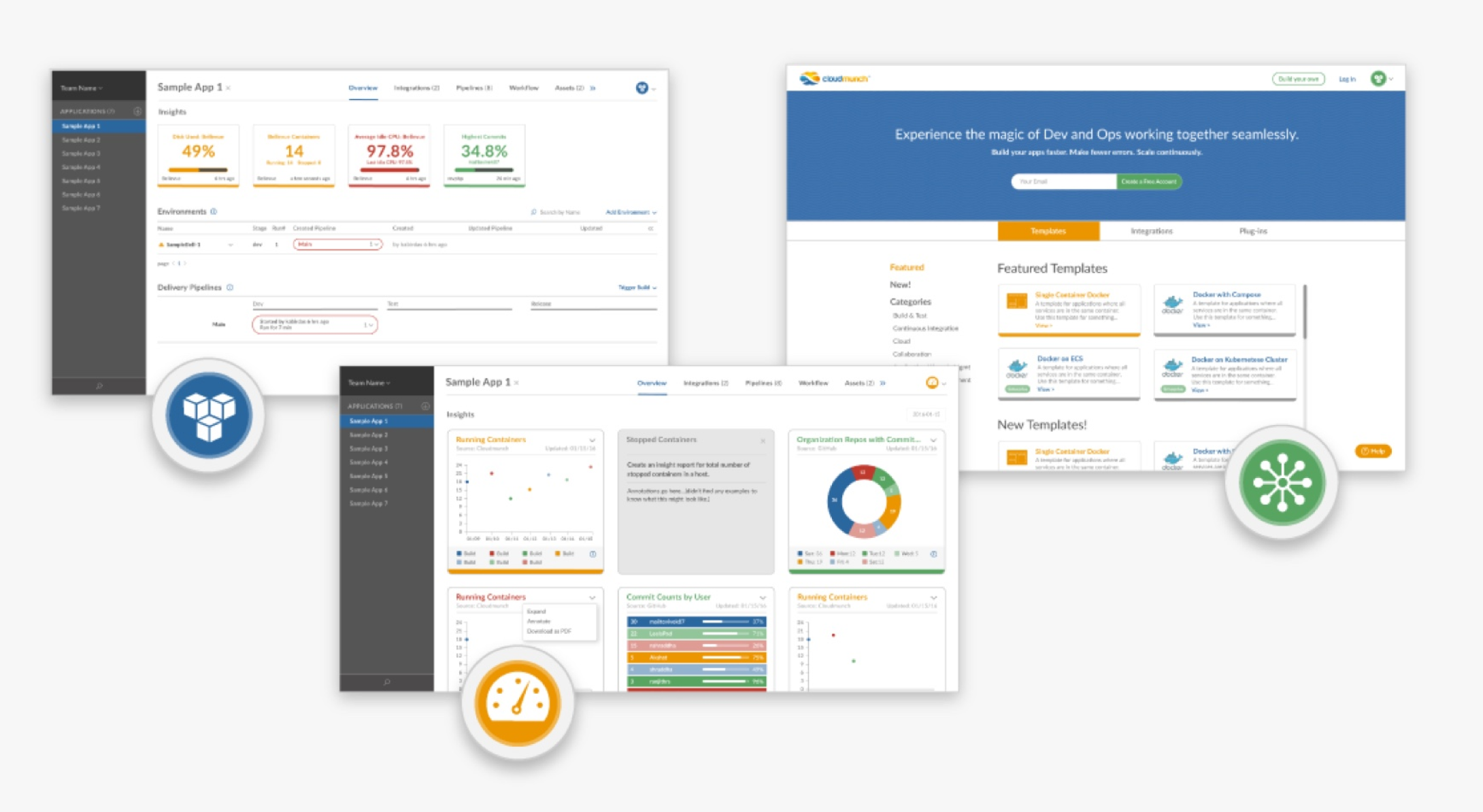
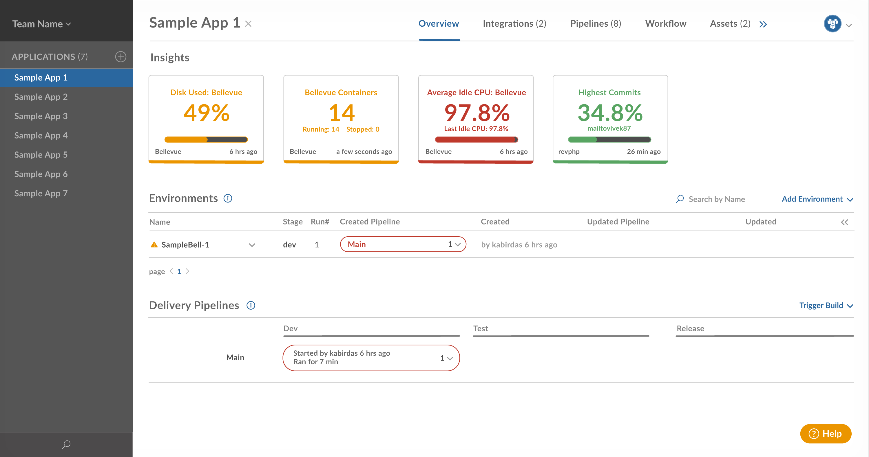
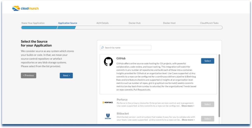
The Workspace featured app delivery pipelines with at-a-glance monitoring. Pipelines are a popular tool for testing app stability and performance before updating them across multiple environments. From the Workspace, users could walk through a step-by-step approach to build each new pipeline with robust functionality and less manual effort.
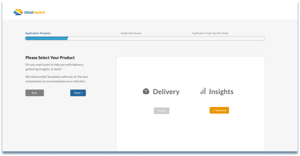
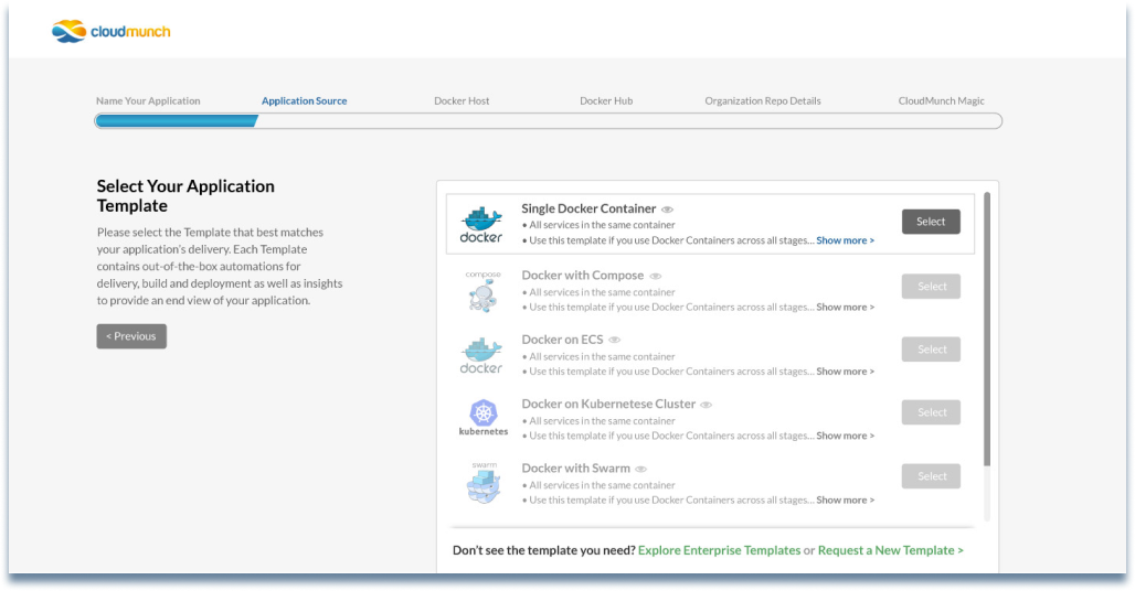
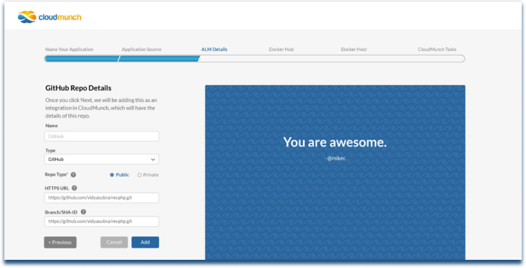
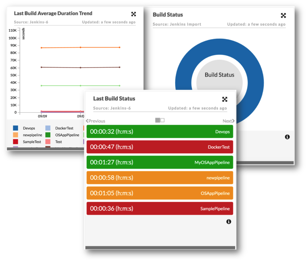
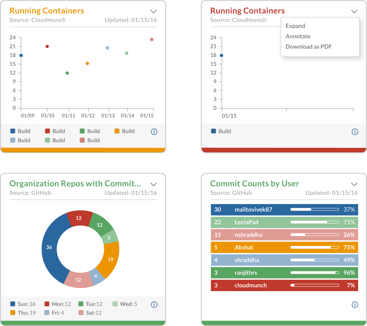
The Dashboard provided flexible insights displayed as individual modules. This allowed users to customize their focus to highlight key stats for current projects, and download reports as needed.
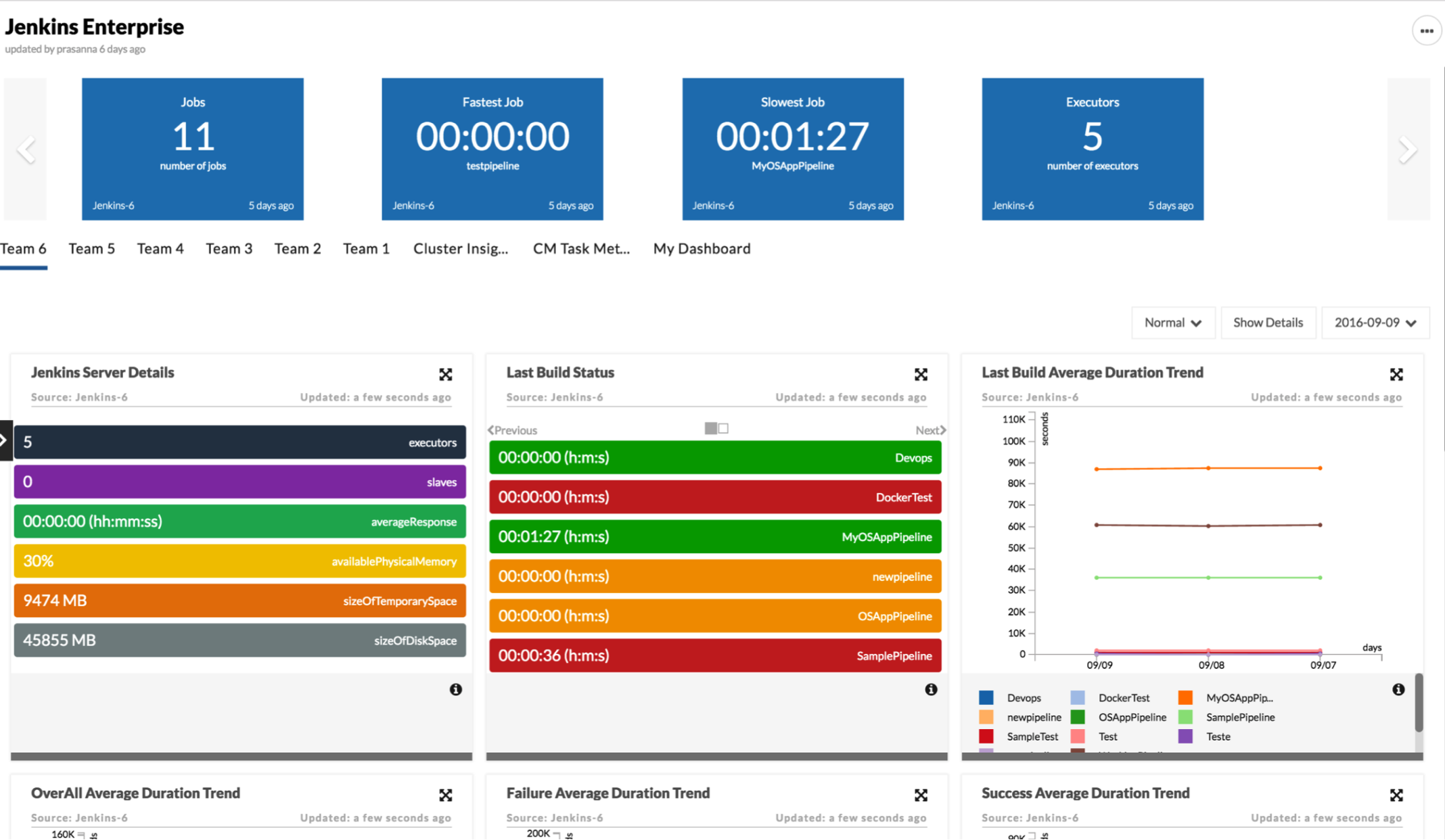
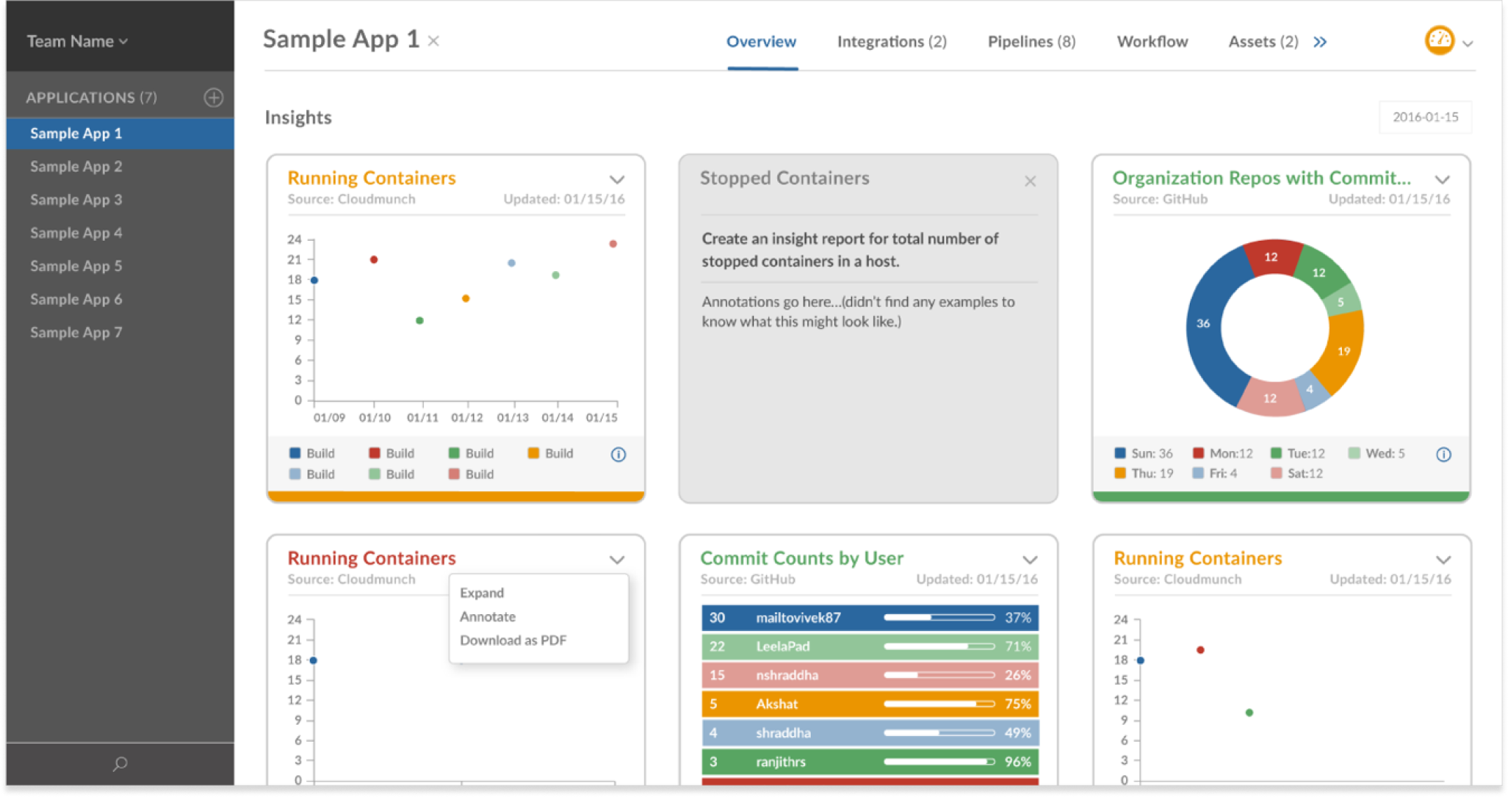
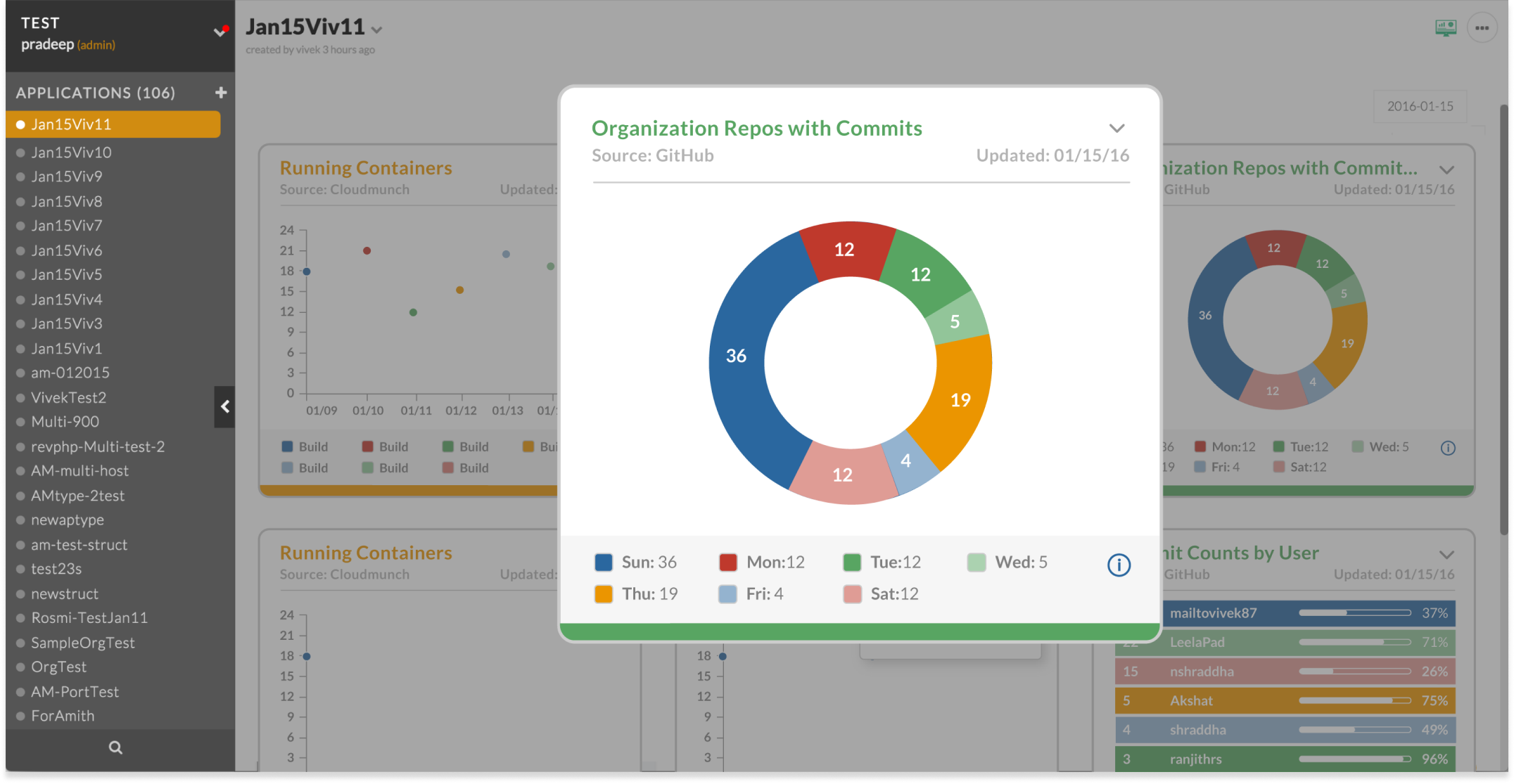
A lightbox effect allowed users to view stats close-up and in isolation. By improving the color scheme, contrast levels and spacing of elements, the graphs became more readable while conveying complex detail.
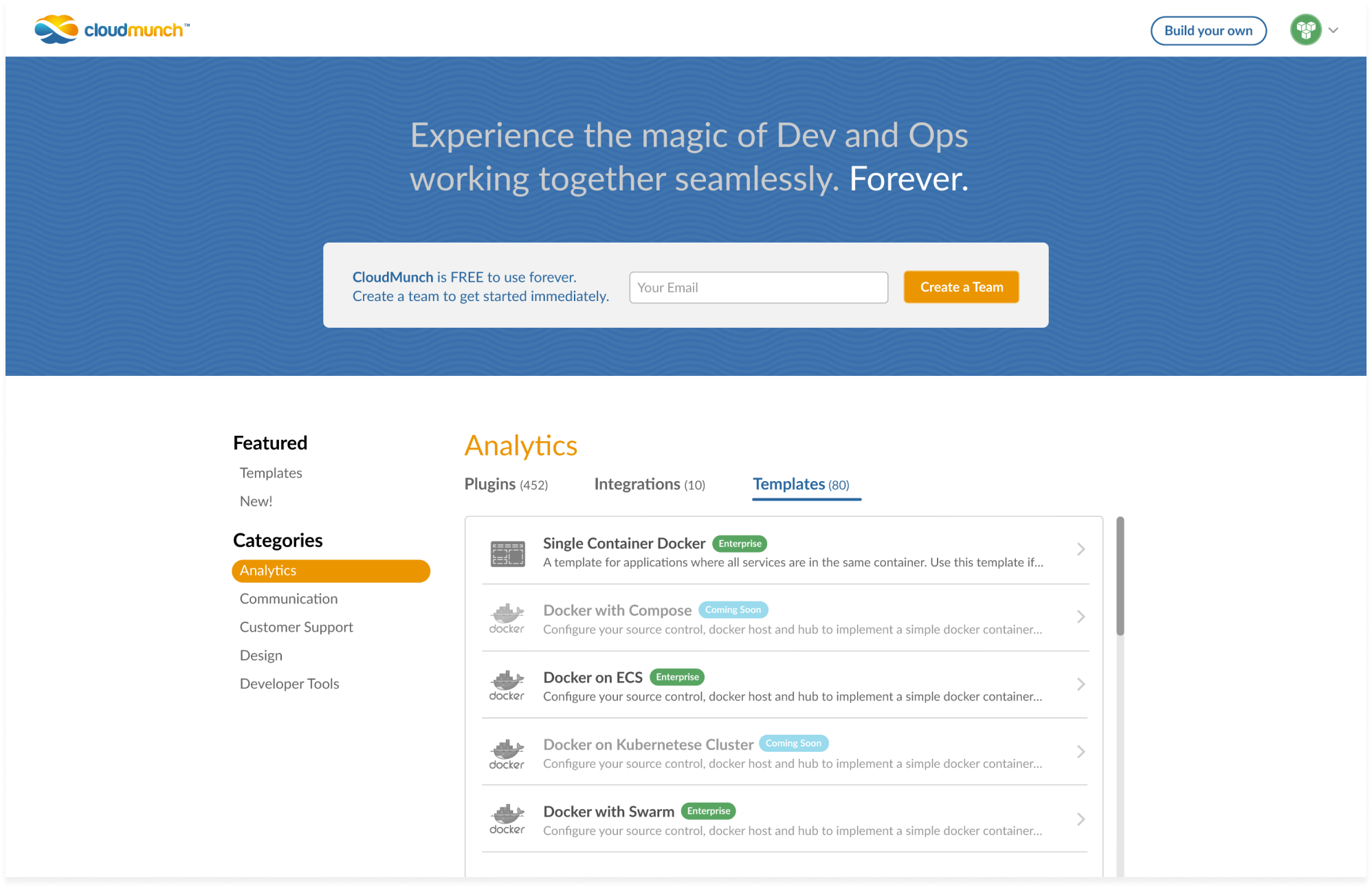
The Hub served as a growing library of templates, tools and plugins for developers to incorporate into their projects. I created a system of iconography and labels to represent the various types of resources to increase findability.
You must be logged in to post a comment.