Archives: Projects
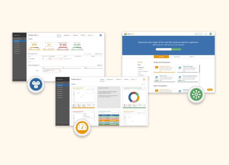
CloudMunch: Brand Extension
CloudMunch: Brand Extension

Role
Visual Designer, Copywriter
Duration
8 Weeks, Completed in 2016
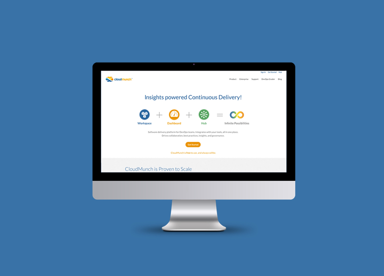
CloudMunch is an ambitious team working to tame the complex world of DevOps with a unifying platform for cloud-based app deployment, including plugins and pipeline templates.
Opportunity. With the popularity of the cloud came a chance to transform how IT teams and app developers worked to test, deploy and maintain apps across their networks. In 2015, cloud applications were gaining traction, and tools to improve their efficiencies would be part of pushing adoption of cloud technologies from a meager 8% of enterprises to 82%. CloudMunch had recently redesigned their logo, and needed help extending their brand identity and tone of voice across their product and website.
Approach. I worked in sprints alongside CloudMunch's Engineering team, and designed within the constraints of their existing graphic style. Because of the quick turnaround to announce their upcoming product release, I made minimal updates to the existing color palette, and improve their copywriting for a US audience.
Outcome. CloudMunch successfully launched their app, and were acquired by JFrog a few months later.
I expanded their brand across both their product design and their marketing website, and created custom branded illustrations and icons to match their desired cartoony style.


CloudMunch provided their logo and two brand colors, and requested a “rippling wave” motif throughout their product. I fleshed out their style guide and created a cohesive look across their product, marketing website and presentations.
I designed a series of product icons to work as both a minimalist UI element as well as a high-fidelity marketing illustration for dramatic effect.


I reimagined their infographics to explain the components of their three primary products and illustrate the structure of their app templates. These were used in various collateral, including their marketing website.


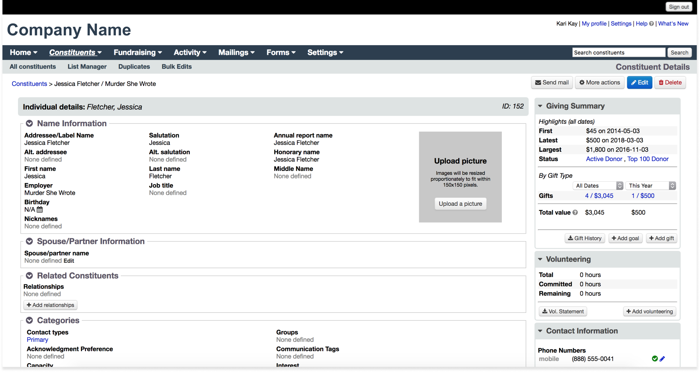
Little Green Light: Donor Management
Little Green Light: Donor Management Platform

Role
UI Designer, Visual Designer
Duration
5 Weeks, Completed in 2018
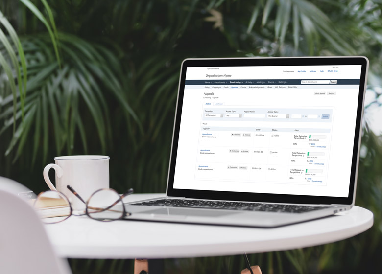
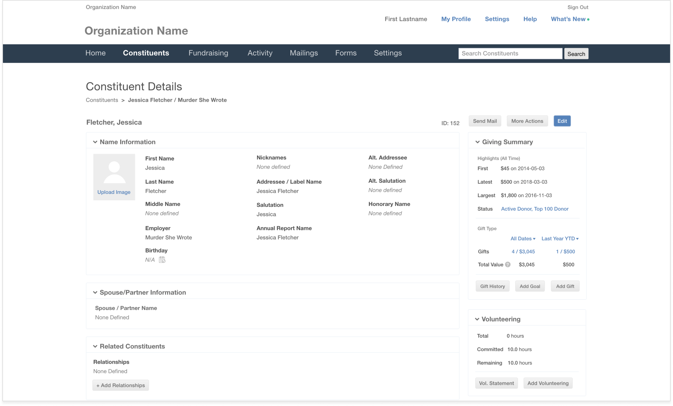
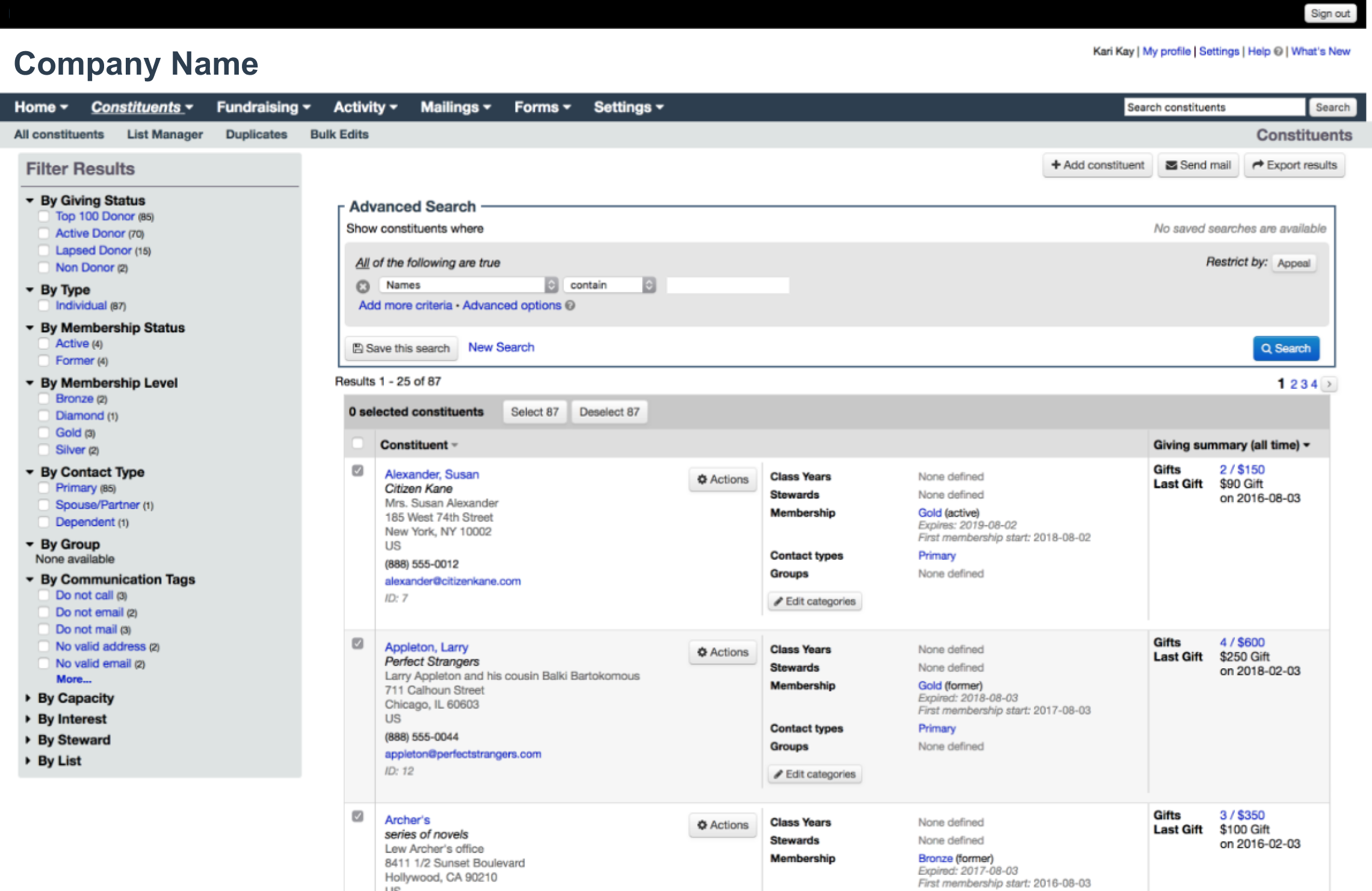
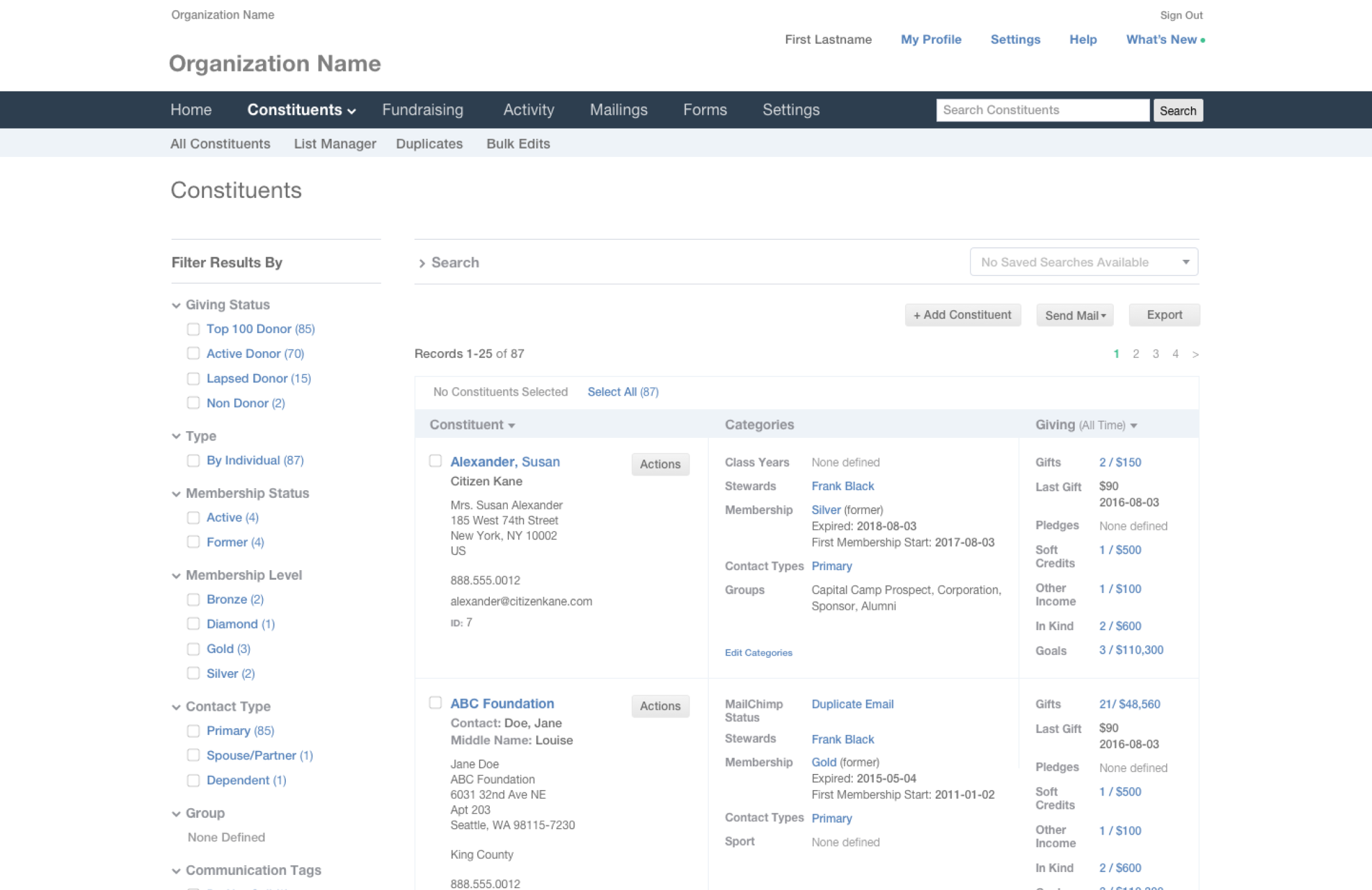
Little Green Light is a donor management platform for nonprofits, serving over 3,000 small and mid-sized nonprofits around the world. After ten years in business, they were ready to revamp their outdated product infrastructure to reduce their workload for future releases.
Opportunity. As they were nearing their tenth business anniversary, Little Green Light's small but mighty team were ready to transition to Vue and refresh their product UI for a leaner, more modern interface. Out of an abundance of caution for their existing users—who tended to be very non-technically inclined—they wanted to maintain their existing UI and flows as much as possible to avoid an onslaught of customer service calls from user confusion.
Approach. To avoid spending energy maintaining two code databases simultaneously while developing the new version of the app, I worked with their team of developers to deliver iterative updates over the course of a few sprints. Little Green Light provided an inventory of their existing pages and components. I audited existing layouts, navigation structure, theming, and reviewed their list of prioritized areas for UX improvements. I then selected a UI library compatible with Vue to shave additional design and development time.
Outcome. Little Green Light launched the revamped design with the option to toggle between the old and new UI. Users were successfully able to transition to the new UI without issue, and Little Green Light continues to be known as a top contender for donor management, with consistent 4.7+ star ratings.
I started by auditing their existing layouts and design patterns, looking for opportunities to declutter and reduce clicks.

Little Green Light provided a list of components in use, highlighting some issues to resolve.

I discovered additional opportunities to clarify functionality and create more defined hierarchy using simple text updates to statuses and labels
Despite the temptation to make more drastic recommendations to evolve the UI, the scope of work was limited to the most surface-level CSS and HTML updates. This left little room to reduce the density of content on the pages, which proved to be the most challenging design issue to solve. Instead, I focused on improving visual proportions and introducing more hiearchy to guide the eye throughout the page.
Component Improvements
Before. Sorted lists looked date, were difficult to scan quickly, and were clunky to work with due to the tight spacing between elements

After. Sorted lists were simplified by removing unnecessary repeated elements, increasing spacing between lines and reducing the weight of fonts and carets

Before. The Advanced Search function supported numerous nested fields. While it was robust, it was not readily intuitive, and users couldn’t enjoy its full functionality.

Before. Sidebar panels remained open most of the time, and were styled slightly differently throughout the interface, adding to the visual clutter

CloudMunch: DevOps Platform
CloudMunch: DevOps Platform
Role
UI Designer, Visual Designer
Duration
8 Weeks, Completed in 2016
CloudMunch is an ambitious team working to tame the complex world of DevOps with a unifying platform for cloud-based app deployment, including plugins and pipeline templates.
Opportunity. With the popularity of the cloud came a chance to transform how IT teams and app developers worked to test, deploy and maintain apps across their networks. In 2015, cloud applications were gaining traction, and tools to improve their efficiencies would be part of pushing adoption of cloud technologies from a meager 8% of enterprises to 82%. CloudMunch saw the opportunity to utilize quality user experience design as a differentiator to attract more of the 18 million software developers to their tools.
Approach. I worked in sprints alongside CloudMunch's Engineering team through multiple iterations of their web app.
Outcome. CloudMunch successfully launched their app, and were acquired by JFrog a few months later.
Their range of DevOps tools was presented in three distinct parts to emphasize their value in supporting continuous app delivery and monitoring: the Workspace, Dashboard and Hub.

The Workspace featured app delivery pipelines with at-a-glance monitoring. Pipelines are a popular tool for testing app stability and performance before updating them across multiple environments. From the Workspace, users could walk through a step-by-step approach to build each new pipeline with robust functionality and less manual effort.


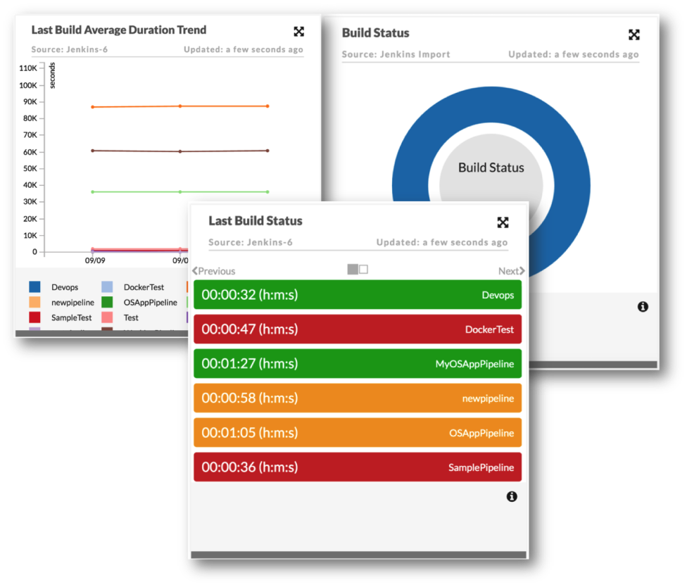
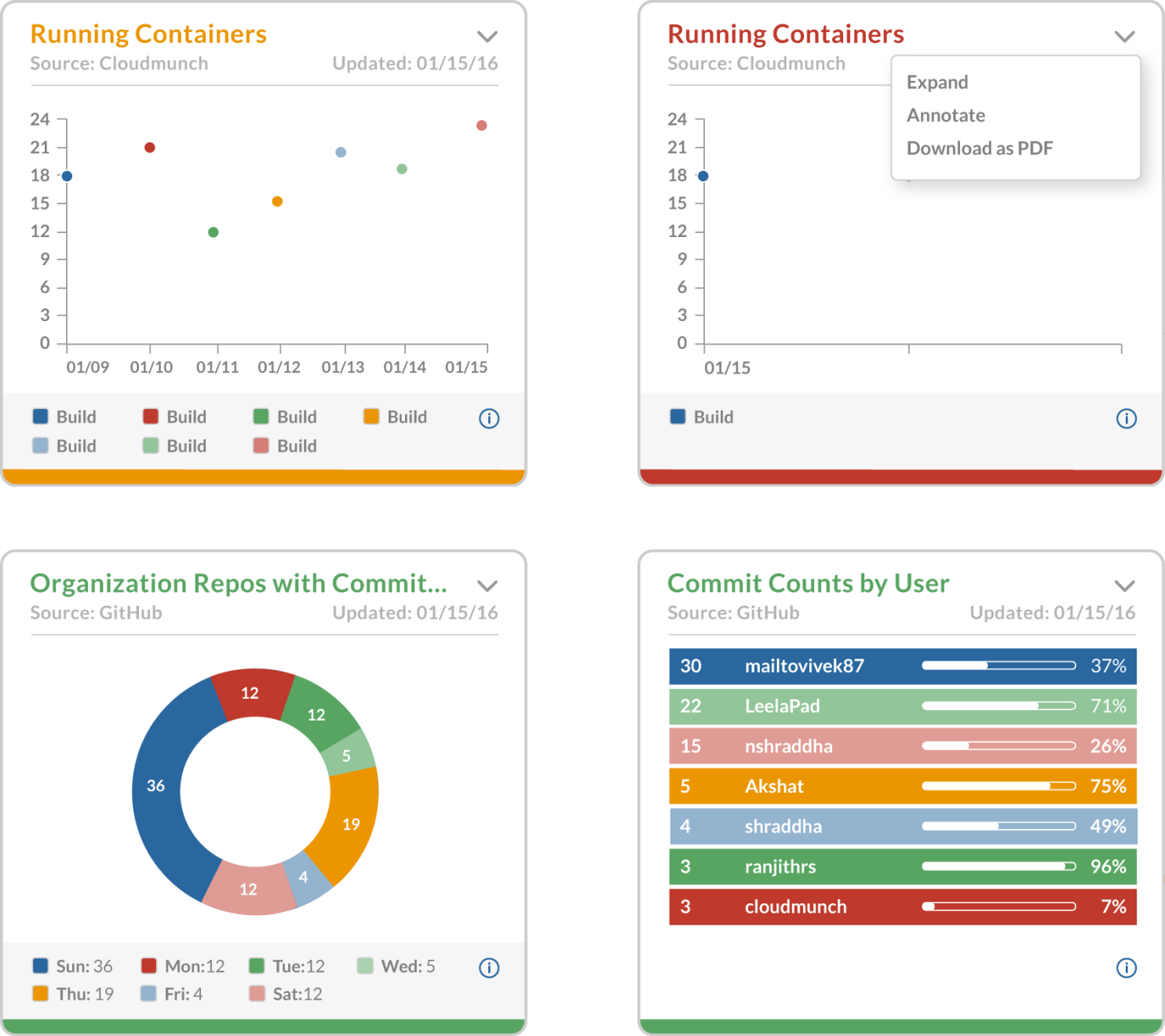
The Dashboard provided flexible insights displayed as individual modules. This allowed users to customize their focus to highlight key stats for current projects, and download reports as needed.
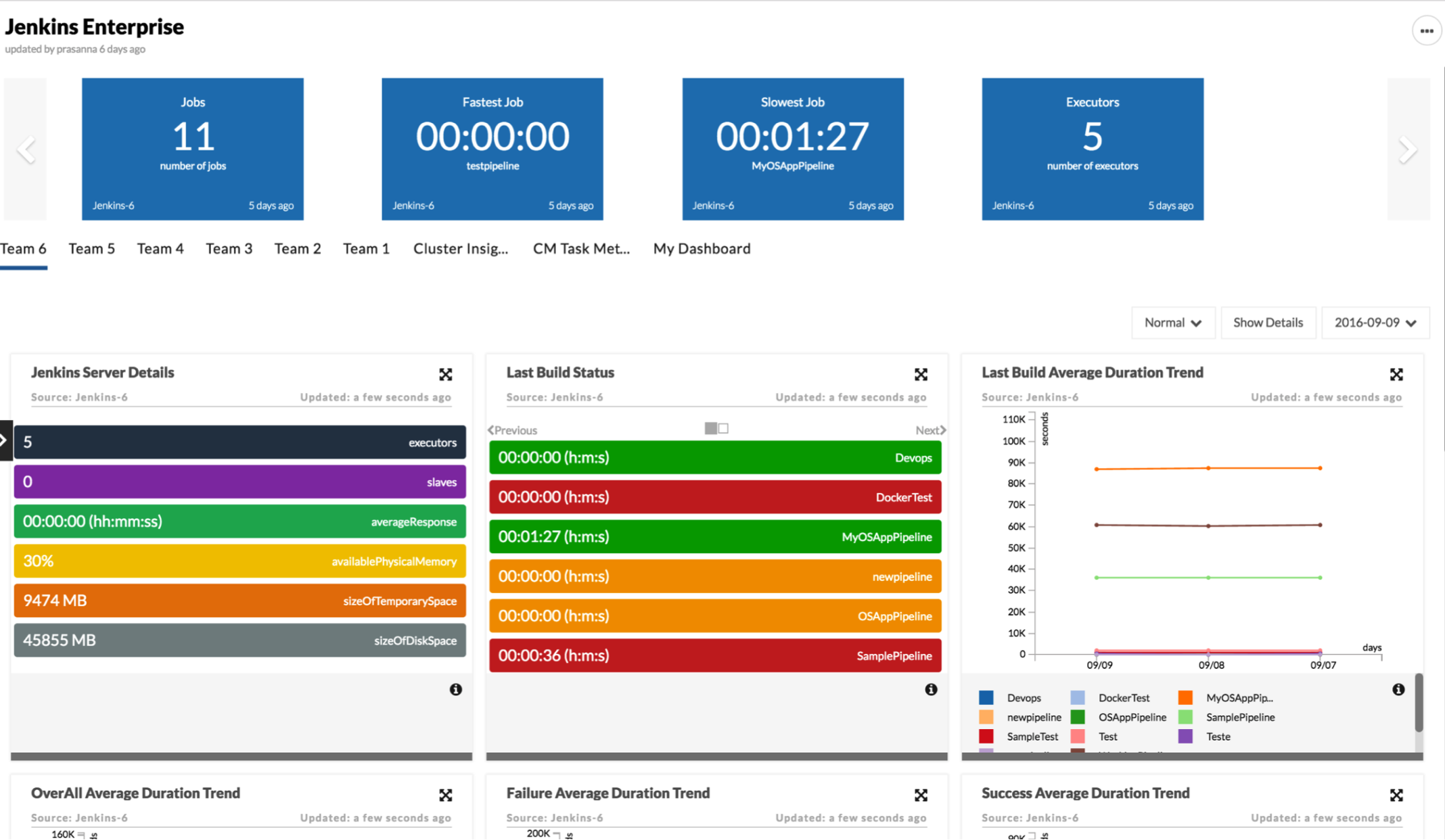
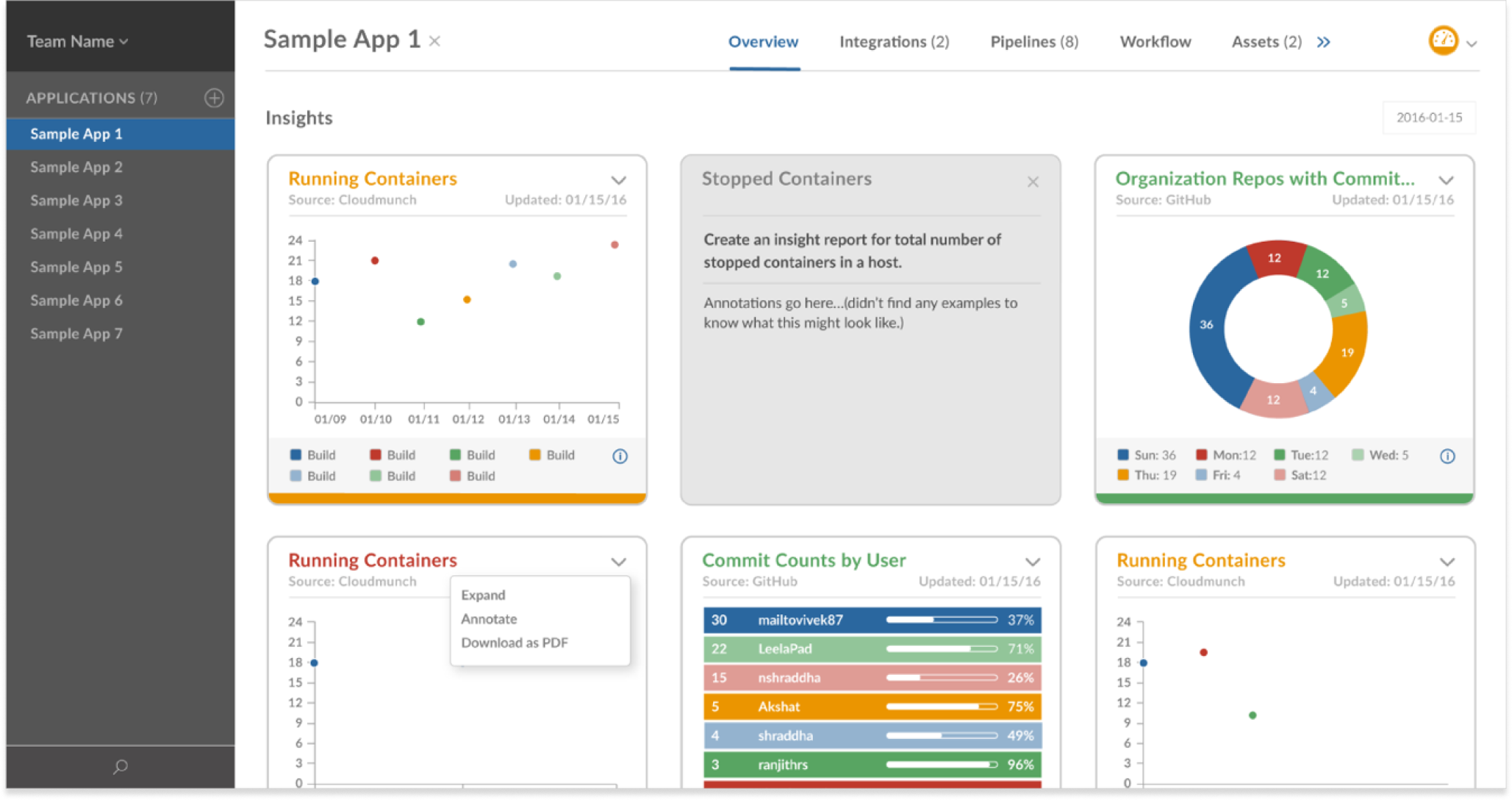

A lightbox effect allowed users to view stats close-up and in isolation. By improving the color scheme, contrast levels and spacing of elements, the graphs became more readable while conveying complex detail.
The Hub served as a growing library of templates, tools and plugins for developers to incorporate into their projects. I created a system of iconography and labels to represent the various types of resources to increase findability.


CloudMunch: User Onboarding
CloudMunch: User Onboarding
Role
Visual Designer
Duration
4 Weeks, Completed in 2016
CloudMunch is an ambitious team working to tame the complex world of DevOps with a unifying platform for cloud-based app deployment, including plugins and pipeline templates. They knew the importance of making user onboarding smooth and engaging, and requested custom graphics and copywriting to help tell the story of their product's value.
Opportunity. CloudMunch knew that to increase adoption, they needed to refine their onboarding process and infuse more personality into the user experience. Having recently rebranded, they also needed help extending their brand identity and tone of voice into their product.
Approach. I worked with CloudMunch through multiple iterations of their marketing website and app platform. This included designing everything from their individual product icons to their multi-step onboarding process and illustrated product diagrams.
Outcome. CloudMunch successfully launched their app, and were acquired by JFrog a few months later.
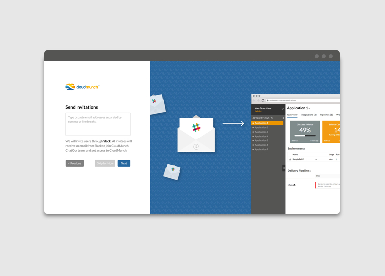
CloudMunch requested a short, friendly setup process for new users, complete with compelling visuals for each screen in the flow. This seamless onboarding process encouraged collaboration for an even stickier product experience.

By positioning their product as a collaborative environment for development teams at the very beginning of the user experience, we were able to showcase the real power of their platform.

Each step of the onboarding process served double-duty as both an opportunity to highlight the product value and to reduce the number of form fields exposed at once to the user.

Experimentation with A/B testing would reveal the pros and cons of how fields were grouped. For example, combining the password and team name fields into one step may have resulted in fewer dropoffs, or fewer reminders to secure their account and finish onboarding.

Closing with the option to send invitations to collaborators reinforced the spirit of the product, and emphasized the speed at which teams could ramp up with their new tool.
Redox: Web App
Redox: Healthcare Interoperability Platform

Role
Lead Product Designer
Duration
6 Weeks, Completed in 2020
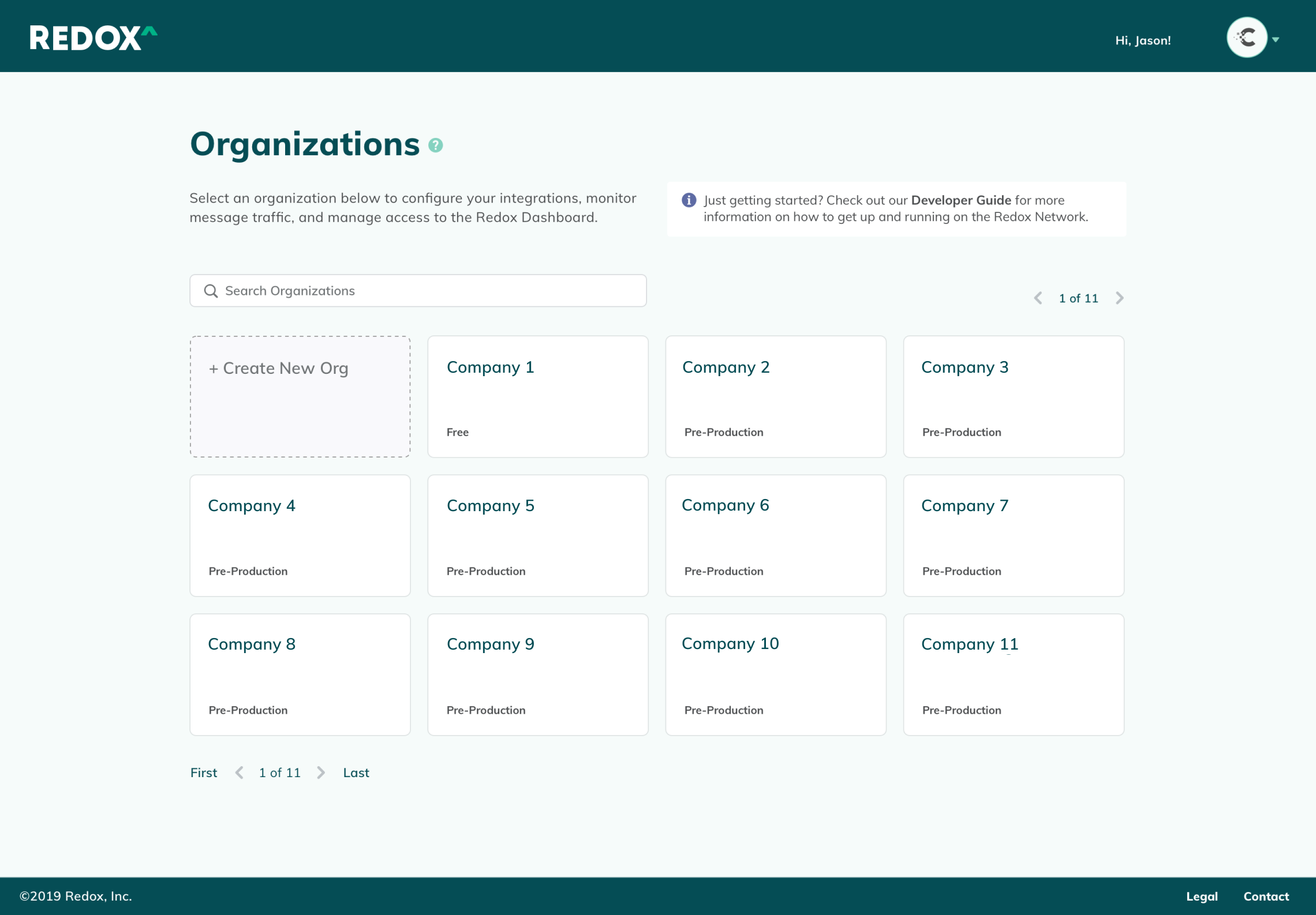
Redox is a healthcare interoperability platform aimed at simplifying the healthcare journey for patients, payors and providers. As they were preparing to transition their app to React, they wanted to take the opportunity to address some minimal UX/UI improvements and reflect more of their visual identity in the product.
Opportunity. Like many companies at the time, Redox was making the shift to React and wanted to make some simple updates to their UI and UX in the process. Based on feedback from Customer Success, the onboarding tasks and dashboard were in particular need of a revamp to provide context and generate enthusiasm at the outset for the app developers who used their product. Copywriting and minimal UI updates needed to be kept to a minimum so Redox's engineers could focus on the more critical tasks for the transition.
Approach. I worked with their UI engineers to flesh out a simple style guide to get them started in a good direction. I provided redlines, style guides and video walkthroughs to introduce new features and redesigns. Since we had received feedback that users often conflated terms like "Source" and "Destination" when configuring their tenant, I added simple tooltips and copywriting updates to guide users through the process.
Outcome. Unfortunately, layoffs affecting 25% of the company occurred before the project was implemented.
I worked with the UI engineers to identify a React-based UI kit to minimize the work required to flesh out their app. I reviewed their existing UX/UI patterns, and modified components from the UI kit to carry their branding throughout the product.


Consolidated Navigation

Since the sidebar is an omnipresent element, it needed to serve as an anchor for the rest of the page—an element that is intuitively organized and easy to reference at a glance. I updated the font weights, padding, and color assignments, and swapped in icons from the new UI kit. These simple updates made for a fairly extreme makeover to the interface, and saved precious vertical space.
To guide the user throughout the product, I added descriptions, tooltips and contextual documentation links for each product section.
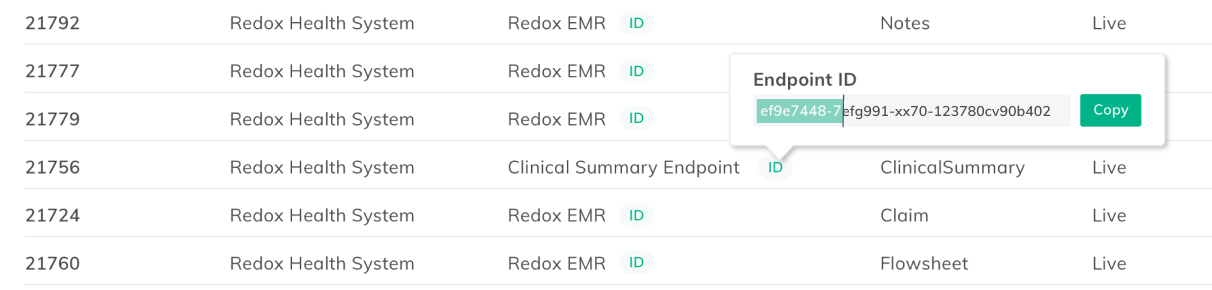
Simple improvements, like enabling one-click copying of Endpoint IDs, and space-saving accordion-style filters created a more seamless user experience.
Onboarding Improvements
I narrowed the focus of the onboarding experience to the bare essentials, and linked pertinent documentation for easy reference.

Previously, the “Getting Started” checklist was easy to miss, as half of it appeared below the fold. It also included extraneous steps beyond what was actually needed to up the product, which cluttered the interface, and made it likely to be overlooked by users. Additionally, the list was pervasive even after steps were completed. It became a clunky interruption to daily work unless the user had hunted down the “off” switch in their settings menu.
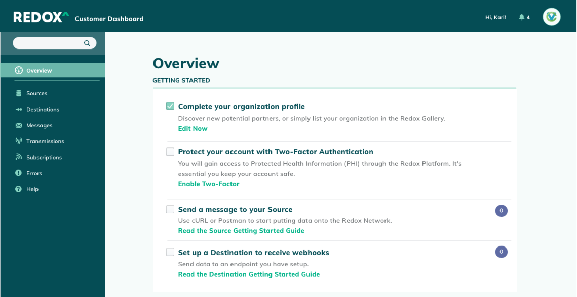
I removed unnecessary items from the checklist, and positioned it at the very top of the Overview page. When users completed all the steps, the checklist would automatically disappear from the Overview page.

As a future iteration, I suggested integrating with Salesforce's Content Management System to pull in relevant guides and collateral based on customer data.
Dashboard Improvements
The Redox Network drew power from the "strength in numbers" maxim. The more healthcare providers that joined their network, the easier it became for health tech companies and app developers to connect to these institutions. More institutions meant more patients being offered options to enhance their personal healthcare experience with technology—Redox's ultimate mission. These numbers highlighted the Redox Network's collective progress, and encouraged their community of users to keep building.


Seattle in Progress: Web App
Seattle in Progress: Web App

Role
Lead Product Designer
Scope of Work
Mini Design System, Prototyping, UX Design, UI Design, Visual Design
Seattle in Progress set out to give residents greater visibility into the development of their city by providing easy access to upcoming construction and land development plans.
Duration. 3 months, Completed in 2015
Opportunity. Seattle in Progress tracks construction projects throughout Seattle from application to completion, giving local residents and businesses a way to stay informed at each step of the process, right from their phones. The founder approached me to improve the UX and UI in preparation for creating a white label offering as well as a paid subscription.
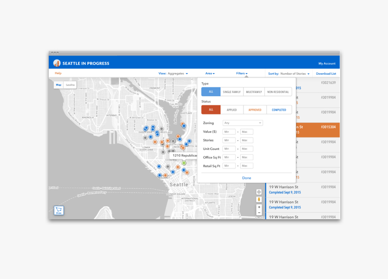
Approach. I worked with the founder/developer directly to refine their style guide and make simple design updates that could be executed with little effort in CSS and HTML. The need to differentiate this product was unusually high since a look-alike app had recently launched. With this in mind, I looked for ways to solidify the Seattle in Progress identity and position the product as a more enjoyable, robust interface. As companies showed interest in the white label option, I provided branded mockups and collateral to pitch the idea.
Outcome. The founder ultimately decided not to implement the new app design, as he transitioned his focus to other projects. The free app continues to provide value to users many years later.
The need to differentiate this product was unusually high due to the fact that another organization had copied it almost down to the pixel. Rather than seeking legal retribution, the founder took the opportunity to level up his app and amplify its value with a superior UX and UI. With this in mind, I emphasized the Seattle in Progress brand throughout the UI, and used minimalist UI elements and bold color blocking to polish the look.
Before. Primary Navigation Bar

After. Primary Navigation Bar

The scope of the project was limited to improving how existing elements displayed on screen. Redefining the page hierarchy, element positioning, typography, colors and spacing modernized the look and feel instantly, and made it easier to find tools throughout the interface.

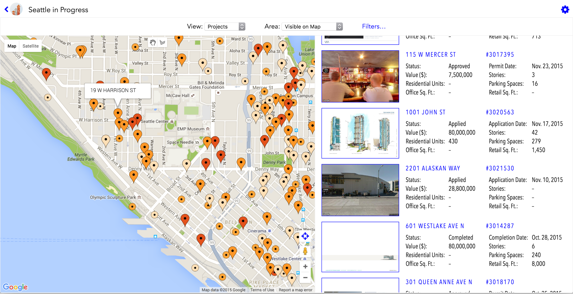
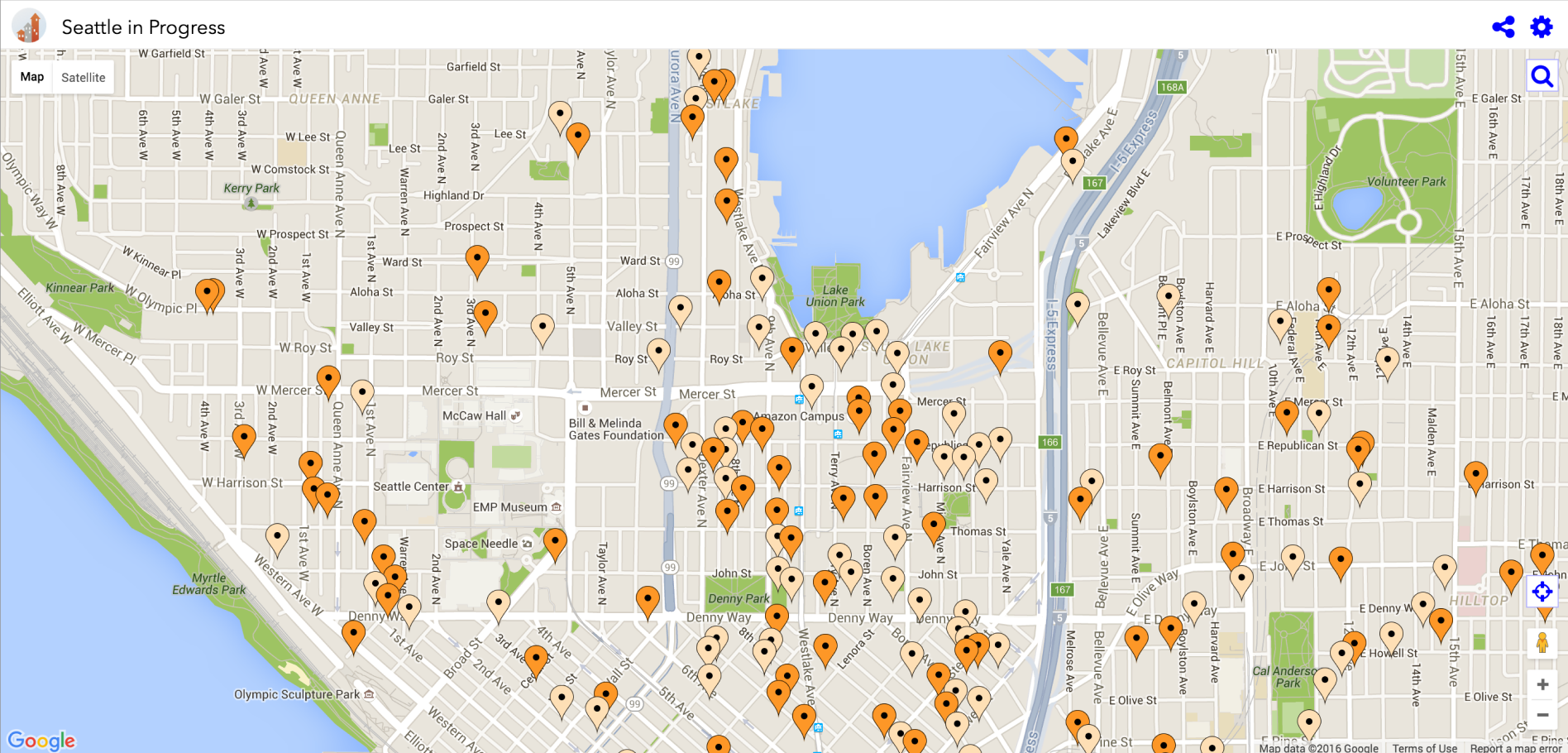
As the map and listings were the primary focus of the app, I paid close attention to reducing visual clutter and removing unnecessary elements to create a clean working space for users. This involved swapping default map location beacons for smaller jewel-like nodes, simplifying the map colors to a monochromatic palette, and repositioning tools.

After. Map with listings. Custom area drawing tool was moved to the corner of the map to make it easier to find.
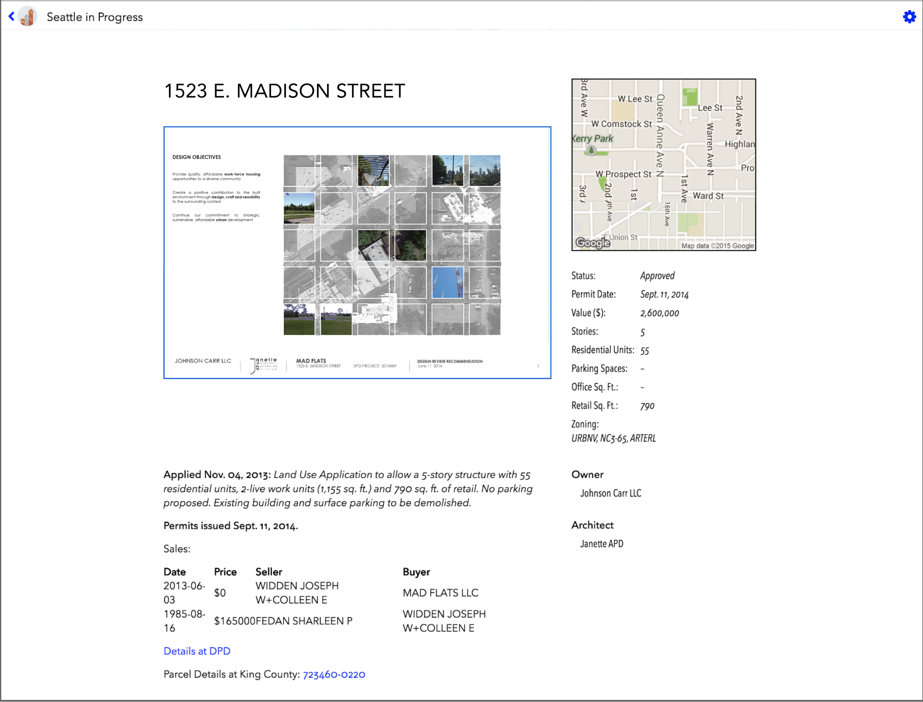
Before. Listing details were difficult to scan easily.
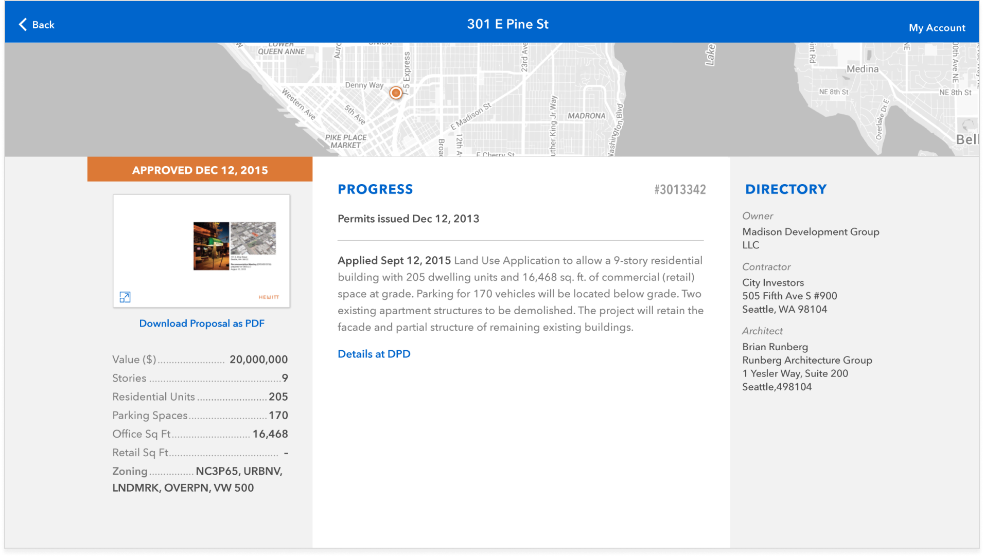
After. Key details were consolidated and placed above the fold for easier reference.
The responsive web app was ideal for users looking to explore details about construction projects as they encountered them throughout Seattle. The modular design and bold colors translated well across both desktops and mobile devices.
Before. Mobile view

After. Mobile view

After. Mobile experience


In parallel with updating their new app, I helped Seattle in Progress develop a white-label version of the app to generate a new revenue stream.

Digital Alchemy: iOS App
Digital Alchemy: Bank Loan iOS App

Role
Lead Product Designer
Scope of Work
User Research, iOS App Design, Prototyping, UX Design, UI Design, Visual Design, Interaction Design
Digital Alchemy uses the power of mobile technology to connect house hunters and homeowners with trusted financial professionals. This white label bank iOS app allows users to discover new real estate opportunities, then guides them through comparison shopping for mortgage rates and applying for a loan.
Duration. 9 months, completed in 2017
Opportunity. Digital Alchemy is a white label financial product for real estate brokers and agents. It non-intrusively guides home owners and house hunters through each stage of the home financing process with in-depth information uncommonly found in tools for mass markets. For house hunters, this means less time spent hunting down agents' and loan officers' contact information or sifting through emails. For agents and loan officers, the app provides a direct connection to clients, while guiding them through a simplified experience, reducing repeated questions and back-and-forth communication.
Approach. I worked directly with the executive team. They requested targeted support to validate their product offering for three audience segments, explore UX and UI design enhancements to their existing app, and create a system of matching collateral and branded app themes customized for each financial institution. In addition to conducting user research, I proposed a plan to improve the app's readability and establish the interactive experience of launching the white label app for different brands. I also provided prototypes to present to prospects to help close deals.
Outcome. Digital Alchemy was able to launch their app with multiple financial institutions. They sold their company and suite of products three years later.
User Research

Surveys
I emailed a 9-question survey to a group of pre-screened participants, all of whom owned an iPhone and had experience with real estate apps. This included current renters, current and former home owners, and those who had invested in multiple properties. The surveys revealed differences in how they approached the home-buying process, and their comfort level for using an app to communicate with agents and loan officers.
User Interviews & Usability Testing
To learn whether the existing screens and flows were providing adequate information, I conducted in-person and virtual usability tests using a prototype of the current app design. The feedback drew attention to readability issues, and highlighted the information different personas tended to prioritize first when searching for properties.
As always, speaking with participants directly provided a wealth of information about how they preferred to use technology in their property search and engagement with real estate and financial professionals. For example, investors who were more familiar with the real estate process strongly preferred viewing additional fine-grained financial details, and therefore preferred accessing this app from a larger screen.

Before. Landing page and property details page
Customer Journey: Finding a Desirable Property
A house hunter's journey to find a property is long and meandering. This meant that the app needed to be flexible enough to account for the number of times a user may need to research properties before they were ready to put in an offer, or, in many cases, another offer.

Assessing Property Financials
Keeping an eye on interest rates is top-of-mind for house-hunters. I explored a few design concepts that would allow users to cycle through saved mortgage rates without having to navigate through the app to get to them.

Dynamic sliders. Users could explore financing options based on their desired downpayment.

Cash-to-close. Cash to close is a complex set of calculations, so scrolling is required to see it all (hover to scroll).

Saved for comparison. Weighing the pros and cons of each loan was made easier by consolidating saved estimates in one place.
Discovering Mortgage Options
Keeping an eye on interest rates is top-of-mind for house-hunters. I explored a few design concepts that would allow users to cycle through saved mortgage rates without having to navigate through the app to get to them.

Saved mortgages. The ability to save mortgage rates made it easier to shop, compare and revisit options.

Expanding tab bar. A long-press would animate to display mortgage details, and allow the user to cycle through a few saved mortgages.

Stock-ticker style mortgages. This treatment allowed users to glance at interest rates as they scrolled across the screen. They could drag to view previous and next rates.
Messaging
Discussion threads support conversations with verified loan officers assigned via the app, as well as personal contacts, such as a spouse who may need to co-sign documents. Images, property links and documents are consolidated from messages in a separate area for easy reference.

New Message. Contact names would populate as users typed.

Message inbox. Arranged with most recent messages on top.

Contacts. Loan officers' images were automatically imported, and were used to help build trust.

Contact search. Dynamic search made it faster to find contacts by typing the first letter or two.

Shared—Empty State. Until property links or documents are shared, this is displayed.

Shared Content. Both property links and documents could be communicated in-app, cutting down on cluttered email inboxes.

Message archives. Discussions can get long, so the app archives them by month. Tapping on the count unfurls them for viewing.

Unarchived messages. After a session, the messages archive again to keep threads tidy. (hover to scroll)

Built-in organization. Important content is consolidated in one place keeps all parties organized throughout the process.

Save time uploading. Rather than using a scanner, users could take pictures from their phone and upload important documents to keep things moving.

Automatically locked content. As an extra security precaution, sensitive documents could be set to expire after a number of days.
Mortgage Application
The app drastically reduced the burden of finding properties, gathering and comparing mortgage estimates, and hunting down loan officers' contact information. Once a house-hunter found their ideal property, the app made it convenient to connect them with a loan officer directly to begin their mortgage application.
Convenient in-app messaging. Rather than having to hunt for a loan officer, users could simply click a button to be connected with one in-app.


Recent Threads. If a discussion had previously been initiated, the thread would conveniently appear above the message box so users didn't accidentally contact multiple loan officers.
Loan Application Status. Once an application is submitted, house-hunters can see the status as it moves throughout the lengthy approval process.


A face to go with a name. The loan officer's portrait appears next to the status bar to reassure the user they're in good hands.

Confirmation. Once the loan is approved, a confirmation message is displayed, and the loan application process is marked complete.
You must be logged in to post a comment.